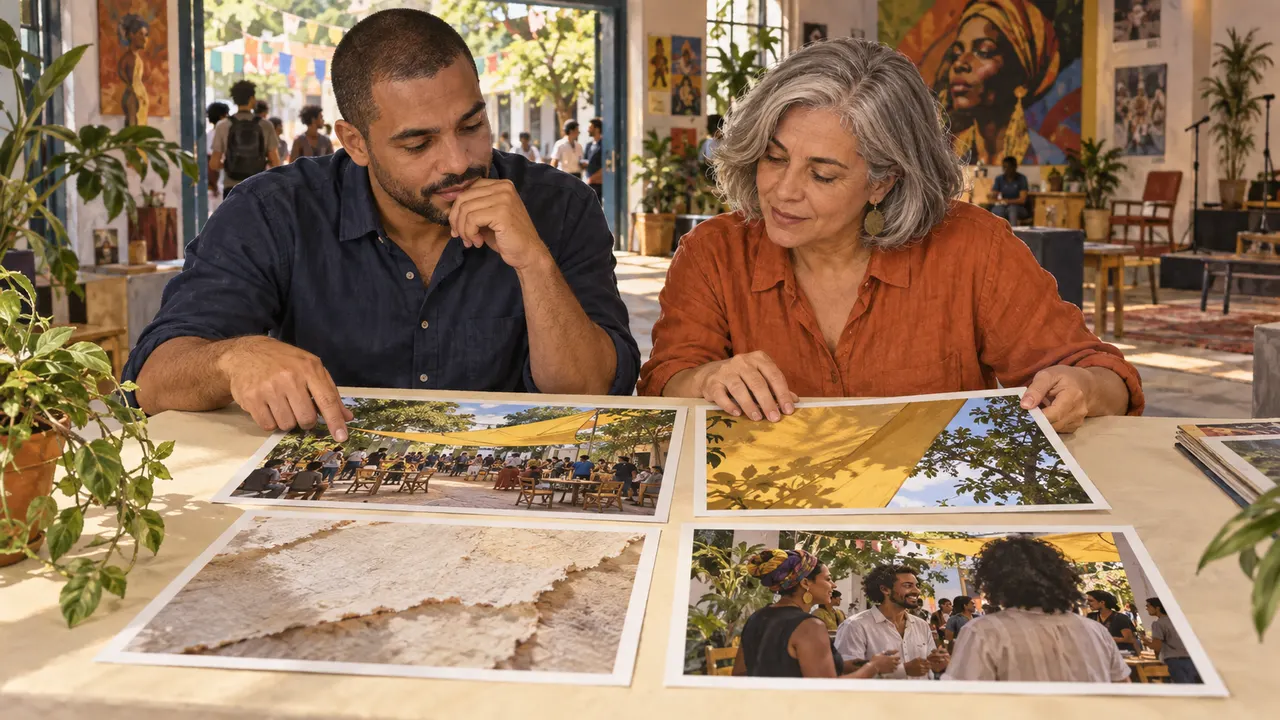
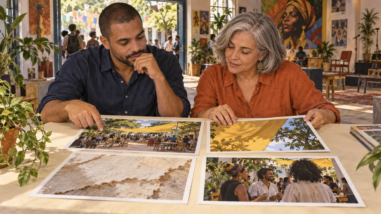
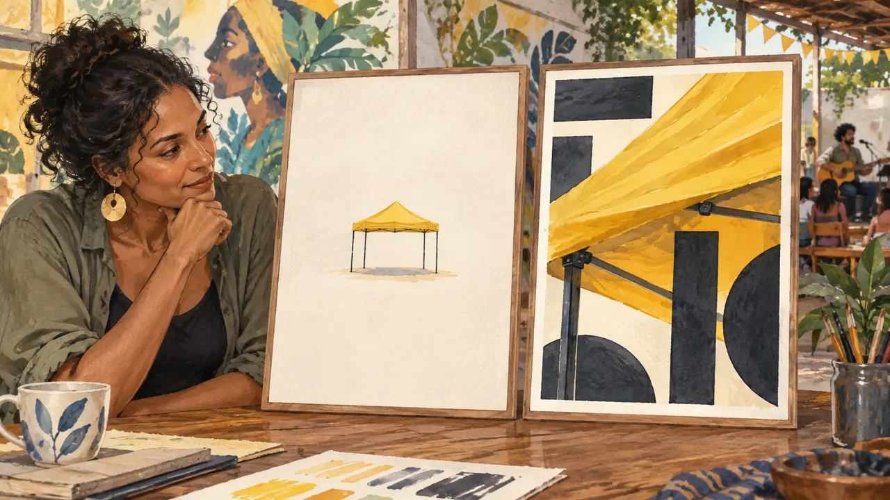
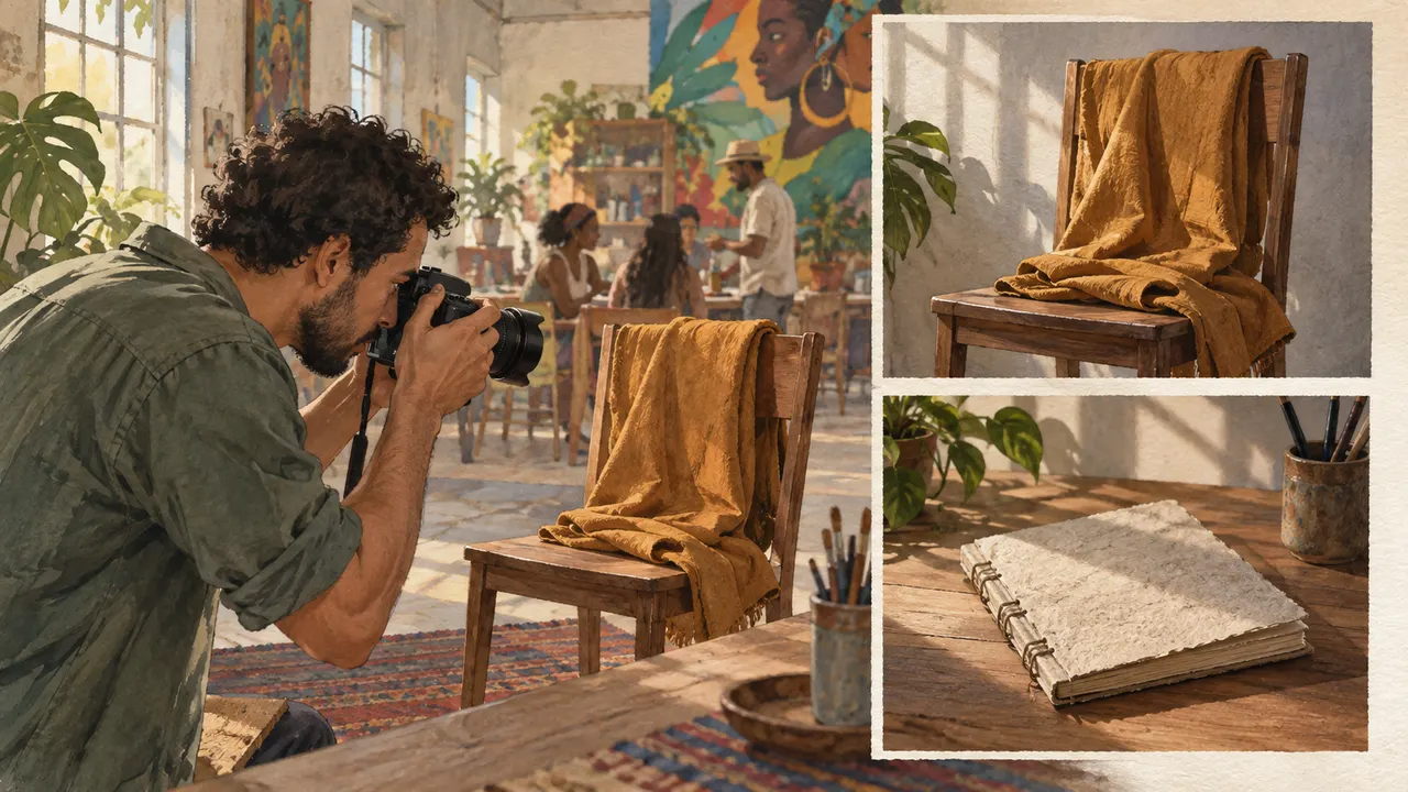
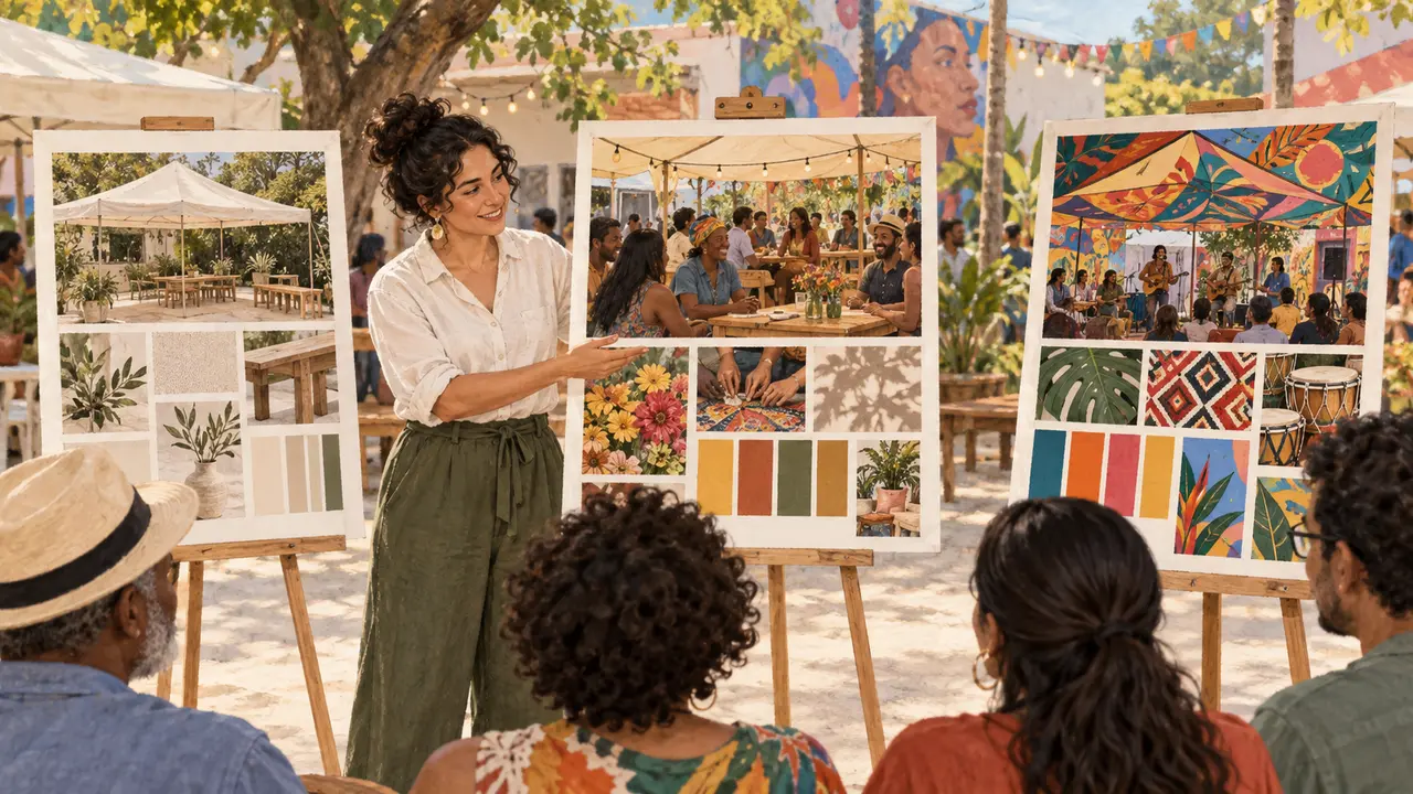
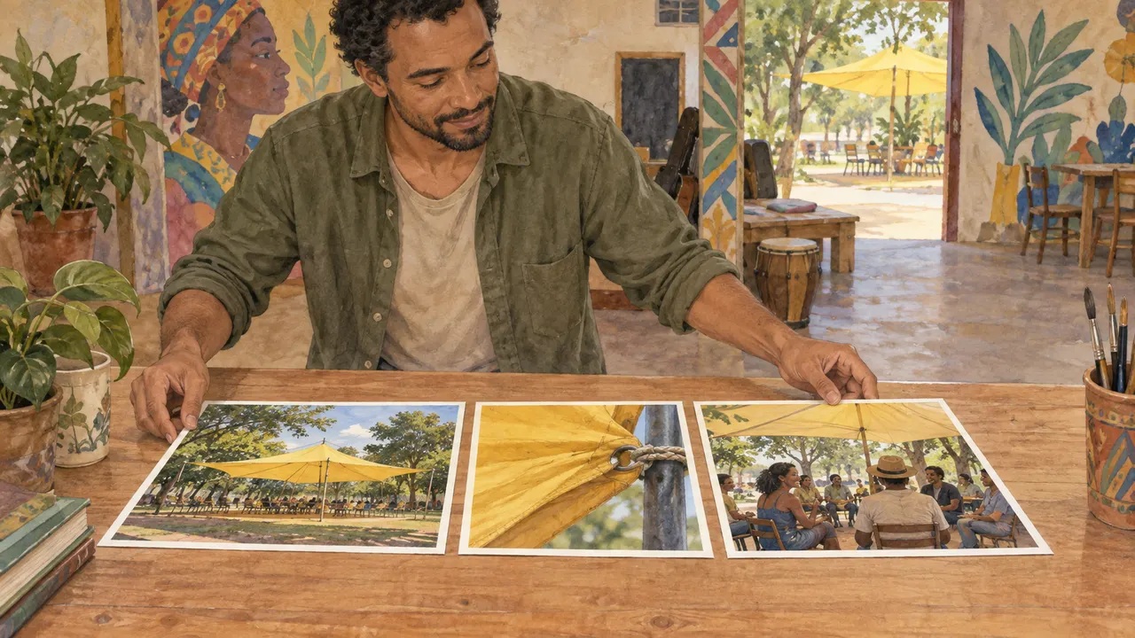
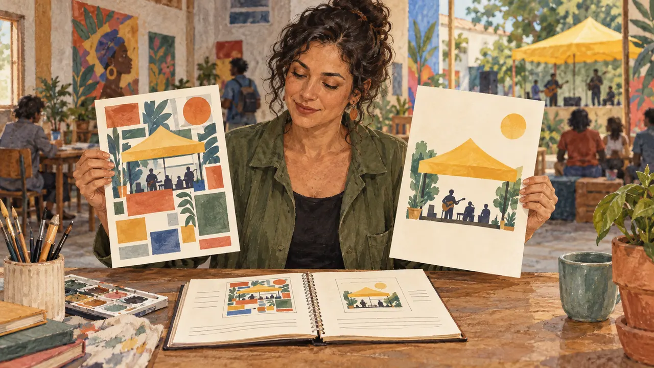
You can select three references to study one decision.
A collection of beautiful images can grow without teaching you a decision. A question helps you select references you can use.
In 1 minute
Question: where does yellow draw attention to the subject?
Select: three references that help answer the question
There is no universal beauty that replaces the goal.
1Taste as a set of decisions
Visual taste can be described through choices you recognize and repeat: color, light, composition, texture, and rhythm.
In this course, we practice observing and explaining these choices without defining a universal standard of beauty.
Saying “I like it” helps you choose, but it does not explain how to make another image.
A specific observation lets you turn a preference into a work decision.
André, a photographer, applies this choice to material for the fictional Bairro Vivo fair: Select three images to observe how soft light shows fabrics and people at a fair.
Prompts to compare · teaching example
PromptSave fifty images without asking how color draws attention to the subject.
There are no observable limits to check the work against.
PromptSelect three references to observe where yellow appears and how it contrasts with the surroundings.
One change is defined, along with something that must stay the same.
Compare the two instructions. They are examples written for this lesson, with no simulated tool response.
2Curation: choose with a question
Curation means selecting references for a purpose.
A board for studying side lighting is different from a collection of beautiful images.
The question guides what goes in and what stays out.
A huge, unorganized archive makes patterns harder to notice.
A few well-annotated examples can be more useful for the exercise.
Marina, a cultural producer, makes a note before choosing: Record one visible clue for each image.
Completed brief · lesson example
1Question: where does yellow draw attention to the subject?
2Select: three references that help answer the question
3Record one visible clue for each image
Use this sheet as a reference. Replace the example with your own project.
3Check the decision against its use
There is no universal beauty that replaces the goal.
Marina uses the observation below to decide: record one visible clue for each image.
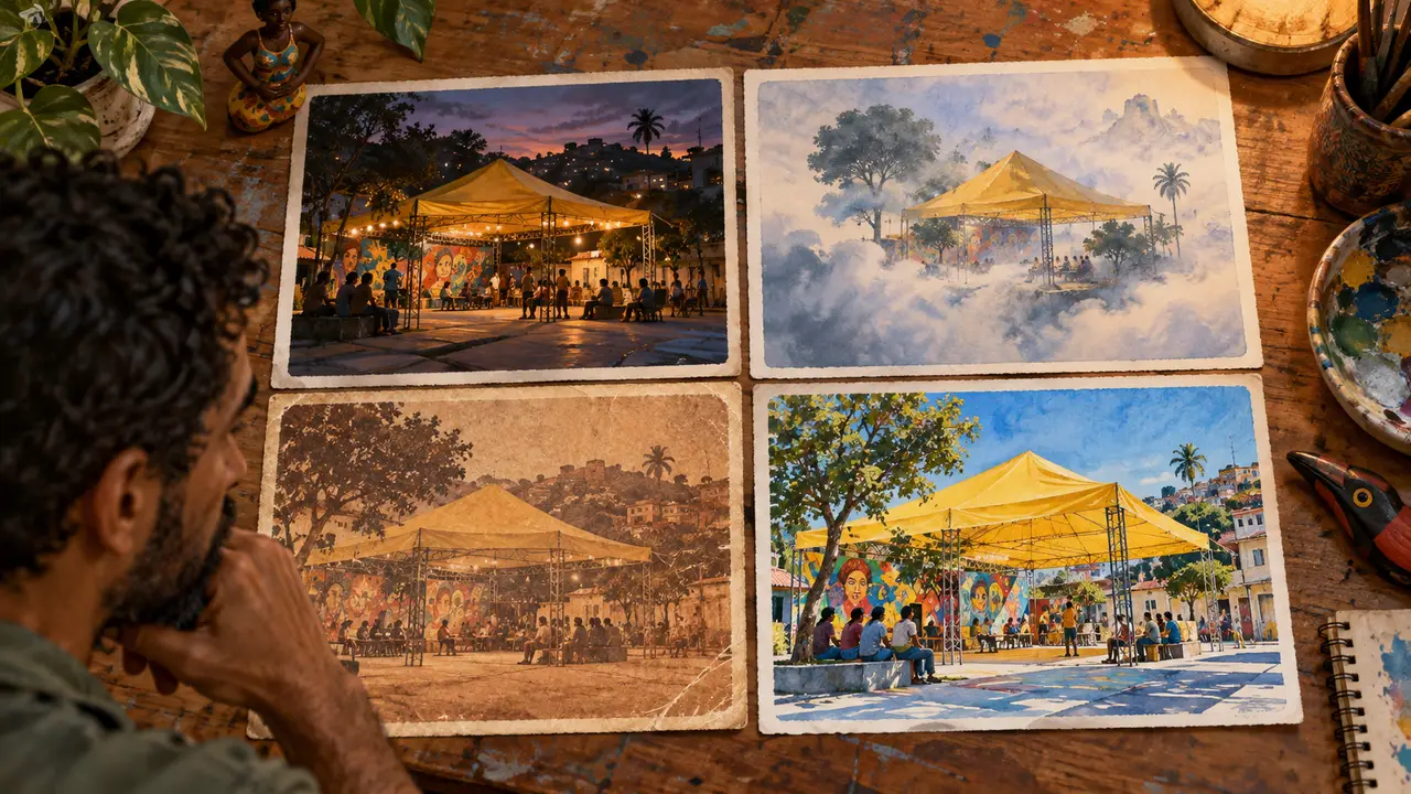
Teaching illustration created in Codex: The four prints show space, fabric, texture, and people. Each one can answer a different question.
Test yourself
A beautiful image does not answer the study question. What should you do?
If you got stuck here, that is normalNo photos of your own right now? Use the prints in the illustration. Write what you can see; mark details as insufficient when needed.
Practice now 0/3
Choose references with a question
About 10 minutes. You are done when three references have an observation or a justified limitation.
Use your own photos or ones you are authorized to use. Fill out the brief on paper or in Notes. If the exercise asks you to edit, keep the original and work on a copy.
Question: where does yellow draw attention to the subject?
Reference 1: <photo or print>. Clue: <covering, fabric, clothing>.
Reference 2: <identification>. Clue: <observation>.
Reference 3: <identification>. Clue: <observation>.
After completing the steps, you can select three references to study one decision.
Lesson cheat sheet
Choose references with a question
Question: where does yellow draw attention to the subject?
Select: three references that help answer the question
There is no universal beauty that replaces the goal.
Your next step
You now have criteria for selecting three references to study one decision.
Use this lesson’s brief with an image from your work. Set aside ten minutes and note the decision you made.
Next step: Separate what you see from what you interpret
Supplementary material · module 1Practice and considerations for both topics. Not included in lesson time.
Taste as a set of decisions
Experiment at your own pace
Choose an image of your own that works for you. Complete the sentence: my eye goes first to this element because it has greater contrast, scale, or isolation. Point to the area instead of just using an adjective.
What to observe
Do not treat personal preference as a rule for every audience. The context and goal may call for different solutions.
Curation: choose with a question
Experiment at your own pace
Start with six references and one question, such as where the light reveals texture. Record each source and why you chose it. Expand the board only if a new image adds a different decision.
What to observe
Use your own photos or references you are allowed to use. If you study someone else’s work, record its source and write down what you observed.
Lesson 1 · Trained Eye v6.2 · INEMA.CLUB PRO
Module 1 · Lesson 2 of 12
Separate what you see from what you interpret
You can record observations, interpretations, and a pattern.
A feeling is not the same as visible evidence. Separating the two keeps you from turning personal taste into certainty about an audience.
In 1 minute
Observation: soft light and empty chairs
Interpretation: it may suggest a pause
A suggested feeling is not a proven audience reaction.
1Observation and interpretation
Observation describes what is visible: a light background, an isolated object, a short shadow.
Interpretation suggests a meaning: calm, familiarity, or precision.
Both are useful, but they are not the same thing.
Separating the two keeps impressions from being presented as facts.
It also makes it possible to discuss why two people read the same image differently.
André, a photographer, applies this choice to material for the fictional Bairro Vivo fair: The scene has soft light and few objects. This may suggest calm for this project, but it is still an interpretation.
Prompts to compare · teaching example
PromptThe photo proves that everyone will feel calm.
There are no observable limits to check the work against.
PromptThe scene has soft light and few objects. This may suggest calm for this project, but it is still an interpretation.
One change is defined, along with something that must stay the same.
Compare the two instructions. They are examples written for this lesson, with no simulated tool response.
2Find patterns without erasing differences
A pattern is something that recurs across references: a limited palette, side lighting, close-up shots, or matte materials.
It can guide a shared visual language without requiring identical images.
Noting only the subject—all of them have posters—is not enough to understand style.
You need to notice how each subject was represented.
Marina, a cultural producer, makes a note before choosing: Pattern: look for a sign in more than one image
Completed brief · lesson example
1Observation: soft light and empty chairs
2Interpretation: it may suggest a pause
3Pattern: look for a sign in more than one image
Use this sheet as a reference. Replace the example with your own project.
3Check the decision against its use
A suggested feeling is not a proven audience reaction.
Marina uses the observation below to decide: pattern: look for a sign in more than one image.
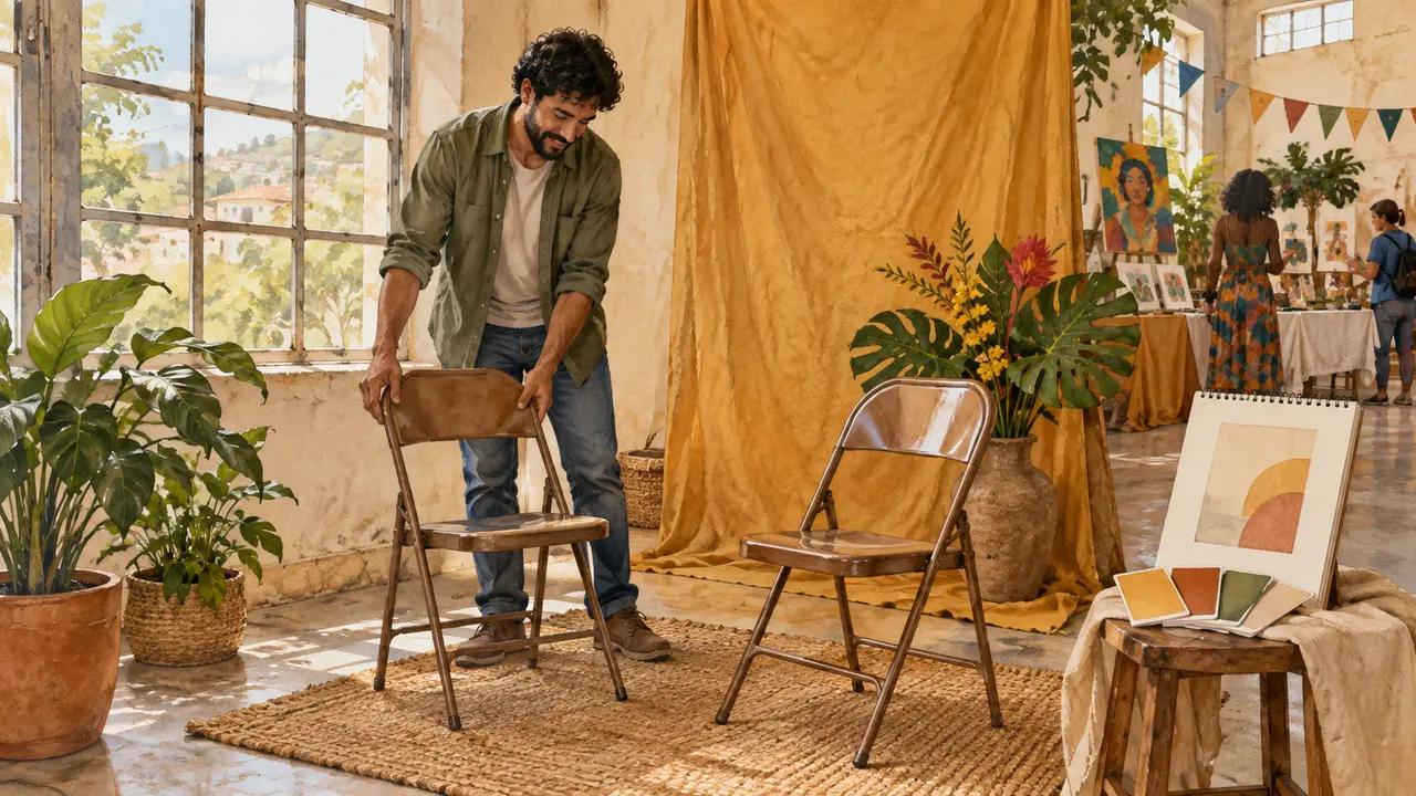
Teaching illustration created in Codex: The chairs and fabric are observable. The atmosphere attributed to the light is an interpretation to check in context.
Test yourself
Which sentence describes something visible without claiming an emotion?
If you got stuck here, that is normalStart with nouns and colors: chair, yellow fabric, light background. Then write what feeling it may suggest.
Practice now 0/3
Separate what you see from what you interpret
About 10 minutes. You are done when observations and interpretations appear on separate lines.
Use your own photos or ones you are authorized to use. Fill out the brief on paper or in Notes. If the exercise asks you to edit, keep the original and work on a copy.
Image A — I see: <two clues>. I interpret: <hypothesis>.
Image B — I see: <two clues>. I interpret: <hypothesis>.
Repeats: <sign>. Differs: <sign>.
What I cannot conclude: <limitation>.
After completing the steps, you can record observations, interpretations, and a pattern.
Lesson cheat sheet
Separate what you see from what you interpret
Observation: soft light and empty chairs
Interpretation: it may suggest a pause
A suggested feeling is not a proven audience reaction.
Your next step
You now have criteria for recording observations, interpretations, and a pattern.
Use this lesson’s brief with an image from your work. Set aside ten minutes and note the decision you made.
Next step: Replace an adjective with visible choices
Supplementary material · module 1Practice and considerations for both topics. Not included in lesson time.
Observation and interpretation
Experiment at your own pace
Make two columns in your notebook. In the first, list three visual clues; in the second, write the feeling you associate with them. Then ask someone else what they notice.
What to observe
Blue does not create trust in every situation. Associations with color and shape depend on culture, context, experience, and combinations with other elements.
Find patterns without erasing differences
Experiment at your own pace
Mark two or three patterns on the board. Also write down one important difference between the references. Choose what you want to keep in your project and what does not fit the goal.
What to observe
Do not combine every feature you find into one prompt. If they conflict, create separate directions to compare.
Lesson 2 · Trained Eye v6.2 · INEMA.CLUB PRO
Module 1 · Lesson 3 of 12
Replace an adjective with visible choices
You can make a photo or drawing based on three decisions.
Broad adjectives can point in different directions. Translating the intent into light, color, and placement lets you make and check a study.
In 1 minute
Intent: welcome visitors
Choices: soft light, warm color, and closeness
Translating an adjective is a hypothesis, not a universal formula.
1Turn adjectives into instructions
Visual vocabulary turns broad expressions into observable choices.
Welcoming might mean soft window light, earthy tones, and a few everyday objects. That is one possible direction, not a universal equivalent.
A specific instruction can be produced and evaluated.
If you ask for “elegant” without defining visual clues, it is hard to tell what needs to be fixed.
André, a photographer, applies this choice to material for the fictional Bairro Vivo fair: Use window light, ochre fabric, and two chairs close together. Take a photo and check whether all three choices appear.
Weak decision
I want a welcoming image, without explaining what that means.
Verifiable decision
Use window light, ochre fabric, and two chairs close together. Take a photo and check whether all three choices appear.
Notice which characteristics make the second decision easy to check.
2A short study routine
A visual study is a small practice focused on one technique.
It could mean recreating a lighting approach with a different object or rearranging a composition while keeping the content.
Repeating a technique with intention helps you recognize its effects.
A routine should lead to observation and application, not just more saved images.
Marina, a cultural producer, makes a note before choosing: Study: one photo of your own and one observation
Completed brief · lesson example
1Intent: welcome visitors
2Choices: soft light, warm color, and closeness
3Study: one photo of your own and one observation
Use this sheet as a reference. Replace the example with your own project.
3Check the decision against its use
Translating an adjective is a hypothesis, not a universal formula.
Marina uses the observation below to decide: study: one photo of your own and one observation.
Teaching illustration created in Codex: The window, fabric, and chair placement make the intent concrete. Observe one decision at a time.
Test yourself
Which prompt lets you check the welcoming intent?
If you got stuck here, that is normalCannot take a photo right now? Sketch the composition and label it as a drawing study. Do not describe an image you have not made as a photo.
Practice now 0/3
Replace an adjective with visible choices
About 10 minutes. You are done when a photo or drawing has been compared with the three choices.
Use your own photos or ones you are authorized to use. Fill out the brief on paper or in Notes. If the exercise asks you to edit, keep the original and work on a copy.
Intent: <adjective>.
Light: <choice>. Color: <choice>. Composition: <choice>.
Study: <photo in gallery or drawing on paper>.
Appeared: <evidence>. Revise: <decision>.
After completing the steps, you can make a photo or drawing based on three decisions.
Lesson cheat sheet
Replace an adjective with visible choices
Intent: welcome visitors
Choices: soft light, warm color, and closeness
Translating an adjective is a hypothesis, not a universal formula.
Your next step
You now have criteria for making a photo or drawing based on three decisions.
Use this lesson’s brief with an image from your work. Set aside ten minutes and note the decision you made.
Next step: Compare minimalist and editorial directions
Supplementary material · module 1Practice and considerations for both topics. Not included in lesson time.
Turn adjectives into instructions
Experiment at your own pace
Write ten expressions that describe your direction. Prefer “light background” to “beautiful,” and “soft shadow” to “wonderful light.” Point to where each expression appears in your own photo or this lesson’s illustration.
What to observe
Do not rely only on an artist’s, brand’s, or style’s name. Describe the features you want to study and make your own composition.
A short study routine
Experiment at your own pace
Set aside fifteen minutes: five to observe a reference, five to describe one decision, and five to sketch an application. If the study takes longer, continue later without losing the original question.
What to observe
Do not confuse speed with learning. Finish with one sentence about what you noticed and what you need to test again.
Lesson 3 · Trained Eye v6.2 · INEMA.CLUB PRO
Module 2 · Lesson 4 of 12
Compare minimalist and editorial directions
You can compare two directions by their use of space and hierarchy.
A visual choice is more useful when you can explain what you observed. In this lesson, turn your first impression into a decision you can check.
In 1 minute
Minimalist: few elements and ample space
Editorial: composition and scale guide the reading
The families are a study map, not rigid boxes.
1Aesthetic is a combination of signs
Aesthetic is a visual language formed by choices in color, light, composition, texture, and shape.
The seven families in this module are a study map: cinematic, minimalist, editorial, dreamlike, retro, raw, and futuristic.
The names help us talk, but they do not replace description.
Two images called cinematic may use very different approaches.
André, a photographer, applies this choice to material for the fictional Bairro Vivo fair: A minimalist direction reduces elements. An editorial direction creates a striking entrance. Choose based on what the message needs to communicate.
Weak decision
Minimalist is always better; editorial needs lots of things.
Verifiable decision
A minimalist direction reduces elements. An editorial direction creates a striking entrance. Choose based on what the message needs to communicate.
Notice which characteristics make the second decision easy to check.
2Minimalist and editorial
A minimalist direction reduces elements and highlights spatial relationships.
An editorial direction may use striking composition, scale contrast, styling, and typography.
Neither one requires a single palette.
Comparing them shows that clarity and impact can come from different approaches.
The goal guides how many elements to use and what role they play.
Marina, a cultural producer, makes a note before choosing: Shared goal: highlight the fair without inventing information
Completed brief · lesson example
1Minimalist: few elements and ample space
2Editorial: composition and scale guide the reading
3Shared goal: highlight the fair without inventing information
Use this sheet as a reference. Replace the example with your own project.
3Check the decision against its use
The families are a study map, not rigid boxes.
Marina uses the observation below to decide: shared goal: highlight the fair without inventing information.
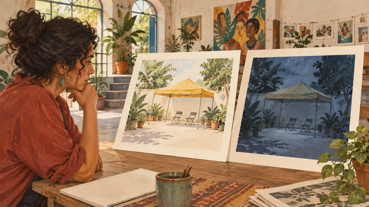
Teaching illustration created in Codex: Compare the empty space and the scale of the canopy. Both studies are valid options for different goals.
Test yourself
What criterion guides a choice between two valid directions?
If you got stuck here, that is normalYou do not need to get the name right. First describe the space, the size of the elements, and the contrast.
Practice now 0/3
Compare minimalist and editorial directions
About 10 minutes. You are done when you have compared two directions and justified a choice.
Use your own photos or ones you are authorized to use. Fill out the brief on paper or in Notes. If the exercise asks you to edit, keep the original and work on a copy.
Goal: announce a calm fair.
Study with ample space: the eye starts at <element>; clue: <which one>.
Study with a tighter crop: the eye starts at <element>; clue: <which one>.
Choice: <direction + reason>. The other option could work for <use>.
After completing the steps, you can compare two directions by their use of space and hierarchy.
Lesson cheat sheet
Compare minimalist and editorial directions
Minimalist: few elements and ample space
Editorial: composition and scale guide the reading
The families are a study map, not rigid boxes.
Your next step
You now have criteria for comparing two directions by their use of space and hierarchy.
Use this lesson’s brief with an image from your work. Set aside ten minutes and note the decision you made.
Next step: Recognize signs of four aesthetics
Supplementary material · module 2Practice and considerations for both topics. Not included in lesson time.
Aesthetic is a combination of signs
Experiment at your own pace
Lessons 4, 5, and 6 show the seven families in illustrations. Observe the two directions in this lesson and identify space and scale. In the next lessons, compare the others without treating this map as an absolute rule.
What to observe
This classification is neither exhaustive nor scientific. Use it as flexible vocabulary without forcing every image into a rigid category.
Minimalist and editorial
Experiment at your own pace
Sketch one layout with an isolated product and another with a large title and asymmetrical composition. Keep the information the same. Compare which works better as a catalog and which as a campaign opener.
What to observe
Minimalism does not mean a lack of decisions; editorial does not mean excess. Every element should help people read the image.
Lesson 4 · Trained Eye v6.2 · INEMA.CLUB PRO
Module 2 · Lesson 5 of 12
Recognize signs of four aesthetics
You can connect four studies to observable clues.
A visual choice is more useful when you can explain what you observed. In this lesson, turn your first impression into a decision you can check.
In 1 minute
Cinematic: depth and a situation that suggests a story
Dreamlike: dream relationships; retro: signs of another era
The same work can combine cues from several families.
1Cinematic and dreamlike
Cinematic visual language can use depth, contrast, and a situation that suggests a story.
Dreamlike visual language can explore soft transitions, gentle light, and less literal relationships between elements.
Both can create atmosphere, but they may not suit showing product details.
Balance mood with readability.
André, a photographer, applies this choice to material for the fictional Bairro Vivo fair: Describe depth, contrast, and situation. For another direction, choose print texture, direct light, or dreamlike relationships.
Prompts to compare · teaching example
PromptJust write “cinematic” to get a precise story.
There are no observable limits to check the work against.
PromptDescribe depth, contrast, and situation. For another direction, choose print texture, direct light, or dreamlike relationships.
One change is defined, along with something that must stay the same.
Compare the two instructions. They are examples written for this lesson, with no simulated tool response.
2Retro and raw
Retro refers to visual cues from other eras through color, composition, typography, or finish.
Raw visual language can use strong contrast, pronounced textures, and less polished framing.
These are expressive choices, not automatic flaws.
Naming the specific cue prevents every grain from becoming vintage or every shadow from feeling intense.
Describe the reference precisely.
Marina, a cultural producer, notes before choosing: Raw: pronounced texture and a direct finish
Completed brief · lesson example
1Cinematic: depth and a situation that suggests a story
2Dreamlike: dream relationships; retro: signs of another era
3Raw: pronounced texture and a direct finish
Use this sheet as a reference. Replace the example with your own project.
3Check the decision against its use
The same work can combine cues from several families.
Marina uses the note below to decide: raw: pronounced texture and a direct finish.
Didactic illustration created in Codex: The four cards vary light, depth, texture, and connection to reality. Name the cue before the aesthetic.
Test yourself
An image has worn print and faded colors. Which hypothesis makes sense?
If you got stuck here, that is normalDreamlike means a dreamlike visual language. If you cannot find a cue in an illustration, write “not evident” instead of guessing.
Practice now 0/3
Recognize signs of four aesthetics
About 10 minutes. You are done when the four directions have cues or a justified “not evident,” and you have chosen one for the study.
Use your own photos or ones you are authorized to use. Fill out the brief on paper or in Notes. If the exercise asks you to edit, keep the original and work on a copy.
Cinematic → cue: <which one>.
Dreamlike → cue: <which one>.
Retro → cue: <which one>.
Raw → cue: <which one>.
My study: <direction>. Use <choice>. Avoid <choice>.
By following the steps, you can connect four visual studies to observable cues.
Lesson cheat sheet
Recognize signs of four aesthetics
Cinematic: depth and a situation that suggests a story
Dreamlike: dream relationships; retro: signs of another era
The same work can combine cues from several families.
Your next step
You now have criteria for connecting four visual studies to observable cues.
Use this lesson’s brief with an image from your work. Set aside ten minutes and note the decision you made.
Next step: Combine styles with one priority
Supplementary material · module 2Practice and considerations for both topics. Not included in lesson time.
Cinematic and dreamlike
Experiment at your own pace
Look at the four cards in this lesson’s illustration. Compare depth, contrast, and texture. Write one direction with pronounced light and another with diffused light that creates soft shadows.
What to observe
Blur and fog are not shortcuts to quality. If they hide a detail required by the brief, adjust the intensity or choose another direction.
Retro and raw
Experiment at your own pace
Choose one feature at a time: an earthy palette, limited-color printing, or irregular texture. Apply it to another subject and see whether it supports the message.
What to observe
Do not present dirt or low quality as proof of authenticity. The finish still needs to fit the purpose and remain readable.
Lesson 5 · Trained Eye v6.2 · INEMA.CLUB PRO
Module 2 · Lesson 6 of 12
Combine styles with one priority
You can write a hybrid direction with a base and an accent.
A visual choice is more useful when you can explain what you observed. In this lesson, turn your first impression into a decision you can check.
In 1 minute
Base: clean composition and few elements
Accent: one subtle luminous line
A blend works best when you explain the role of each part.
1Futurism and its substyles
Futuristic visual language can combine geometry, reflective surfaces, luminous contrast, or technical organization.
A substyle is a more specific direction within a broad visual repertoire, such as a restrained technological look or a saturated night city.
The label “future” does not define the intent.
A campaign about precision may need space and order; one about fiction may explore density and strangeness.
André, a photographer, applies this choice to material for the fictional Bairro Vivo fair: Use a minimalist structure with one subtle luminous accent. The fair remains the subject, not the effect.
Weak decision
Cinematic, retro, futuristic, minimalist, and dramatic, all at maximum.
Verifiable decision
Use a minimalist structure with one subtle luminous accent. The fair remains the subject, not the effect.
Notice which characteristics make the second decision easy to check.
2Combine styles with a hierarchy
A hybrid direction combines elements from different visual repertoires.
It is easier to read when one system organizes the composition and another adds a language detail.
Mixing five labels in a prompt can create conflict.
Choose one dominant style and one secondary element so you can observe the effect of the combination.
Marina, a cultural producer, notes before choosing: Limit: keep the yellow canopy as the subject
Completed brief · lesson example
1Base: clean composition and few elements
2Accent: one subtle luminous line
3Limit: keep the yellow canopy as the subject
Use this sheet as a reference. Replace the example with your own project.
3Check the decision against its use
A blend works best when you explain the role of each part.
Marina uses the note below to decide: limit: keep the yellow canopy as the subject.
Didactic illustration created in Codex: The illustration shows a geometric base with a yellow canopy. The luminous line is a proposal for the activity: imagine or draw the accent; it is not already visible.
Test yourself
The luminous line hides the fair canopy. What should you adjust?
If you got stuck here, that is normalIf the effect dominates everything, reduce its area or intensity. A hybrid label does not require using half of each style.
Practice now 0/3
Combine styles with one priority
About 10 minutes. You are done when the drawing has a clear base, accent, and limit.
Use your own photos or ones you are authorized to use. Fill out the brief on paper or in Notes. If the exercise asks you to edit, keep the original and work on a copy.
Goal: highlight the Bairro Vivo fair.
Base: few elements and generous cream space.
Accent: one luminous blue-green line.
Subject: yellow canopy.
Limit: the accent must not cover the subject or fill the whole background.
By following the steps, you can write a hybrid direction with a base and an accent.
Lesson cheat sheet
Combine styles with one priority
Base: clean composition and few elements
Accent: one subtle luminous line
A blend works best when you explain the role of each part.
Your next step
You now have criteria for writing a hybrid direction with a base and an accent.
Use this lesson’s brief with an image from your work. Set aside ten minutes and note the decision you made.
Next step: Trace the path of your gaze
Supplementary material · module 2Practice and considerations for both topics. Not included in lesson time.
Futurism and its substyles
Experiment at your own pace
Describe a futuristic version of the Bairro Vivo composition using three concrete choices. Define what stays the same in the product and what changes only in the setting. Compare it with the original direction.
What to observe
Do not assume neon communicates innovation to every audience. Test whether the piece reads clearly, and avoid effects that hide the subject.
Combine styles with a hierarchy
Experiment at your own pace
Try a minimalist composition with a retro palette. Keep the space and hierarchy; change the colors and one finish detail. Write what each part contributes.
What to observe
If the result feels confusing, remove the secondary element and compare again. Keep a blend only if it serves the goal, not just because it feels original.
Lesson 6 · Trained Eye v6.2 · INEMA.CLUB PRO
Module 3 · Lesson 7 of 12
Trace the path of your gaze
You can record a reading hypothesis and an application.
A visual choice is more useful when you can explain what you observed. In this lesson, turn your first impression into a decision you can check.
In 1 minute
Entry point: the element you notice first
Support: the second point of attention
Your path is a hypothesis, not a measure of every reader.
1An annotated board
An annotated board connects each reference to an observation and an application.
The caption needs to say what to look at and why it matters for the activity.
Without notes, the board depends on memory.
A precise sentence turns it into a tool for deciding on light, framing, and finish.
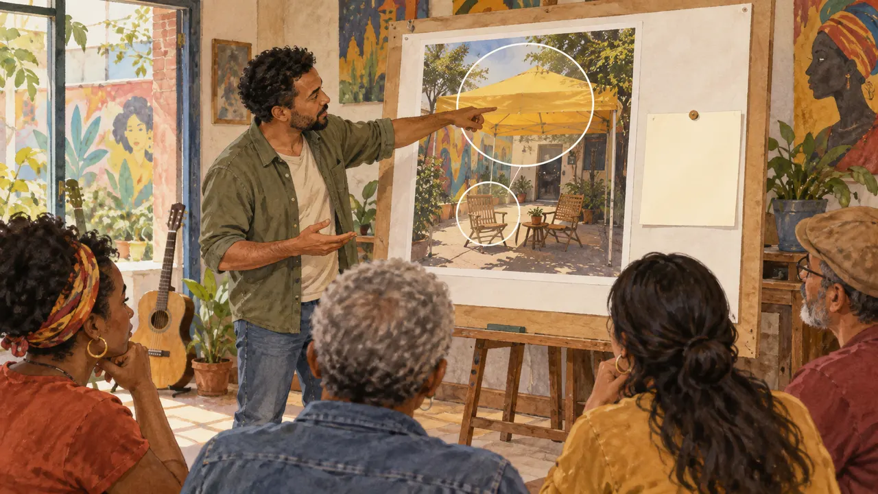
André, a photographer, applies this choice to material for the Bairro Vivo fair: My eye enters at the light canopy, moves to the chair, and ends at the plant. I will use one dominant element and a quiet supporting element.
Weak decision
This board is beautiful; I cannot explain why.
Verifiable decision
My eye enters at the light canopy, moves to the chair, and ends at the plant. I will use one dominant element and a quiet supporting element.
Notice which characteristics make the second decision easy to check.
2Trace the path of the gaze
The path of the gaze is a hypothesis about attention order: dominant element, support, and detail.
Scale, contrast, line direction, and faces can influence this reading.
Mapping the path helps you notice whether a secondary detail competes with the main message.
Test the hypothesis through observation; do not treat it as a universal certainty.
Marina, a cultural producer, notes before choosing: Application: a decision for another piece
Completed brief · lesson example
1Entry point: the element you notice first
2Support: the second point of attention
3Application: a decision for another piece
Use this sheet as a reference. Replace the example with your own project.
3Check the decision against its use
Your path is a hypothesis, not a measure of every reader.
Marina uses the note below to decide: application: a decision for another piece.
Didactic illustration created in Codex: The markings already guide the gaze toward the canopy and chair. For a spontaneous reading, do this activity with your own photo that you have not analyzed yet.
Test yourself
Two people looked at different parts first. What does that show?
If you got stuck here, that is normalIf two elements compete for attention, record the competition. That already points to a possible revision.
Practice now 0/3
Trace the path of your gaze
About 10 minutes. You are done when the observed path has three points and an application.
Use your own photos or ones you are authorized to use. Fill out the brief on paper or in Notes. If the exercise asks you to edit, keep the original and work on a copy.
First I notice: <element + cue>.
Then: <element + cue>.
Finally: <element + cue>.
Hypothesis: <path>.
Application: <decision for another piece>.
By following the steps, you can record a reading hypothesis and an application.
Lesson cheat sheet
Trace the path of your gaze
Entry point: the element you notice first
Support: the second point of attention
Your path is a hypothesis, not a measure of every reader.
Your next step
You now have criteria for recording a reading hypothesis and an application.
Use this lesson’s brief with an image from your work. Set aside ten minutes and note the decision you made.
Next step: Give color and texture a purpose
Supplementary material · module 3Practice and considerations for both topics. Not included in lesson time.
An annotated board
Experiment at your own pace
For your own photo or this lesson’s illustration, write the cue, its effect, and its use. Example: higher contrast on the yellow canopy; subject stays visible; useful for presenting the fair.
What to observe
Do not use a caption just to praise. Replace “wonderful” with a description someone else can locate in the image.
Trace the path of the gaze
Experiment at your own pace
Look at the reference for a few seconds and note the first element you notice. Cover the image and describe what you remember. Compare that with the piece’s stated goal.
What to observe
An arrow in a study does not prove everyone will look in that order. Use it to explain your reading and gather other interpretations.
Lesson 7 · Trained Eye v6.2 · INEMA.CLUB PRO
Module 3 · Lesson 8 of 12
Give color and texture a purpose
You can describe a base, accent, and finish in a composition.
A visual choice is more useful when you can explain what you observed. In this lesson, turn your first impression into a decision you can check.
In 1 minute
Base: larger, quieter area
Accent: small area that draws attention
A color’s effect changes with its area and neighboring elements.
1Observe color by role
A color can serve as a base, accent, or support.
Its effect depends on area, neighboring colors, and contrast.
A small area of intense color can draw more attention than a large neutral area.
Analyzing roles is more useful than copying a list of color codes.
This helps transfer the reference’s logic to another image.
André, a photographer, applies this choice to material for the Bairro Vivo fair: Give cream the largest area, use ochre for the subject, and reserve a small blue-green accent.
Prompts to compare · teaching example
PromptUse five strong colors because they are all favorites.
There are no observable limits to check the work against.
PromptGive cream the largest area, use ochre for the subject, and reserve a small blue-green accent.
One change is defined, along with something that must stay the same.
Compare the two instructions. They are examples written for this lesson, with no simulated tool response.
2Texture, shape, and coherence
Texture and shape can reinforce or contradict the message.
An irregular surface can support a handmade idea; precise geometry can support a technical presentation.
These are contextual hypotheses.
A piece can combine cues that point in different directions.
Review whether that tension is intentional or distracting.
Marina, a cultural producer, notes before choosing: Texture: finish that fits the goal
Completed brief · lesson example
1Base: larger, quieter area
2Accent: small area that draws attention
3Texture: finish that fits the goal
Use this sheet as a reference. Replace the example with your own project.
3Check the decision against its use
A color’s effect changes with its area and neighboring elements.
Marina uses the note below to decide: texture: finish that fits the goal.
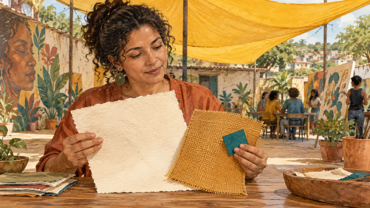
Didactic illustration created in Codex: The paper, fabric, and small color sample differ in area and finish. Observe each one’s role.
Test yourself
A small accent now covers almost the whole page. What should you review?
It’s normal to get stuck hereWithout a color tool, write large cream, medium ochre, and small blue-green. The relationship matters before the code.
Practice now 0/3
Give color and texture a purpose
About 10 minutes. You’re done when each color has a role and the texture has a reason.
Use your own photos or ones you are authorized to use. Fill out the brief on paper or in Notes. If the exercise asks you to edit, keep the original and work on a copy.
Goal: <message>.
Base and area: <color + large>.
Subject: <color + medium>.
Accent: <color + small>.
Texture: <finish>.
Reason: <relationship to the goal>.
After these steps, you can describe the base, accent, and finish in a composition.
Lesson cheat sheet
Give color and texture a purpose
Base: largest, quietest area
Accent: small area that draws attention
A color’s effect changes with its area and neighboring elements.
Your next step
You now have criteria for describing the base, accent, and finish in a composition.
Use this lesson’s brief with an image from your work. Set aside ten minutes and note the decision you made.
Next: Study a technique in a different subject
Supplementary material · module 3Practice and considerations for both topics. Not included in lesson time.
Notice what each color does
Experiment at your own pace
Separate the palette into base, accent, and support. Estimate which covers the most area. Make your own version with the same roles, without copying the whole composition.
What to observe
Colors do not guarantee specific emotions. Describe your intent and check how it reads in the project context.
Texture, shape, and coherence
Experiment at your own pace
Compare the light paper and fabric in the illustration. Describe their surface differences. Choose one finish for a fair poster study.
What to observe
Don’t treat a visual material as proof of its source or manufacturing process. A generated image may only suggest those features.
Lesson 8 · Trained Eye v6.2 · INEMA.CLUB PRO
Module 3 · Lesson 9 of 12
Study a technique in a different subject
You can create your own study and five rules with limits.
A visual choice is more useful when you can explain what you observed. In this lesson, turn your first impression into a decision you can check.
In 1 minute
Study: transfer a decision to a different subject
Rules: light, space, contrast, texture, and repetition
Learning a technique does not require reproducing an entire work.
1Study a technique, not a full copy
A study transfers one decision to a new subject: how light relates to volume, where larger areas sit, or how space is used.
You can learn the logic without reproducing the whole work.
Changing only the object’s name in a copied composition limits what you learn.
Separating the technique helps you create your own solution and explain your reasoning.
André, a photographer, applies this choice to the Bairro Vivo fair materials: Transfer side lighting to an object of your own. Write usage rules without treating the result as a copy of the reference.
Weak decision
Copy the whole composition and change only the signature.
Verifiable decision
Transfer side lighting to your own object. Write usage rules without treating the result as a copy of the reference.
Notice which characteristics make the second decision easy to check.
2Write five rules with limits
Personal rules are useful decisions for a project, paired with conditions for using them.
A rule like leaving room for text makes sense only when the piece will contain text.
Contextual rules help maintain consistency without restricting every creation.
You can review them when the goal changes.
Marina, a cultural producer, notes this before choosing: Limit: each rule depends on the project
Completed brief · lesson example
1Study: transfer a decision to a different subject
2Rules: light, space, contrast, texture, and repetition
3Limit: each rule depends on the project
Use this sheet as a reference. Replace the example with your own project.
3Check the decision against its use
Learning a technique does not require reproducing an entire work.
Marina uses this observation to decide: limit: each rule depends on the project.
Didactic illustration created in Codex: The objects change, but side lighting remains the decision being studied. Compare shadow and volume.
Test yourself
Which study transfers a technique instead of copying the whole work?
It’s normal to get stuck hereUse simple rules: leave clear space when there is a title. A specific condition helps more than an absolute rule.
Practice now 0/3
Study a technique in a different subject
About 10 minutes. You’re done when your own study has evidence and five rules with conditions.
Use your own photos or ones you are authorized to use. Fill out the brief on paper or in Notes. If the exercise asks you to edit, keep the original and work on a copy.
Example: use side lighting when you want to show relief; check whether the texture is visible.
1 Light: use <choice> when <condition>.
2 Space: leave <area> when <condition>.
3 Contrast: highlight <element> when <condition>.
4 Texture: use <finish> when <condition>.
5 Repetition: keep <sign> when <condition>.
My study: <photo/drawing>; evidence: <observation>.
After completing the steps, you can make a study of your own and write five rules with limitations.
Lesson cheat sheet
Study a technique in a different subject
Study: transfer one decision to a different subject
Rules: light, space, contrast, texture, and repetition
Learning a technique does not require reproducing an entire work.
Your next step
You now have criteria for making a study of your own and writing five rules with limitations.
Use this lesson’s brief with an image from your work. Set aside ten minutes and note the decision you made.
Next step: Compare three boards for the same goal
Supplementary material · module 3Practice and considerations for both topics. Not included in lesson time.
Study a technique, not an entire copy
Experiment at your own pace
Choose a reference, describe its technique in one sentence, and apply it in a different context. Change the subject, arrangement, and details. Compare whether the principle still works.
What to observe
Keep a record of the reference and label your studies as studies. Do not present another person’s work as your own.
Write five rules with limitations
Experiment at your own pace
Write five rules in this format: when the goal is X, I will do Y and check Z. Include at least one exception. Test the rules in a new image.
What to observe
Avoid absolute statements like “a clean background is always better.” A contextual background may be essential to a use story.
Lesson 9 · Trained Eye v6.2 · INEMA.CLUB PRO
Module 4 · Lesson 10 of 12
Compare three boards for the same goal
You can create three directions and choose one using clear criteria.
A visual choice is more useful when you can explain what you observed. In this lesson, turn your first impression into a decision you can check.
In 1 minute
Goal: invite families to enjoy a calm stroll through the fair
Three hypotheses: calm, welcoming, and energetic
Personal preference matters, but the goal still needs to be met.
1Three boards, three hypotheses
Each board represents one possible direction for the same goal.
Keeping the brief the same lets you compare solutions instead of unrelated collections.
Different boards show language options before you create every image.
The choice becomes clearer and easier to review.
André, a photographer, applies this choice to material for the fictional Bairro Vivo fair: Keep the fair as the subject. Compare calm, welcoming, and energetic directions by the invitation each one suggests.
Weak decision
Compare a food board with a machinery board without a shared goal.
Verifiable decision
Keep the fair as the subject. Compare calm, welcoming, and energetic directions by the invitation each one suggests.
Notice which characteristics make the second decision easy to check.
2Choose a direction based on the goal
The choice brings together intent, audience, use, and visual features.
Personal preference matters, but it does not replace what the piece needs to communicate.
A direction may be interesting but unsuitable for showing the product’s shape.
Explaining the choice keeps you from choosing only because something is new.
Marina, a cultural producer, makes a note before choosing: Choice: clear subject, suitable mood, and room for a message
Completed brief · lesson example
1Goal: invite families to enjoy a calm stroll through the fair
2Three hypotheses: calm, welcoming, and energetic
3Choice: clear subject, suitable mood, and room for a message
Use this sheet as a reference. Replace the example with your own project.
3Check the decision against its use
Personal preference matters, but the goal still needs to be met.
Marina uses the observation below to decide: choice: clear subject, suitable mood, and room for a message.
Teaching illustration created in Codex: The three boards show the same fair with different levels of intensity. Compare each idea against the same goal.
Test yourself
Your favorite board hides the subject. Which decision is more useful?
If you got stuck here, that is normalNo images available? Make simple drawings and use words for light and color. Label them as studies, not final photographs.
Practice now 0/3
Compare three boards for the same goal
About 10 minutes. You are done when you have three boards and have chosen one with a reason.
Use your own photos or ones you are authorized to use. Fill out the brief on paper or in Notes. If the exercise asks you to edit, keep the original and work on a copy.
Shared goal: invite families to take a calm stroll through a neighborhood fair.
A Calm: light <which>; color <which>; composition <which>.
B Welcoming: light <which>; color <which>; composition <which>.
C Energy: light <which>; color <which>; composition <which>.
Choice: <A/B/C>. Criteria: subject, mood, room for a message.
Reason and limitation: <decision>.
After completing the steps, you can create three directions and choose one using clear criteria.
Lesson cheat sheet
Compare three boards for the same goal
Goal: invite families to enjoy a calm stroll through the fair
Three hypotheses: calm, welcoming, and energetic
Personal preference matters, but the goal still needs to be met.
Your next step
You now have criteria for creating three directions and choosing one.
Use this lesson’s brief with an image from your work. Set aside ten minutes and note the decision you made.
Next step: Create three images with one visual language
Supplementary material · module 4Activities and guidance for the two topics. Not included in the lesson time.
Three boards, three hypotheses
Experiment at your own pace
Create three small boards: one for clarity, one for atmosphere, and one for graphic expression. Use your own images or references you are allowed to use, and note each board’s decisions.
What to observe
Do not force each board to use the same number of references if that reduces quality. Each direction should be understandable, and its sources should be recorded.
Choose a direction based on the goal
Experiment at your own pace
Compare the three boards with the Bairro Vivo brief. Give one reason to choose one and one reason to set the others aside for this project. Record the audience response you want to test.
What to observe
Do not declare one board universally better. The choice applies to this goal and may change in another context.
Lesson 10 · Trained Eye v6.2 · INEMA.CLUB PRO
Module 4 · Lesson 11 of 12
Create three images with one visual language
You can create a small series and a vocabulary of ten decisions.
A visual choice is more useful when you can explain what you observed. In this lesson, turn your first impression into a decision you can check.
In 1 minute
Series: wide view, detail, and use
Visual language: repeat light, palette, and finish
Consistency does not require repeating the same framing.
1Ten words you can point to
Useful visual words point to observable properties.
They form a working vocabulary: wide shot, side lighting, cream background, matte texture, generous margin.
If you cannot point to a word in the result, it may be too vague or may not have been carried out.
The vocabulary also helps with review.
André, a photographer, applies this choice to material for the fictional Bairro Vivo fair: Keep soft light and warm colors; vary the wide view, detail, and use. Record ten words you can point to in the images.
Prompts to compare · teaching example
PromptThree unrelated images held together only by a filter.
There are no observable limits to check the work against.
PromptKeep soft light and warm colors; vary the wide view, detail, and use. Record ten words you can point to in the images.
One change is defined, along with something that must stay the same.
Compare the two instructions. They are examples written for this lesson, with no simulated tool response.
2Three images, one visual language
A coherent series keeps visual-language choices consistent while intentionally varying the content.
For the Bairro Vivo fair, use a wide view, a detail, and a scene of use.
For your study, you could choose a table, an object, and a hand.
The series tests whether the board has become a system of decisions.
One image may simply be an isolated success.
Marina, a cultural producer, makes a note before choosing: Vocabulary: ten choices you can point to
Completed brief · lesson example
1Series: wide view, detail, and use
2Visual language: repeat light, palette, and finish
3Vocabulary: ten choices you can point to
Use this sheet as a reference. Replace the example with your own project.
3Check the decision against its use
Consistency does not require repeating the same framing.
Marina uses the observation below to decide: vocabulary: ten choices you can point to.
Teaching illustration created in Codex: The set shows the space, fabric in detail, and the chairs in use. The light and palette bring the three images together.
Test yourself
Three pieces repeat light and palette but show different functions. Can they still feel consistent?
If you got stuck here, that is normalFor a scene of use, photograph your own hand with the object. You do not need to organize a fair or involve anyone else.
Practice now 0/3
Create three images with one visual language
About 10 minutes. You are done when you have three images or drawings and ten observable decisions.
Use your own photos or ones you are authorized to use. Fill out the brief on paper or in Notes. If the exercise asks you to edit, keep the original and work on a copy.
Vocabulary example: side lighting; soft shadow; light background; ochre; matte paper; generous margin; wide shot; close detail; simple lines; focal point.
My series: <three files or drawings>.
Repeats: <decision>. Varies: <function>.
Term without evidence: <which one>. Observable replacement: <another term, without repeating a decision>.
After completing the steps, you can create a small series and a vocabulary of ten decisions.
Lesson cheat sheet
Create three images with one visual language
Series: wide view, detail, and use
Visual language: repeat light, palette, and finish
Consistency does not require repeating the same framing.
Your next step
You now have criteria for creating a small series and a vocabulary of ten decisions.
Use this lesson’s brief with an image from your work. Set aside ten minutes and note the decision you made.
Next step: Review one piece and keep what you learned
Supplementary material · module 4Activities and guidance for the two topics. Not included in the lesson time.
Ten words you can point to
Experiment at your own pace
Choose ten expressions from the board you selected. Organize them by color, light, composition, and material. Use them to plan a study and mark which ones actually appeared.
What to observe
Do not add synonyms just to reach ten. Choose distinct decisions and remove contradictions before making the study.
Three images, one visual language
Experiment at your own pace
Create three pieces using the same visual references. Place them side by side and check palette, light, and material. Note one intentional difference and one deviation to fix.
What to observe
Don’t confuse coherence with exact repetition. Each image should add information to the set.
Lesson 11 · Trained Eye v6.2 · INEMA.CLUB PRO
Module 4 · Lesson 12 of 12
Revise a piece and keep what you learned
You can make a revision and record the before, after, and reason.
A visual choice is more useful when you can explain what you observed. In this lesson, turn your first impression into a decision you can check.
In 1 minute
Before: find a problem related to the goal
After: change one decision and check
If a revision works against the goal, keeping the original is a valid choice.
1Improve a piece and explain why
A portfolio revision applies the rules to an existing work.
The before-and-after should show an improvement tied to the goal, such as a clearer focal point or more readable text.
The comparison shows whether observation led to a practical decision.
It also helps you spot when the change was only a matter of taste.
André, a photographer, applies this choice to the Bairro Vivo fair materials: Remove an element that competes with the subject. Compare versions at the same size and explain the change.
Weak decision
Change everything and say the new version is better without evidence.
Verifiable decision
Remove an element that competes with the subject. Compare versions at the same size and explain the change.
Notice which characteristics make the second decision easy to check.
2Keep an observation practice
A study notebook keeps references, hypotheses, attempts, and conclusions.
Consistency comes from small practices that lead to decisions, not from a required streak of days.
Returning to old studies helps you notice changes in vocabulary and judgment.
It also helps you avoid repeating the same mistakes without noticing.
Marina, a cultural producer, notes this before choosing: Notebook: keep evidence and a next study
Completed brief · lesson example
1Before: find a problem related to the goal
2After: change one decision and check
3Notebook: keep evidence and a next study
Use this sheet as a reference. Replace the example with your own project.
3Check the decision against its use
If a revision works against the goal, keeping the original is a valid choice.
Marina uses this observation to decide: notebook: keep evidence and a next study.
Didactic illustration created in Codex: The second composition reduces visual competition. Compare how clear the subject is, not just the number of elements.
Test yourself
The revision looks good, but it removed needed information. What should you do?
It’s normal to get stuck hereCan’t find Crop? Revise it on paper and keep both versions. Record the method you actually used.
Practice now 0/3
Revise a piece and keep what you learned
About 10 minutes. You’re done when a real revision has a before, an after, and a conclusion.
Use your own photos or ones you are authorized to use. Fill out the brief on paper or in Notes. If the exercise asks you to edit, keep the original and work on a copy.
Before: <problem>.
Change made: <one decision>.
After: <evidence of improvement or decline>.
Rule applied: <which rule and its limit>.
Files/drawings: <identify both versions>.
Next study: <technique + ten minutes>.
After these steps, you can make a revision and record the before, after, and reason.
Lesson cheat sheet
Revise a piece and keep what you learned
Before: find a problem related to the goal
After: change one decision and check
If a revision works against the goal, keeping the original is a valid choice.
Your next step
You now have criteria for revising a piece and recording the before, after, and reason.
Use this lesson’s brief with an image from your work. Set aside ten minutes and note the decision you made.
Next step: Apply the method to another product and compare your decisions.
Supplementary material · module 4Activities and guidance for the two topics. Not included in the lesson time.
Improve a piece and explain why
Experiment at your own pace
Choose a piece of your own. Define a problem and apply a rule from the previous module. Compare both versions at their intended size. Write evidence of improvement or a question that remains.
What to observe
If the revision did not solve the problem, record that and revisit your hypothesis. Don’t force a success story onto every experiment.
Keep an observation practice
Experiment at your own pace
Plan three future studies: one on light, one on composition, and one on color. For each, choose a question, reference, and application. Save your progress and keep your panels with the files.
What to observe
This course does not sort people into fixed learning styles. Visual supports and practice make the material observable and open to checking.