The Starter plan supports basic work, with limits on organization and collaboration.
The course uses one file, one page, and several frames. It does not depend on paid features.
Figma saves changes to your account.
Wait for the saved indicator before leaving.
Later, you will also save a local copy.
Screens and names may change. Find the described function and check the result instead of memorizing button locations.
Álvaro bookmarks the address so he does not have to search for the file again.
Completed brief · lesson example
1Product: Figma Design
2File: Luz de Rua
3Check: reopen with editing permission
Use this sheet as a reference. Replace the example with your own project.
3Check the decision against its use
Create a Design file, name it, and confirm you can reopen it.
Álvaro checks the worksheet: reopen with editing permission.
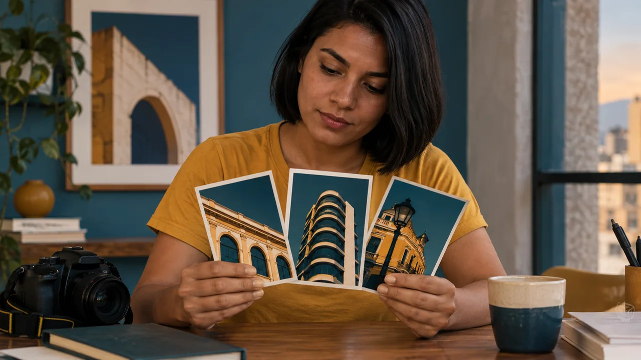
Educational illustration created with Codex: Tainá and Álvaro plan the pieces using photos and cards. This is an illustrative scene, not a Figma screenshot.
Test yourself
The file is view-only. What should you check before looking for tools?
If you got stuck here, that is normalIf you cannot sign in or edit, leave the practice pending. The next steps need an accessible file.
Practice now 0/3
Open a file you can find again
Set aside 10 minutes of active work for this section. Account access and processing may take extra time. You are done when the named file reopens and allows editing.
Use your own or authorized references. Label illustrative images and keep the originals. AI features may depend on your account and plan; check before generating.
Project: Luz de Rua
Lesson: Open a file you can find again
Product: Figma Design — <your choice>
File: Luz de Rua — <your choice>
Check: reopen with editing permission — <your choice>
File or frame checked:
Decision: keep or adjust
Actual pending item:
After these steps, you can create and reopen a Figma Design file.
Lesson cheat sheet
Open a file you can find again
Product: Figma Design
File: Luz de Rua
Check: reopen with editing permission
Your next step
You now have criteria to create and reopen a Figma Design file.
Save this lesson’s deliverable in the project folder. You will use it in the next step.
Next: Use five rules to find the problem
Supplemental material · Module 1Production notes and safeguards for continuing after the short practice.
Figma Design is the workspace for this course
Experiment at your own pace
Repeat on a copy of the piece, changing only one choice. Compare before keeping the change.
What to observe
Control names and locations may vary. Check your selection and editing permission before looking for the feature.
Confirm access before you start
Experiment at your own pace
Keep the earlier version and record what changed in how it reads. Undo a change if it does not help.
What to observe
The Luz de Rua case is fictional. The images are Codex illustrations; the diagrams show the method, not the actual Figma interface.
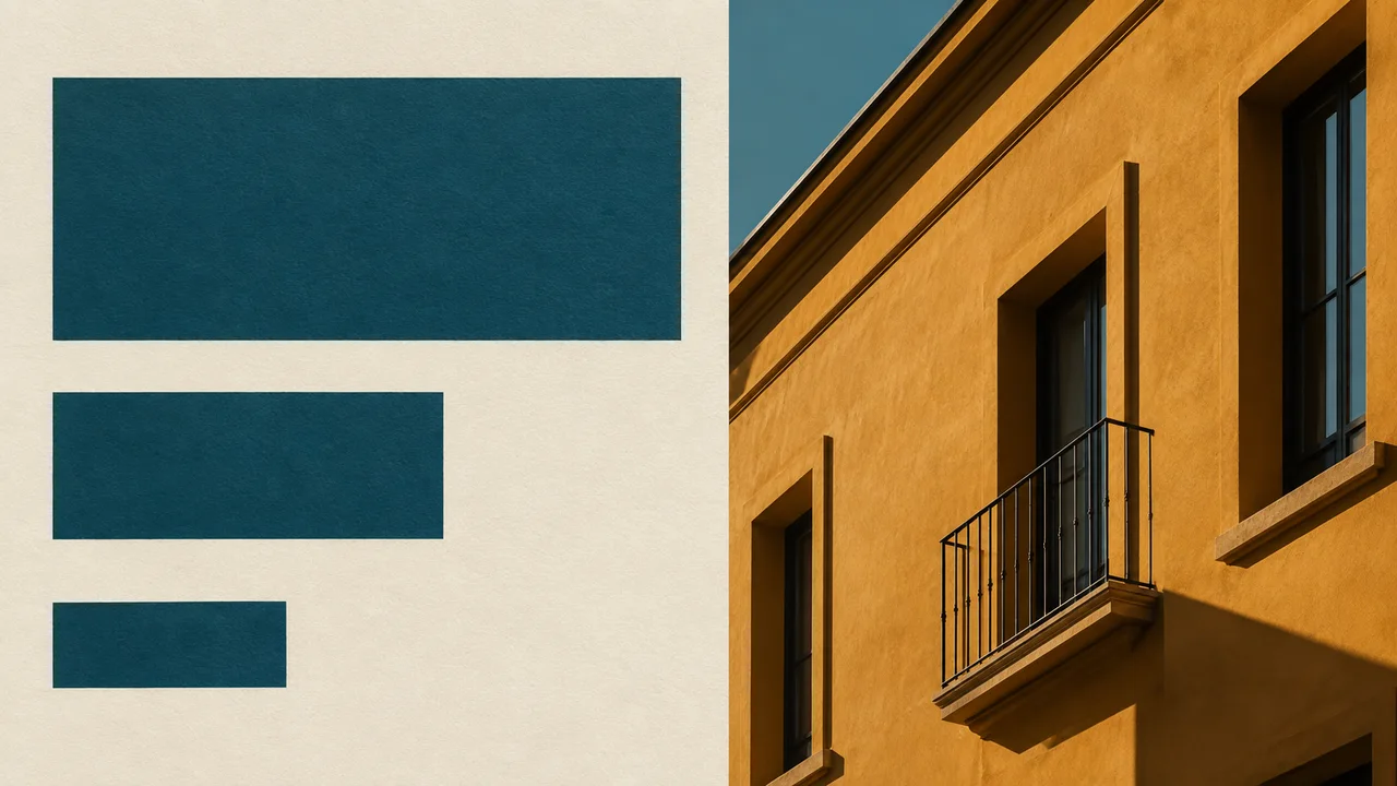
Look at the before-and-after example in this lesson.
The revised version organizes the call to action, explanation, and photo.
Write down the problem that most affects readability.
Choose one related change: remove clutter, add space, align, or increase contrast.
Save your assessment with a screenshot of the piece or a note.
If no problem stands out, record which criteria passed.
The exercise ends with a diagnosis and a decision; no unnecessary redesign is required.
Álvaro can explain which information should be read first.
Original compositions · not Figma screenshots
Version to review
LUZ DE RUA PHOTOGRAPHY! LOOK! LEARN! A NEW EXPERIENCE!
Too many calls to action have the same emphasis.
Organized version · educational example
Luz de Rua
Learn to observe the city.
One message, a few styles, space, repetition, and contrast.
The second piece gives the call to action priority and makes the photo larger. Check all five criteria; do not judge by taste alone.
3Check the decision against its use
Choose one message and fix the problem that most gets in the way of reading it.
Álvaro checks the worksheet: decision—make one justified change or keep it.
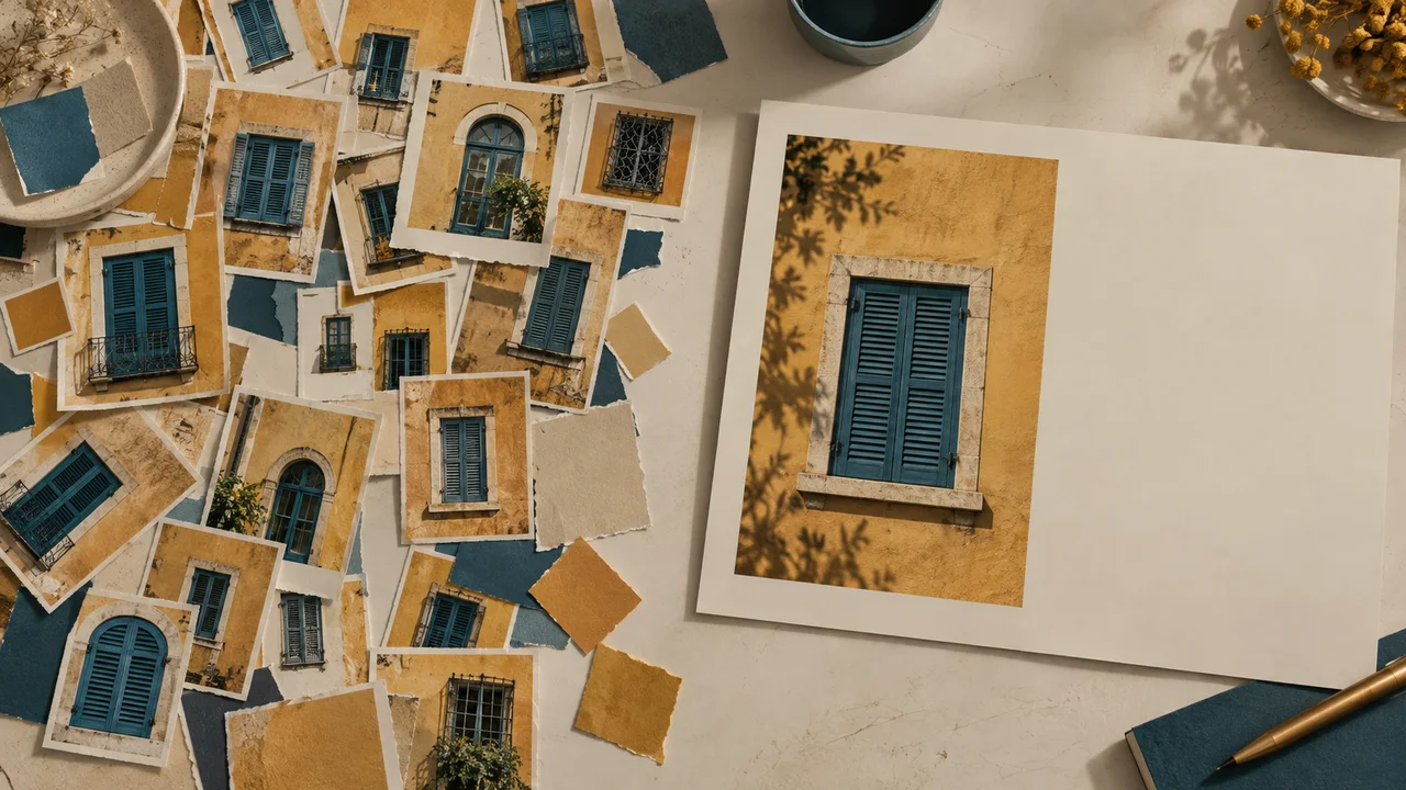
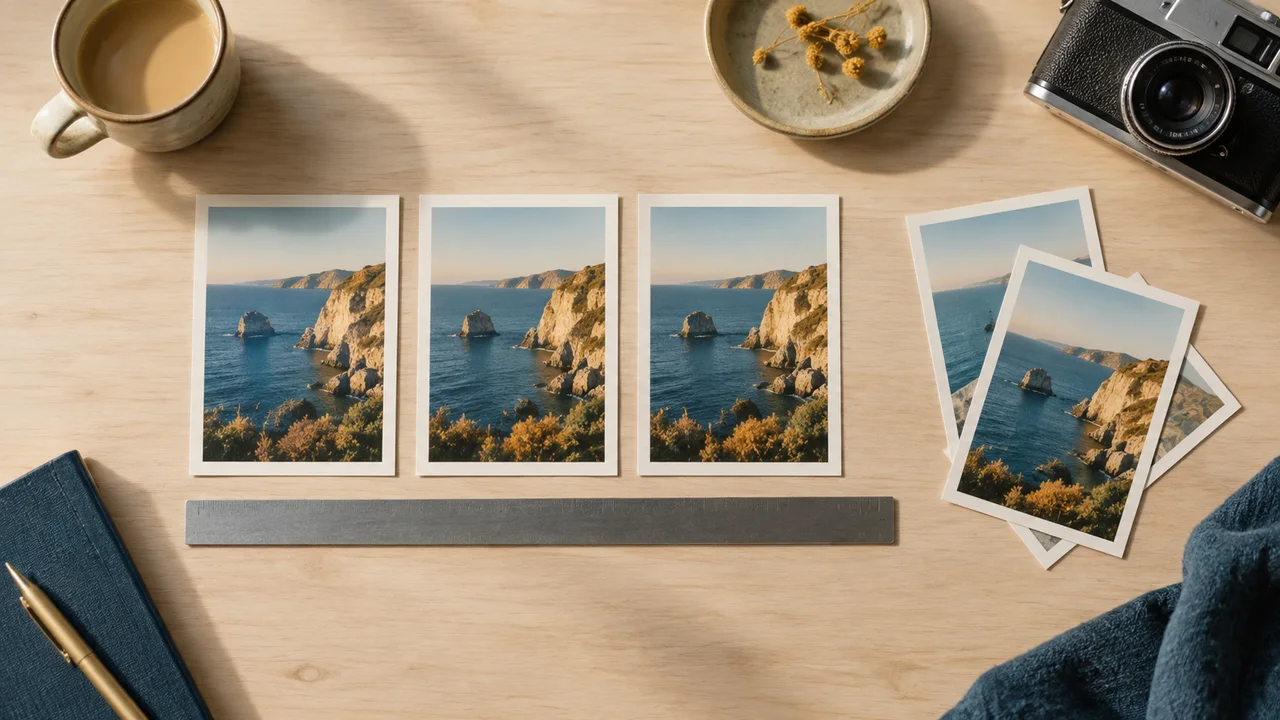
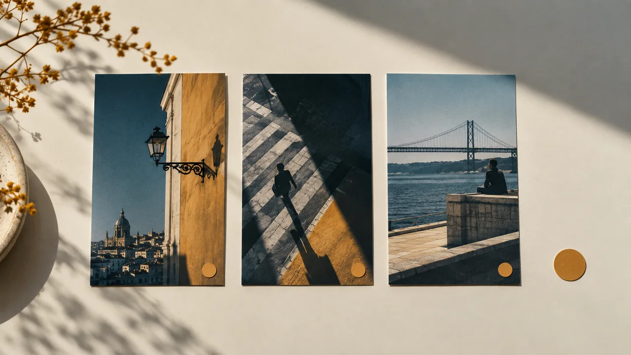
Educational illustration created with Codex: Many crops compete with a single-focus card. The scene illustrates selection; the example with text appears in the lesson frame.
Test yourself
The title competes with four calls to action of equal size. Which change addresses the problem?
If you got stuck here, that is normalYou do not need design terms. Point out what you read first and what was hard to understand.
Practice now 0/3
Use five rules to find the problem
Set aside 10 minutes of active work for this section. Account access and processing may take extra time. You are done when all five criteria are checked and you have one justified decision.
Use your own or authorized references. Label illustrative images and keep the originals. AI features may depend on your account and plan; check before generating.
Project: Luz de Rua
Lesson: Use five rules to find the problem
Checklist: five observable criteria — <your choice>
Diagnosis: one main problem or none — <your choice>
Decision: make one justified change or keep it — <your choice>
File or frame checked:
Decision: keep or adjust
Actual pending item:
After these steps, you can assess a piece by its message, type, spacing, repetition, and readability.
Lesson cheat sheet
Use five rules to find the problem
Checklist: five observable criteria
Diagnosis: one main problem or none
Decision: make one justified change or keep it
Your next step
You now have criteria to assess a piece by its message, type, spacing, repetition, and readability.
Save this lesson’s deliverable in the project folder. You will use it in the next step.
Next: Plan a cover and three pages
Supplemental material · Module 1Production notes and safeguards for continuing after the short practice.
Clarity can be observed
Experiment at your own pace
Repeat on a copy of the piece, changing only one choice. Compare before keeping the change.
What to observe
Control names and locations may vary. Check your selection and editing permission before looking for the feature.
Make one correction at a time
Experiment at your own pace
Keep the earlier version and record what changed in how it reads. Undo a change if it does not help.
What to observe
The Luz de Rua case is fictional. The images are Codex illustrations; the diagrams show the method, not the actual Figma interface.
Choose a background color, a text color, and an accent color.
Leave space for the name and page number.
For this exercise, use cream, deep teal, and ochre.
These choices help the pieces look related without making the images identical.
If you use Canva, think of a page as one design.
In Figma, each piece will sit in a frame.
One file page can contain many frames.
This keeps you from creating separate files for one carousel.
Álvaro can tell the file page apart from the four frames it contains.
Completed brief · lesson example
1Cover: introduce Luz de Rua
2Pages: light, detail, and series
3Keep consistent: colors, type, and signature
Use this sheet as a reference. Replace the example with your own project.
3Check the decision against its use
Give each frame a purpose and call to action while keeping the visual family consistent.
Álvaro checks the worksheet: keep consistent—colors, type, and signature.
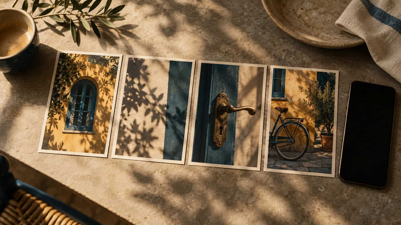
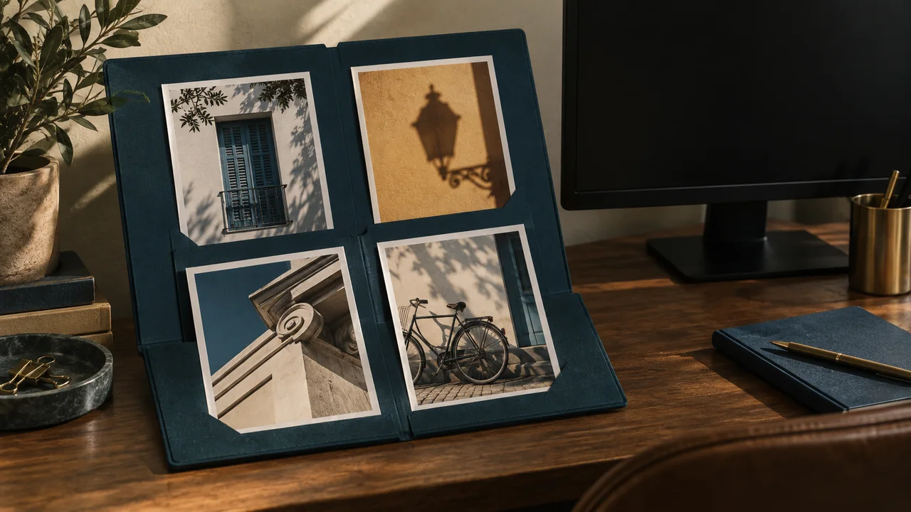
Educational illustration created with Codex: Four cards share colors and vary the photos. They have no text; the practice guide supplies each piece’s message.
Test yourself
In Figma Design, how do you organize four pieces in one carousel?
If you got stuck here, that is normalUse the four example titles if you are out of ideas. Add one simple sentence for each.
Practice now 0/3
Plan a cover and three pages
Set aside 10 minutes of active work for this section. Account access and processing may take extra time. You are done when all four pieces have defined content and identified consistent elements.
Use your own or authorized references. Label illustrative images and keep the originals. AI features may depend on your account and plan; check before generating.
Project: Luz de Rua
Lesson: Plan a cover and three pages
Cover: introduce Luz de Rua — <your choice>
Pages: light, detail, and series — <your choice>
Keep consistent: colors, type, and signature — <your choice>
File or frame checked:
Decision: keep or adjust
Actual pending item:
After these steps, you can write the content for four pieces before laying them out.
Lesson cheat sheet
Plan a cover and three pages
Cover: introduce Luz de Rua
Pages: light, detail, and series
Keep consistent: colors, type, and signature
Your next step
You now have criteria to write the content for four pieces before laying them out.
Save this lesson’s deliverable in the project folder. You will use it in the next step.
Next: Create a frame with known dimensions
Supplemental material · Module 1Production notes and safeguards for continuing after the short practice.
Four pieces, one sequence
Experiment at your own pace
Repeat on a copy of the piece, changing only one choice. Compare before keeping the change.
What to observe
Control names and locations may vary. Check your selection and editing permission before looking for the feature.
Choose the elements that will repeat
Experiment at your own pace
Keep the earlier version and record what changed in how it reads. Undo a change if it does not help.
What to observe
The Luz de Rua case is fictional. The images are Codex illustrations; the diagrams show the method, not the actual Figma interface.
Check features and costs in your current account. Guides may show different paths depending on version and device.
Lesson 3 · Figma for Creators v6.2 · INEMA.CLUB PRO
Module 2 · Lesson 4 of 18
Create a frame with known dimensions
You can create a portrait frame that is 1080 by 1350.
A large object on the workspace does not define the final piece. The frame sets what will be exported.
In 1 minute
Frame: 00-Capa
Dimensions: W 1080 and H 1350
Zoom changes the view, not the size.
1The frame holds the dimensions and content
In the Luz de Rua file, choose Frame from the toolbar or press F when you are not editing text.
Draw an empty frame.
With it selected, find W and H for width and height.
Set them to 1080 and 1350.
If needed, turn off the linked proportions.
Rename the frame 00-Capa in the layer list.
The 4:5 format is this exercise’s target, not a permanent platform rule.
For delivery, check the actual destination.
A horizontal thumbnail can use a different 1280 by 720 frame.
Tainá sets the size before placing the photo.
Weak decision
Adjust the zoom and expect the exported file size to change.
Verifiable decision
Set the frame width and height; use zoom only to change the view.
Notice which characteristics make the second decision easy to check.
2Screen zoom does not change the file
Zooming out helps you see the whole frame.
It does not change the dimensions.
Changing W and H changes the frame.
This distinction keeps you from resizing the piece when you only wanted a better view.
Select 00-Capa in the list to check the frame outline.
Leave room in the workspace to duplicate it later.
You do not need to create another file page.
Keep all the pieces together so you can compare them.
Álvaro zooms out without changing the W and H values.
Completed brief · lesson example
1Frame: 00-Capa
2Dimensions: W 1080 and H 1350
3Zoom changes the view, not the size
Use this sheet as a reference. Replace the example with your own project.
3Check the decision against its use
Set the frame width and height; use zoom only to change the view.
Álvaro checks the worksheet: zoom changes the view, not the size.
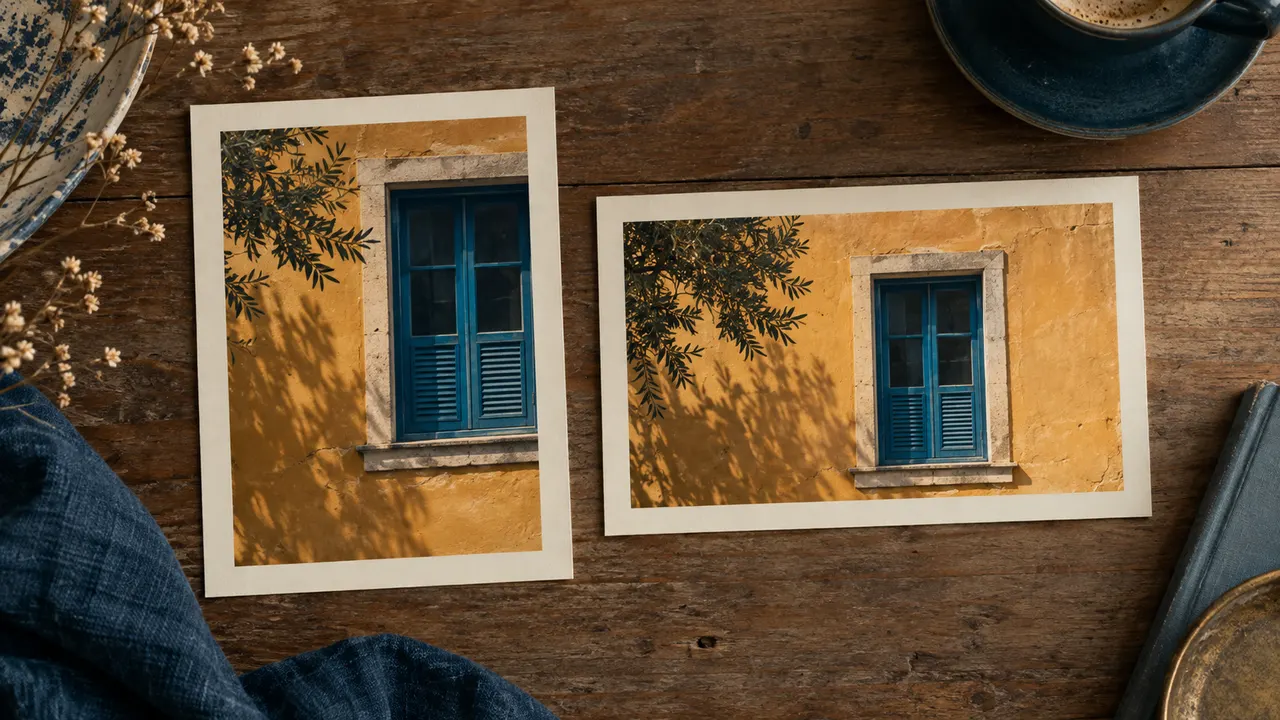
Educational illustration created with Codex: The papers show portrait and landscape formats. They are an analogy for frame boundaries, not actual program controls.
Test yourself
You zoom out to 25%. What happens to the frame dimensions?
If you got stuck here, that is normalIf you are typing text, press Escape before F. Make sure the selected item is the frame, not a shape inside it.
Practice now 0/3
Create a frame with known dimensions
Set aside 10 minutes of active work for this section. Account access and processing may take extra time. You are done when the named frame stays 1080 by 1350 after the zoom changes.
Use your own or authorized references. Label illustrative images and keep the originals. AI features may depend on your account and plan; check before generating.
Project: Luz de Rua
Lesson: Create a frame with known dimensions
Frame: 00-Capa — <your choice>
Dimensions: W 1080 and H 1350 — <your choice>
Zoom: changes the view, not the size — <your choice>
File or frame checked:
Decision: keep or adjust
Actual pending item:
After these steps, you can create a portrait frame that is 1080 by 1350.
Lesson cheat sheet
Create a frame with known dimensions
Frame: 00-Capa
Dimensions: W 1080 and H 1350
Zoom changes the view, not the size
Your next step
You now have criteria to create a portrait frame that is 1080 by 1350.
Save this lesson’s deliverable in the project folder. You will use it in the next step.
Next: Understand layer order
Supplemental material · Module 2Production notes and safeguards for continuing after the short practice.
The frame holds the dimensions and content
Experiment at your own pace
Repeat on a copy of the piece, changing only one choice. Compare before keeping the change.
What to observe
Control names and locations may vary. Check your selection and editing permission before looking for the feature.
Screen zoom does not change the file
Experiment at your own pace
Keep the earlier version and record what changed in how it reads. Undo a change if it does not help.
What to observe
The Luz de Rua case is fictional. The images are Codex illustrations; the diagrams show the method, not the actual Figma interface.
Check features and costs in your current account. Guides may show different paths depending on version and device.
Lesson 4 · Figma for Creators v6.2 · INEMA.CLUB PRO
Module 2 · Lesson 5 of 18
Understand layer order
You can arrange two shapes inside the frame and check how they overlap.
When something disappears, it may be covered or outside the frame. Check the structure before redrawing.
In 1 minute
Structure: two shapes inside 00-Capa
Order: Card above Background
Test: hide, show, and check the crop
1Each object sits on a layer
Select 00-Capa.
Use Rectangle or R to draw two overlapping rectangles inside it.
Apply different colors in Fill.
Look at the two items in the layer list.
The item higher in the list usually appears in front.
Rename the rectangles Background and Card.
In the list, drag Card above Background.
Check the change on the screen.
Both should be inside 00-Capa.
Indentation in the list shows this relationship; drag them into the frame if they are outside it.
Tainá names the shape before locking it.
Prompts to compare · teaching example
PromptDelete objects at random when the photo disappears.
There are no observable limits to check the work against.
PromptCheck order, visibility, and frame membership before making changes.
There are clear criteria for checking the decision.
Compare the two instructions. They are examples written for this lesson, with no simulated tool response.
2Hiding is a reversible test
Use a layer’s visibility control to hide it and show it again.
If the object reappears, you found the right layer.
Locking prevents accidental changes.
Unlock it when you need to adjust the item.
A frame’s Clip content setting crops content that extends beyond its edges.
It does not remove the original file.
Try moving a shape partly outside and watch how it is cropped.
Then move it back and keep only what you want to use.
Álvaro uses visibility to find an object without deleting it.
Completed brief · lesson example
1Structure: two shapes inside 00-Capa
2Order: Card above Background
3Test: hide, show, and check the crop
Use this sheet as a reference. Replace the example with your own project.
3Check the decision against its use
Check order, visibility, and frame membership before making changes.
Álvaro checks the worksheet: test—hide, show, and check the crop.
Educational illustration created with Codex: Overlapping papers represent object order. The scene shows the concept, not Figma’s Layers panel.
Test yourself
The card is in the list but covered by another shape. Which adjustment should you investigate?
If you got stuck here, that is normalUndo restores the recent test. Change one thing at a time to find which layer was covering the subject.
Practice now 0/3
Understand layer order
Set aside 10 minutes of active work for this section. Account access and processing may take extra time. You are done when you have tested the order and both shapes are inside the frame.
Use your own or authorized references. Label illustrative images and keep the originals. AI features may depend on your account and plan; check before generating.
Project: Luz de Rua
Lesson: Understand layer order
Structure: two shapes inside 00-Capa — <your choice>
Order: Card above Background — <your choice>
Test: hide, show, and check the crop — <your choice>
File or frame checked:
Decision: keep or adjust
Actual pending item:
After these steps, you can arrange two shapes inside the frame and check how they overlap.
Lesson cheat sheet
Understand layer order
Structure: two shapes inside 00-Capa
Order: Card above Background
Test: hide, show, and check the crop
Your next step
You now have criteria to arrange two shapes inside the frame and check how they overlap.
Save this lesson’s deliverable in the project folder. You will use it in the next step.
Next: Place an image without cropping out the subject
Supplemental material · Module 2Production notes and safeguards for continuing after the short practice.
Each object sits on a layer
Experiment at your own pace
Repeat on a copy of the piece, changing only one choice. Compare before keeping the change.
What to observe
Control names and locations may vary. Check your selection and editing permission before looking for the feature.
Hiding is a reversible test
Experiment at your own pace
Keep the earlier version and record what changed in how it reads. Undo a change if it does not help.
What to observe
The Luz de Rua case is fictional. The images are Codex illustrations; the diagrams show the method, not the actual Figma interface.
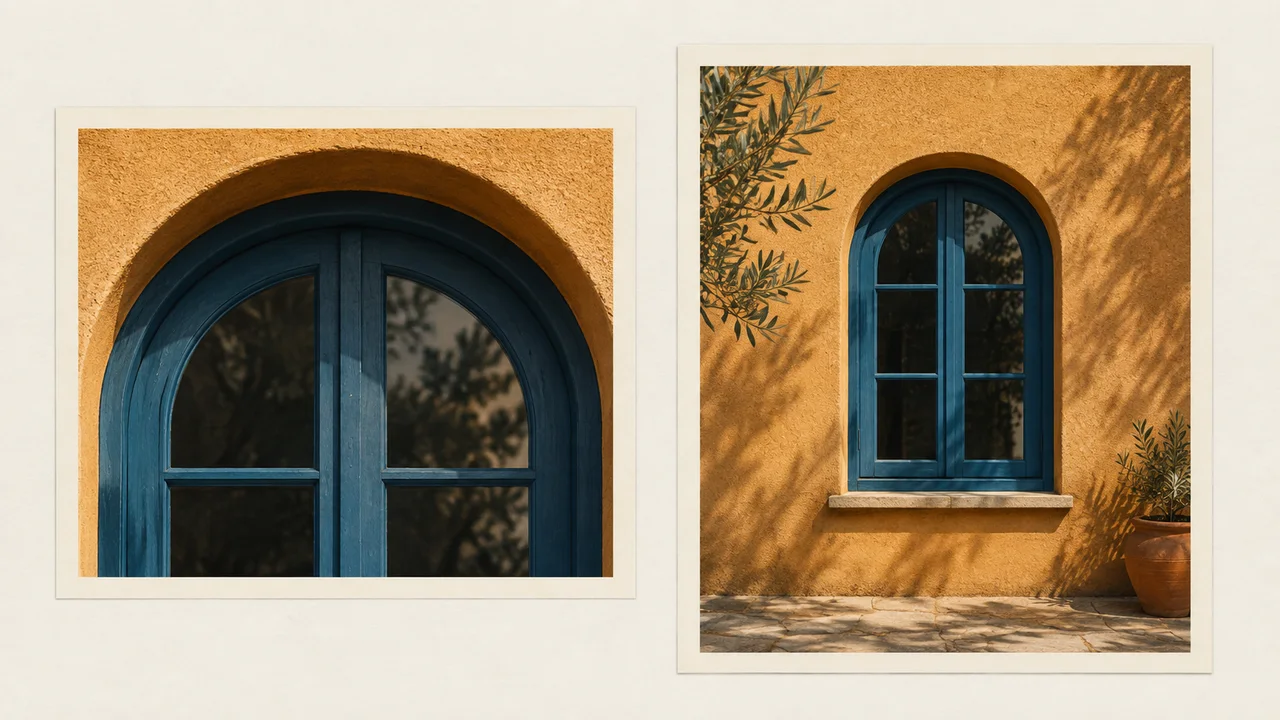
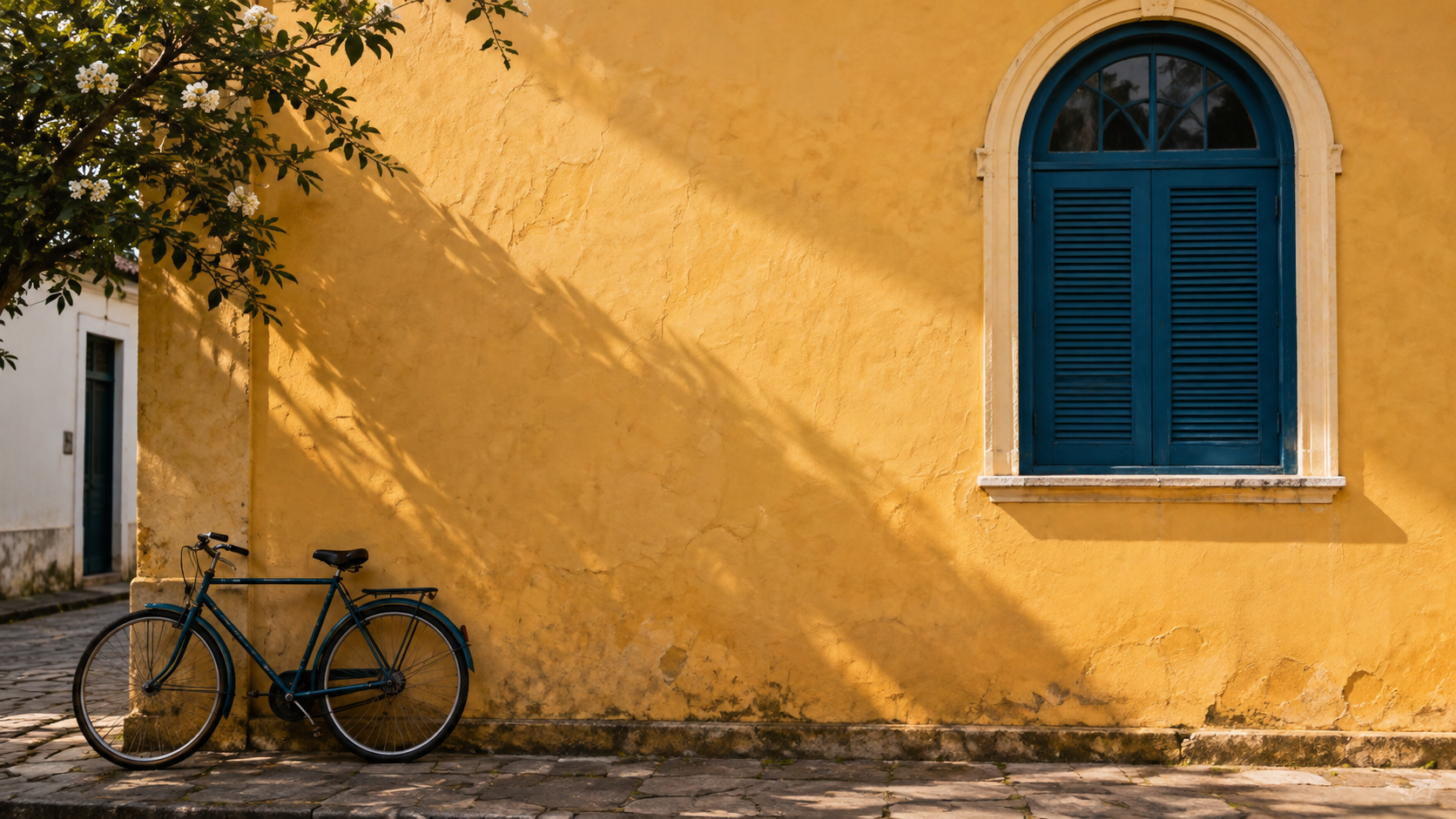
Compare one version that crops out the arch with another that keeps it.
The photo invites viewers to notice the architecture.
Losing the arch can weaken that intention.
If you use another photo, decide first which detail must remain.
The kit image was generated with Codex and depicts a fictional street.
It does not prove that a tour or location exists.
You may use a photo you own and are authorized to use.
Keep the source file separate so you can reframe it for another format.
Álvaro keeps the source image to try another format later.
Completed brief · lesson example
1Source: image saved on your computer
2Mode: Fit, Fill, or Crop with a reason
3Check: keep the window arch visible
Use this sheet as a reference. Replace the example with your own project.
3Check the decision against its use
Choose a crop that preserves the detail supporting the message.
Álvaro checks the worksheet: keep the window arch visible.
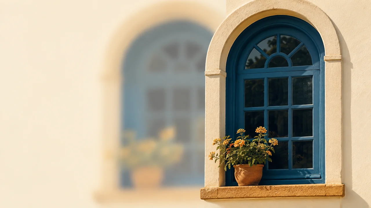
Educational illustration created with Codex: Two framings show the arch with different margins. Compare the space around it before choosing your cover crop.
Test yourself
Fill crops out the arch that explains the image. What is a good next step?
If you got stuck here, that is normalIf the file lands outside the frame, find its layer in the list and move it into 00-Capa. You do not need to import it again.
Practice now 0/3
Place an image without cropping out the subject
Set aside 10 minutes of active work for this section. Account access and processing may take extra time. You are done when the image is in the frame and the main detail remains visible.
Use your own or authorized references. Label illustrative images and keep the originals. AI features may depend on your account and plan; check before generating.
Project: Luz de Rua
Lesson: Place an image without cropping out the subject
Source: image saved on your computer — <your choice>
Mode: Fit, Fill, or Crop with a reason — <your choice>
Check: keep the window arch visible — <your choice>
File or frame checked:
Decision: keep or adjust
Actual pending item:
After these steps, you can add an image and choose between fitting it and cropping it.
Lesson cheat sheet
Place an image without cropping out the subject
Source: image saved on your computer
Mode: Fit, Fill, or Crop with a reason
Check: keep the window arch visible
Your next step
You now have criteria to add an image and choose between fitting it and cropping it.
Save this lesson’s deliverable in the project folder. You will use it in the next step.
Next: Make three text levels work together
Supplemental material · Module 2Production notes and safeguards for continuing after the short practice.
An image can fill a shape
Experiment at your own pace
Repeat on a copy of the piece, changing only one choice. Compare before keeping the change.
What to observe
Control names and locations may vary. Check your selection and editing permission before looking for the feature.
The crop should support the message
Experiment at your own pace
Keep the earlier version and record what changed in how it reads. Undo a change if it does not help.
What to observe
The Luz de Rua case is fictional. The images are Codex illustrations; the diagrams show the method, not the actual Figma interface.
To check the space between lines, make a copy of the title.
Narrow the text box until the title wraps onto two lines.
In Line height, try 72 pixels with 64-size text.
Compare it with a smaller value and see whether the lines feel cramped.
Then restore the one-line cover title and remove the test copy.
Read a sentence with accents, such as Observação da cidade.
Check that the chosen font displays every character.
Then zoom out to about the size people will use it.
If you have to zoom in to read it, adjust the design before adding decoration.
Álvaro checks the accents before duplicating the design.
Hierarchy example · original diagram
Luz de Rua
Learn to observe the city.
Teaching example
Three visible levels. This example is reduced for reading in the course; on a 1080 by 1350 frame, start with 64, 32, and 28.
3Check the decision against its use
Use three text roles and check size, wrapping, and line spacing.
Álvaro uses the sheet to check: review: accents, wrapping, and line spacing.
Teaching illustration created in Codex: Blocks in different sizes illustrate hierarchy. The example with real text is on the lesson frame; blocks alone do not prove readability.
Test yourself
The title lines are too close together. Which property directly affects this space?
It is normal to get stuck hereIf T types a letter into the current text, press Escape and select the Text tool. Check the layer before changing its properties.
Practice now 0/3
Make three text levels work together
Set aside 10 minutes of active work for this section. Account access and processing may take extra time. You are done when all three text layers are editable, not clipped, and have a clear reading order.
Use your own or authorized references. Label illustrative images and keep the originals. AI features may depend on your account and plan; check before generating.
Project: Luz de Rua
Lesson: Make three text levels work together
Headline: 64 as a starting point — <your decision>
Supporting text and signature: 32 and 28 — <your decision>
Review: accents, wrapping, and line spacing — <your decision>
File or frame checked:
Decision: keep or adjust
Actual pending items:
After completing these steps, you can create a headline, supporting text, and signature that are easy to read.
Lesson cheat sheet
Make three text levels work together
Headline: 64 as a starting point
Supporting text and signature: 32 and 28
Review: accents, wrapping, and line spacing
Your next step
You now have criteria for creating a readable headline, supporting text, and signature.
Save this lesson’s deliverable in the project folder. You will use it in the next step.
Next: Align from the same starting point and repeat the spacing
Supplementary material · module 3Production notes and care tips for returning after the short practice.
Text is an editable layer
Experiment at your own pace
Repeat on a copy of the piece, changing only one choice. Compare before keeping the change.
What to observe
Control names and locations may vary. Check your selection and editing permission before looking for the feature.
Line height organizes the text block
Experiment at your own pace
Keep the earlier version and record what changed in how it reads. Undo a change if it does not help.
What to observe
The Luz de Rua case is fictional. The images are Codex illustrations; the diagrams show the method, not the actual Figma interface.
Check features and costs in your current account. Guides may show different paths depending on version and device.
Lesson 7 · Figma para Criadores v6.2 · INEMA.CLUB PRO
Module 3 · Lesson 8 of 18
Align from the same starting point and repeat the spacing
You can arrange three objects with alignment and even spacing.
Objects that are almost aligned create visual noise. Use the controls to check what your eye noticed.
In 1 minute
Selection: three objects from the same group
Test spacing: 24 units
Starting text margin: 64 units
1The selection determines the alignment
Select three objects in the same frame, holding Shift as you click.
Use Align left to line them up at the left edge.
Check which objects are selected.
When only one object is selected, alignment may use the parent frame as its reference.
For practice, use three test rectangles outside the cover.
Place them in a column, select all three, and use Tidy up or distribute vertically.
Look at the spacing between them.
If available, set the spacing field to 24.
Tainá selects only the objects that need to share the spacing.
Prompts to compare · teaching example
RequestDrag each item until it looks roughly aligned.
There are no observable limits to check the work against.
RequestSelect the right objects, align them, and check their spacing.
There are clear criteria for checking the decision.
Compare the two instructions. They are examples written for this lesson, with no simulated tool response.
2Margins are part of the composition
On the cover, start with a 64-unit margin for the text area.
This is a choice for this exercise, not a universal standard.
Check that the headline, supporting text, and signature start at the same point.
Use visual guides and position fields to adjust them.
Do not apply automatic layout to the whole design without checking it.
The program does not know how important each element is.
Tidy up may move more than you want.
Try it on a copy or undo if the composition stops making sense.
Álvaro checks the cover margin after the separate test.
Completed brief · lesson example
1Selection: three objects from the same group
2Test spacing: 24 units
3Starting text margin: 64 units
Use this sheet as a reference. Replace the example with your own project.
3Check the decision against its use
Select the right objects, align them, and check their spacing.
Álvaro uses the sheet to check: starting text margin: 64 units.
Teaching illustration created in Codex: The ruler and photos illustrate alignment and repeated spacing. This is a physical analogy, not a set of exact measurements to copy.
Test yourself
Tidy up changed the whole composition in an unwanted way. What should you do?
It is normal to get stuck hereIf the controls do not appear, check that multiple objects are selected. Alignment and distribution are different actions.
Practice now 0/3
Align from the same starting point and repeat the spacing
Set aside 10 minutes of active work for this section. Account access and processing may take extra time. You are done when the test has three aligned objects and the cover text shares a starting point.
Use your own or authorized references. Label illustrative images and keep the originals. AI features may depend on your account and plan; check before generating.
Project: Luz de Rua
Lesson: Align from the same starting point and repeat the spacing
Selection: three objects from the same group — <your decision>
Test spacing: 24 units — <your decision>
Starting text margin: 64 units — <your decision>
File or frame checked:
Decision: keep or adjust
Actual pending items:
After completing these steps, you can arrange three objects with alignment and even spacing.
Lesson cheat sheet
Align from the same starting point and repeat the spacing
Selection: three objects from the same group
Test spacing: 24 units
Starting text margin: 64 units
Your next step
You now have criteria for arranging three objects with alignment and even spacing.
Save this lesson’s deliverable in the project folder. You will use it in the next step.
Next: Tell fill, stroke, and gradient apart
Supplementary material · module 3Production notes and care tips for returning after the short practice.
The selection determines the alignment
Experiment at your own pace
Repeat on a copy of the piece, changing only one choice. Compare before keeping the change.
What to observe
Control names and locations may vary. Check your selection and editing permission before looking for the feature.
Margins are part of the composition
Experiment at your own pace
Keep the earlier version and record what changed in how it reads. Undo a change if it does not help.
What to observe
The Luz de Rua case is fictional. The images are Codex illustrations; the diagrams show the method, not the actual Figma interface.
Check features and costs in your current account. Guides may show different paths depending on version and device.
Lesson 8 · Figma para Criadores v6.2 · INEMA.CLUB PRO
Module 3 · Lesson 9 of 18
Tell fill, stroke, and gradient apart
You can test a solid color, border, and gradient without confusing their purposes.
Changing the wrong property can make the design feel heavy. Find out which part of the object you are changing.
In 1 minute
Fill: the inside area
Stroke: the object’s outline
Linear: a transition between points
1Fill covers an area; stroke defines its edge
Create three test squares.
In the first, choose a solid Fill in deep teal #173B46.
In the second, remove the fill and add a Stroke, the outline.
Adjust its thickness and check the edge.
In the third, try a Linear fill, the gradient.
In a gradient, each stop controls a color and its opacity.
Use deep teal at one end and lower the opacity at the other.
The control line changes the direction of the transition.
This can help soften an area behind text.
Tainá uses the outline to separate a card without covering the image.
Weak decision
Add a thick border, strong fill, and gradient to every object.
Verifiable decision
Give each property a specific job and check the result.
Notice which characteristics make the second decision easy to check.
2The palette needs clear roles
Use cream #F7F1E6 for the background, blue #173B46 for text, and ochre #C58B35 for accents.
Copy each code into the color field.
It identifies a color; it is not a command.
Do not automatically use ochre for small text; check the contrast of the combination.
Remove effects from the squares to see only the property being studied.
Then apply one choice to the cover and check readability.
A gradient that looks beautiful may compete with the photo.
Keep it only if it helps separate the information.
Álvaro identifies text color by its code and does not rely on the color name alone.
Completed brief · lesson example
1Fill: the inside area
2Stroke: the object’s edge
3Linear: a transition between points
Use this sheet as a reference. Replace the example with your own project.
3Check the decision against its use
Give each property a specific job and check the result.
Álvaro uses the sheet to check: linear: a transition between points.
Teaching illustration created in Codex: Filled samples, hollow borders, and a transition illustrate three functions. Check the actual controls on the selected object.
Test yourself
You want only a frame, with no colored area in the center. What should you set?
It is normal to get stuck hereIf the color does not change, check which layer is selected. Text Fill changes the letters; the background needs a different shape or the frame itself.
Practice now 0/3
Tell fill, stroke, and gradient apart
Set aside 10 minutes of active work for this section. Account access and processing may take extra time. You are done when all three tests exist and you have recorded a choice for the cover.
Use your own or authorized references. Label illustrative images and keep the originals. AI features may depend on your account and plan; check before generating.
Project: Luz de Rua
Lesson: Tell fill, stroke, and gradient apart
Fill: the inside area — <your decision>
Stroke: the object’s edge — <your decision>
Linear: a transition between points — <your decision>
File or frame checked:
Decision: keep or adjust
Actual pending items:
After completing these steps, you can test a solid color, border, and gradient without confusing their purposes.
Lesson cheat sheet
Tell fill, stroke, and gradient apart
Fill: the inside area
Stroke: the object’s edge
Linear: a transition between points
Your next step
You now have criteria for testing a solid color, border, and gradient without confusing their purposes.
Save this lesson’s deliverable in the project folder. You will use it in the next step.
Next: Separate the text from the photo
Supplementary material · module 3Production notes and care tips for returning after the short practice.
Fill covers an area; stroke defines its edge
Experiment at your own pace
Repeat on a copy of the piece, changing only one choice. Compare before keeping the change.
What to observe
Control names and locations may vary. Check your selection and editing permission before looking for the feature.
The palette needs clear roles
Experiment at your own pace
Keep the earlier version and record what changed in how it reads. Undo a change if it does not help.
What to observe
The Luz de Rua case is fictional. The images are Codex illustrations; the diagrams show the method, not the actual Figma interface.
Check features and costs in your current account. Guides may show different paths depending on version and device.
Lesson 9 · Figma para Criadores v6.2 · INEMA.CLUB PRO
Module 4 · Lesson 10 of 18
Separate the text from the photo
You can create a reading area without hiding the main subject.
A photo can range from light to dark. A headline may disappear in one area and work in another.
In 1 minute
Order: photo, overlay, text
Alternative: solid card for measuring contrast
Test: readable sentence and recognizable subject
1An overlay needs a clear layer order
Select 00-Capa in the list and choose Duplicate from the context menu.
The shortcut is Ctrl+D on Windows or Cmd+D on Mac.
Work on the copy to preserve the current version.
On top of the photo, create a blue rectangle #173B46.
Keep the rectangle below the text and above the photo.
Lower the fill opacity so the image shows through.
Adjust the area and intensity while looking at the whole sentence.
There is no percentage that works for every photo.
If the text is still hard to read, put a solid-color card behind it.
The image can stay visible in the rest of the area.
Tainá uses a solid card when the photo makes the text hard to read.
Weak decision
Put light text anywhere on the photo and add a strong shadow.
Verifiable decision
Create a stable reading area and check the contrast and subject.
Notice which characteristics make the second decision easy to check.
Check contrast: Foreground Color is the text color; Background Color is the background.
2The test is readability, not the effect
Cream #F7F1E6 on blue #173B46 is the example’s text pair.
Check the ratio with the recommended checker.
For regular text, use 4.5 to 1 as a minimum reference.
Over a photo, the ratio changes from place to place; a solid background makes it easier to measure.
Compare the earlier and new versions at the size they will be used.
The headline should be clear and the window should remain recognizable.
If the overlay hides the subject, make it smaller or move the text.
Keep the main information visible.
Álvaro checks that the window is still recognizable after adding the overlay.
Completed brief · lesson example
1Order: photo, overlay, text
2Alternative: solid card for measuring contrast
3Test: readable sentence and recognizable subject
Use this sheet as a reference. Replace the example with your own project.
3Check the decision against its use
Create a stable reading area and check the contrast and subject.
Álvaro uses the sheet to check: test: readable sentence and recognizable subject.
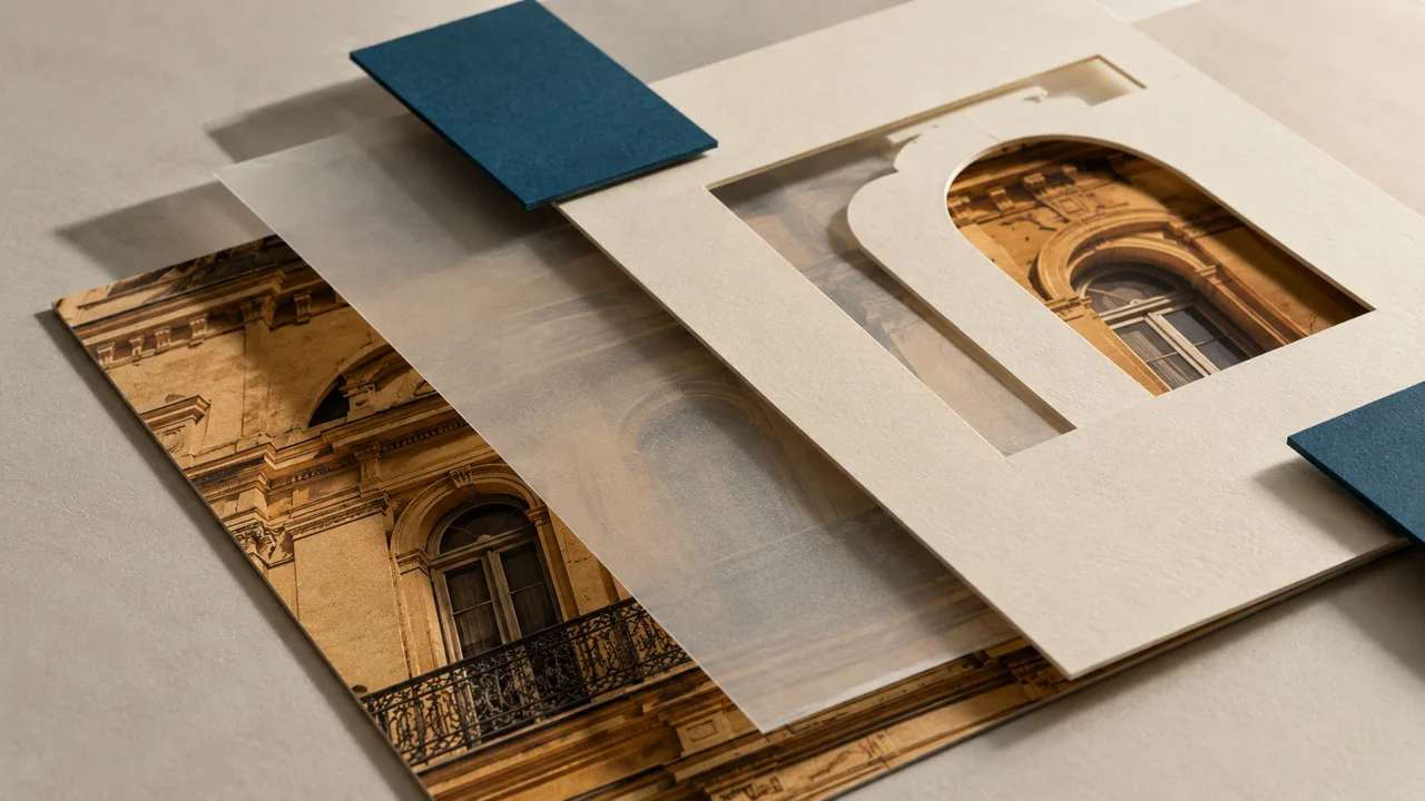
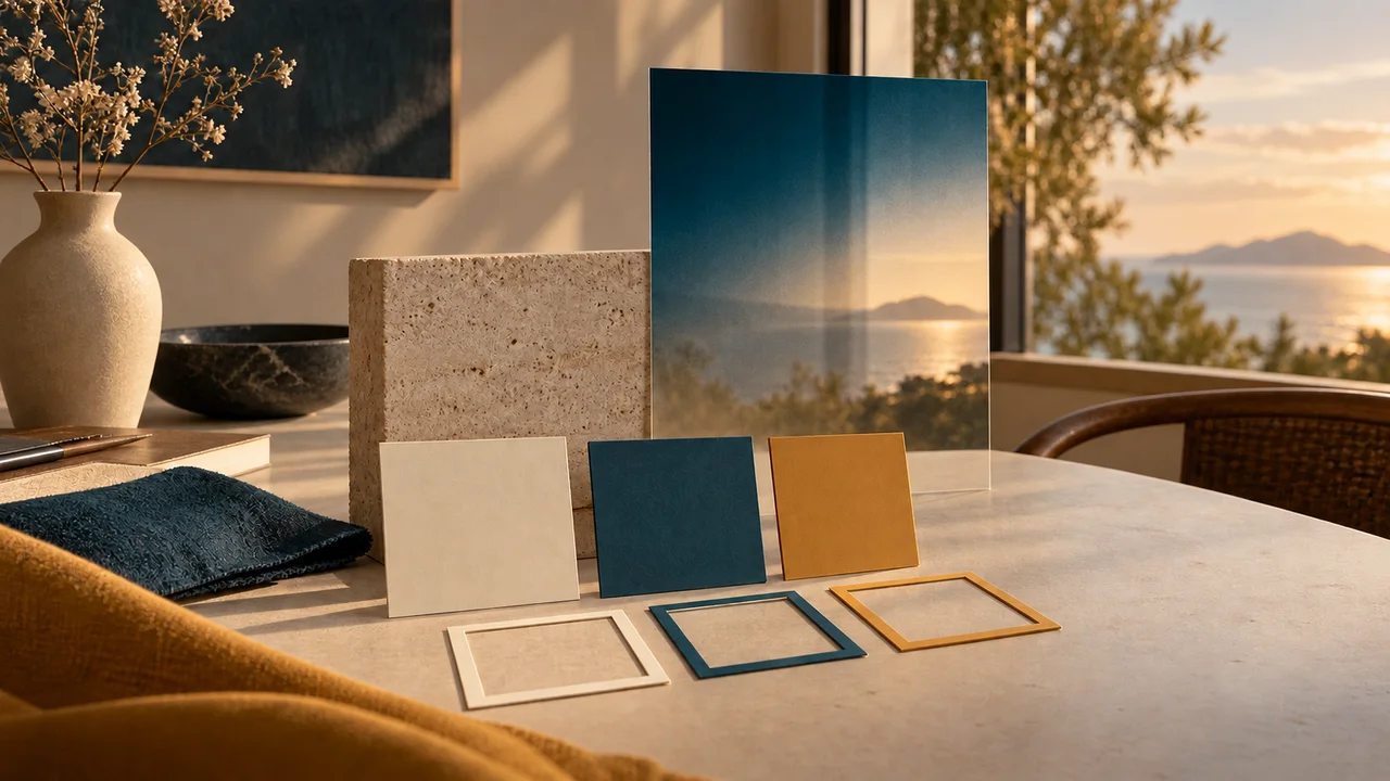
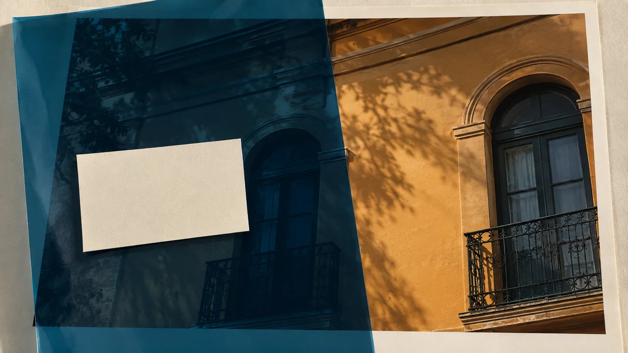
Teaching illustration created in Codex: The acetate represents a layer between the photo and the card. The actual design needs readable text; this scene does not measure contrast.
Test yourself
The overlay makes the photo almost invisible. Which adjustment keeps its purpose?
It is normal to get stuck hereIf the rectangle covers the letters, adjust the layer order. Fill opacity and layer order solve different problems.
Practice now 0/3
Separate the text from the photo
Set aside 10 minutes of active work for this section. Account access and processing may take extra time. You are done when you have compared two versions and checked a reading area.
Use your own or authorized references. Label illustrative images and keep the originals. AI features may depend on your account and plan; check before generating.
Project: Luz de Rua
Lesson: Separate the text from the photo
Order: photo, overlay, text — <your decision>
Alternative: solid card for measuring contrast — <your decision>
Test: readable sentence and recognizable subject — <your decision>
File or frame checked:
Decision: keep or adjust
Actual pending items:
After completing these steps, you can create a reading area without hiding the main subject.
Lesson cheat sheet
Separate the text from the photo
Order: photo, overlay, text
Alternative: solid card for measuring contrast
Test: readable sentence and recognizable subject
Your next step
You now have criteria for creating a reading area without hiding the main subject.
Save this lesson’s deliverable in the project folder. You will use it in the next step.
Next: Use blur to support the information
Supplementary material · module 4Production notes and care tips for returning after the short practice.
An overlay needs a clear layer order
Experiment at your own pace
Repeat on a copy of the piece, changing only one choice. Compare before keeping the change.
What to observe
Control names and locations may vary. Check your selection and editing permission before looking for the feature.
The test is readability, not the effect
Experiment at your own pace
Keep the earlier version and record what changed in how it reads. Undo a change if it does not help.
What to observe
The Luz de Rua case is fictional. The images are Codex illustrations; the diagrams show the method, not the actual Figma interface.
Check features and costs in your current account. Guides may show different paths depending on version and device.
Lesson 10 · Figma para Criadores v6.2 · INEMA.CLUB PRO
Module 4 · Lesson 11 of 18
Use blur to support the information
You can test a blurred background and decide whether it improves the design.
Too much blur can become distracting or slow the editor down. Keep one subject sharp and test what the background is doing.
In 1 minute
Layer blur: affects the layer itself
Background blur: affects the content behind it
Decision: does the effect help, or does the simple version work better?
1Blur can affect different layers
On a copy of the cover, duplicate the photo.
Move the duplicate below the original in the layer list and enlarge it to fill the frame.
Make the original above it smaller to reveal the background edges.
Select only the duplicate.
In Effects, add an effect and choose Layer blur.
Increase the value a little at a time; the background should lose sharpness while the main photo stays sharp.
Background blur works differently: it blurs what is behind the selected shape.
For this to show, the shape’s fill needs to be transparent.
Use it only when there is content behind the shape, and check the effect in the full design.
Tainá keeps the main window sharp to preserve the message.
Prompts to compare · teaching example
RequestApply strong blur to everything, including the subject and text.
There are no observable limits to check the work against.
RequestBlur only the supporting area and keep the main information sharp.
There are clear criteria for checking the decision.
Compare the two instructions. They are examples written for this lesson, with no simulated tool response.
2Glass and atmosphere are optional
A translucent card with blur can look like glass.
It helps only if the text stays readable.
A solid card also works.
Compare the two options without changing the headline, so you can tell what improved.
Do not copy a high value, such as 180, without considering the design size.
Start low and observe.
Several effects can slow the editor down.
If editing becomes slow, hide the test effects and keep the simple alternative.
Álvaro prefers the solid card when the effect does not improve readability.
Completed brief · lesson example
1Layer blur: affects the layer itself
2Background blur: affects the content behind it
3Decision: does the effect help, or does the simple version work better?
Use this sheet as a reference. Replace the example with your own project.
3Check the decision against its use
Blur only the supporting area and keep the main information sharp.
Álvaro uses the sheet to check: decision: does the effect help, or does the simple version work better?
Teaching illustration created in Codex: The scene shows a sharp subject and a blurred version used as support. It illustrates the visual difference without showing Figma’s control.
Test yourself
You apply Layer blur to the title and it loses sharpness. What happened?
It is normal to get stuck hereYou do not have to keep the blur to finish. The deliverable for this lesson is the test and a recorded decision.
Practice now 0/3
Use blur to support the information
Set aside 10 minutes of active work for this section. Account access and processing may take extra time. You are done when the effect has been tested and the decision recorded in a real version.
Use your own or authorized references. Label illustrative images and keep the originals. AI features may depend on your account and plan; check before generating.
Project: Luz de Rua
Lesson: Use blur to support the information
Layer blur: affects the layer itself — <your decision>
Background blur: affects the content behind it — <your decision>
Decision: does the effect help, or does the simple version work better? — <your decision>
File or frame checked:
Decision: keep or adjust
Actual pending items:
After completing these steps, you can test a blurred background and decide whether it improves the design.
Lesson cheat sheet
Use blur to support the information
Layer blur: affects the layer itself
Background blur: affects the content behind it
Decision: does the effect help, or does the simple version work better?
Your next step
You now have criteria for testing a blurred background and deciding whether it improves the design.
Save this lesson’s deliverable in the project folder. You will use it in the next step.
Next: Use a mask to reveal a detail
Supplementary material · module 4Production notes and care tips for returning after the short practice.
Blur can affect different layers
Experiment at your own pace
Repeat on a copy of the piece, changing only one choice. Compare before keeping the change.
What to observe
Control names and locations may vary. Check your selection and editing permission before looking for the feature.
Glass and atmosphere are optional
Experiment at your own pace
Keep the earlier version and record what changed in how it reads. Undo a change if it does not help.
What to observe
The Luz de Rua case is fictional. The images are Codex illustrations; the diagrams show the method, not the actual Figma interface.
Check features and costs in your current account. Guides may show different paths depending on version and device.
Lesson 11 · Figma para Criadores v6.2 · INEMA.CLUB PRO
Module 4 · Lesson 12 of 18
Use a mask to reveal a detail
You can create and check a reversible circular crop.
Cropping the original file removes options. A mask lets you test the visible area within the composition.
In 1 minute
Mask: shape below the photo
Selection: shape and photo to create the group
Review: detail visible without losing its purpose
1The shape defines the visible window
Test it outside the cover using a copy of the photo.
Choose Ellipse or press O.
Draw the ellipse while holding Shift to make a circle, then place it over the detail.
In the layer list, place the ellipse below the photo.
Select both and choose Use as mask from the context menu.
The mask limits which part of the photo appears.
Check the group created in the list.
If everything disappears, check the order, position, and selection.
The mask shape does not automatically detect an object’s outline; it reveals the area you drew.
Tainá tests the crop on a copy to preserve the cover.
Weak decision
Delete parts of the original photo to try a detail.
Verifiable decision
Use a reversible mask and check which layer is being moved.
Notice which characteristics make the second decision easy to check.
2Moving the photo and moving the mask are different
Inside the group, select the photo to adjust the visible detail.
Select the mask to change the window shape.
Look at which layer is highlighted before dragging.
To undo the test, choose Undo or remove the mask function.
A circular mask can highlight texture or a doorknob but hide the arch shape.
Decide whether the crop supports the message.
Do not confuse a mask with AI background removal.
This exercise uses a geometric window and does not require an extra service.
Álvaro selects the photo inside the group before adjusting the detail.
Completed brief · lesson example
1Mask: shape below the photo
2Selection: shape and photo to create the group
3Review: detail visible without losing its purpose
Use this sheet as a reference. Replace the example with your own project.
3Check the decision against its use
Use a reversible mask and check which layer is being moved.
Álvaro uses the sheet to check: review: detail visible without losing its purpose.
Teaching illustration created in Codex: The cutout paper reveals part of the image. This is an analogy; in Figma, the mask sits below the photo in the layer list.
Test yourself
You want to change the detail inside the circle without moving the circle. What should you select?
It is normal to get stuck hereCheck that the ellipse is below the photo and that they overlap. A mask placed away from the subject can look empty.
Practice now 0/3
Use a mask to reveal a detail
Set aside 10 minutes of active work for this section. Account access and processing may take extra time. You are done when the mask works and you have checked what happens when you move the photo.
Use your own or authorized references. Label illustrative images and keep the originals. AI features may depend on your account and plan; check before generating.
Project: Luz de Rua
Lesson: Use a mask to reveal a detail
Mask: shape below the photo — <your decision>
Selection: shape and photo to create the group — <your decision>
Review: detail visible without losing its purpose — <your decision>
File or frame checked:
Decision: keep or adjust
Actual pending items:
After completing these steps, you can create and check a reversible circular crop.
Lesson cheat sheet
Use a mask to reveal a detail
Mask: shape below the photo
Selection: shape and photo to create the group
Review: detail visible without losing its purpose
Your next step
You now have criteria for creating and checking a reversible circular crop.
Save this lesson’s deliverable in the project folder. You will use it in the next step.
Next: Save styles so you can reuse choices
Supplementary material · module 4Production notes and care tips for returning after the short practice.
The shape defines the visible window
Experiment at your own pace
Repeat on a copy of the piece, changing only one choice. Compare before keeping the change.
What to observe
Control names and locations may vary. Check your selection and editing permission before looking for the feature.
Moving the photo and moving the mask are different
Experiment at your own pace
Keep the earlier version and record what changed in how it reads. Undo a change if it does not help.
What to observe
The Luz de Rua case is fictional. The images are Codex illustrations; the diagrams show the method, not the actual Figma interface.
Check features and costs in your current account. Guides may show different paths depending on version and device.
Lesson 12 · Figma para Criadores v6.2 · INEMA.CLUB PRO
Module 5 · Lesson 13 of 18
Save styles so you can reuse choices
You can create and apply a local text style.
Repeating values by hand creates accidental differences. A style groups properties so you can reuse them.
In 1 minute
Style: Title/Light
Test: two linked text layers respond to an edit
Separate: color and alignment
1A text style saves how the letters look
Select the title and check Inter, Bold, size 64, and line height 72.
In Typography, open the style selector and create Title/Light.
Apply that style to a test text layer.
Text styles save font, weight, size, and spacing.
Color and alignment stay separate from the text style.
Check Fill for the color and the alignment control for position.
A title can use the same type style with a different color, as long as it remains readable.
Tainá names the style by its purpose so she can find it again.
Weak decision
Copy similar values into each title and call that a style.
Verifiable decision
Apply a local style and test whether changing it updates linked text layers.
Notice which characteristics make the second decision easy to check.
2Edit the style to check the link
Open the style you created and temporarily change the size to 68.
Check the linked title and test text.
Then restore 64.
If one does not change, check whether it has the style or only similar values.
Save a screenshot of this check.
This course uses local styles in the same file.
You do not need to publish a team library.
Publishing and sharing libraries depends on the plan.
You can also create color styles from the Fill selector, but that is a separate step.
Álvaro checks the color separately without undoing the style.
Completed brief · lesson example
1Style: Title/Light
2Test: two linked text layers respond to an edit
3Separate: color and alignment
Use this sheet as a reference. Replace the example with your own project.
3Check the decision against its use
Apply a local style and test whether changing it updates linked text layers.
Álvaro uses the sheet to check: separate: color and alignment.
Teaching illustration created in Codex: Cards with a repeated treatment illustrate consistency. In the file, check the link by the style name.
Test yourself
The type style changed, but the color did not. Which explanation matches this feature?
It is normal to get stuck hereCheck whether you edited the style or only one text layer. Matching values do not prove the layers are linked.
Practice now 0/3
Save styles so you can reuse choices
Set aside 10 minutes of active work for this section. Account access and processing may take extra time. You are done when two text layers use the style and respond to the edit test.
Use your own or authorized references. Label illustrative images and keep the originals. AI features may depend on your account and plan; check before generating.
Project: Luz de Rua
Lesson: Save styles so you can reuse choices
Style: Title/Light — <your decision>
Test: two linked text layers respond to an edit — <your decision>
Separate: color and alignment — <your decision>
File or frame checked:
Decision: keep or adjust
Actual pending items:
After completing these steps, you can create and apply a local text style.
Lesson cheat sheet
Save styles so you can reuse choices
Style: Title/Light
Test: two linked text layers respond to an edit
Separate: color and alignment
Your next step
You now have criteria for creating and applying a local text style.
Save this lesson’s deliverable in the project folder. You will use it in the next step.
Next: Create a component and check its copies
Extra material · module 5Production notes and care tips to revisit after the short practice.
A text style saves how the letters look
Experiment at your own pace
Repeat on a copy of the piece, changing only one choice. Compare before keeping the change.
What to observe
Control names and locations may vary. Check your selection and editing permission before looking for the feature.
Edit the style to check the link
Experiment at your own pace
Keep the earlier version and record what changed in how it reads. Undo a change if it does not help.
What to observe
The Luz de Rua case is fictional. The images are Codex illustrations; the diagrams show the method, not the actual Figma interface.
Check features and costs in your current account. Guides may show different paths depending on version and device.
Lesson 13 · Figma para Criadores v6.2 · INEMA.CLUB PRO
Module 5 · Lesson 14 of 18
Create a component and check its copies
You can test a change to the main component and two instances.
Duplicating a regular shape creates independent copies. A component keeps a repeated part linked.
In 1 minute
Main component: Marca/Ponto
Instances: two linked copies
Test: color changes on the main component and both copies
1The main component works as a source
Outside the cover, draw a 32 by 32 ellipse and choose ochre in Fill.
Select only that ellipse and choose Create component.
Name it Marca/Ponto.
This is the main component.
Duplicate it twice to create instances, the linked copies.
An instance appears as a component in the list.
You can also insert it from the Assets panel, under local components.
Do not use the main component as a stray decoration on the cover.
Keep it in a reference area in the same file.
Tainá keeps the main component outside the export area.
Prompts to compare · teaching example
RequestDuplicate regular circles and expect them all to change together.
There are no observable limits to check the work against.
RequestCreate the main component, insert instances, and test one property without local changes.
There are clear criteria for checking the decision.
Compare the two instructions. They are examples written for this lesson, with no simulated tool response.
2Test before spreading it across the series
Change the main component color to deep teal.
Check whether both instances update.
Then restore ochre.
For this test, do not change the instances’ colors individually.
Local changes can override an inherited property and change the expected result.
Use an instance as a small marker on each piece if it helps readability.
You do not need to turn the entire cover into a component.
First, understand one simple object.
If a copy does not update, check the link and any local changes before rebuilding everything.
Álvaro tests two instances before repeating the mark across the pages.
Completed brief · lesson example
1Main component: Marca/Ponto
2Instances: two linked copies
3Test: color changes on the main component and both copies
Use this sheet as a reference. Replace the example with your own project.
3Check the decision against its use
Create the main component, add instances, and test a property with no local changes.
Álvaro uses the sheet to check: test: color changes on the main component and both copies.
Teaching illustration created in Codex: Three cards repeat a small marker. The scene illustrates repetition; check the link in Figma.
Test yourself
Two instances with no local changes should receive a new color. Where should you edit it?
It is normal to get stuck hereIf only one copy changed, check whether it is an instance and whether its color has a local change.
Practice now 0/3
Create a component and check its copies
Set aside 10 minutes of active work for this section. Account access and processing may take extra time. You are done when the main component and both instances respond to the color test.
Use your own or authorized references. Label illustrative images and keep the originals. AI features may depend on your account and plan; check before generating.
Project: Luz de Rua
Lesson: Create a component and check its copies
Main component: Marca/Ponto — <your decision>
Instances: two linked copies — <your decision>
Test: color changes on the main component and both copies — <your decision>
File or frame checked:
Decision: keep or adjust
Actual pending items:
After completing these steps, you can test a change to the main component and two instances.
Lesson cheat sheet
Create a component and check its copies
Main component: Marca/Ponto
Instances: two linked copies
Test: color changes on the main component and both copies
Your next step
You now have criteria for testing a change to the main component and two instances.
Save this lesson’s deliverable in the project folder. You will use it in the next step.
Next: Draw a line and assess add-ons
Extra material · module 5Production notes and care tips to revisit after the short practice.
The main component works as a source
Experiment at your own pace
Repeat on a copy of the piece, changing only one choice. Compare before keeping the change.
What to observe
Control names and locations may vary. Check your selection and editing permission before looking for the feature.
Test before spreading it across the series
Experiment at your own pace
Keep the earlier version and record what changed in how it reads. Undo a change if it does not help.
What to observe
The Luz de Rua case is fictional. The images are Codex illustrations; the diagrams show the method, not the actual Figma interface.
Check features and costs in your current account. Guides may show different paths depending on version and device.
Lesson 14 · Figma para Criadores v6.2 · INEMA.CLUB PRO
Module 5 · Lesson 15 of 18
Draw a line and assess add-ons
You can create a simple line and decide whether you need an add-on.
Looking for add-ons before understanding the task can add cost without solving the composition.
In 1 minute
Line: three points and two segments
Appearance: deep teal Stroke, thickness 4
Add-on: documented need or none
1The pen connects editable points
In a test area, choose Pen or press P.
Click three positions to draw a line with two segments.
Finish with Esc.
Select the line, remove Fill if present, and set Stroke to deep teal with thickness 4.
Use only a few points.
The line should guide the eye between three details without looking like a real map.
To curve a section, try dragging as you create a point on a copy.
The required practice uses straight segments.
You do not need advanced drawing tools.
Tainá starts with a few points to control the drawing.
Weak decision
Add an extension because it seems popular, without a specific task.
Verifiable decision
Draw the line with the pen and consider an add-on only when you have a clear need.
Notice which characteristics make the second decision easy to check.
2Add-ons add features made by third parties
Before using an add-on, write down the problem it would solve.
In the tools area, look for Plugins and read the description, owner, and terms.
A community item may require payment or access to data.
The presence of a button does not make the feature necessary.
For this series, the shapes, text, and images in the file are enough.
If that is the case, record that no add-on is needed.
Additional drawing or video features may depend on your plan.
None is needed to export the course’s static pieces.
Álvaro records that he does not need an add-on for the current task.
Completed brief · lesson example
1Line: three points and two segments
2Appearance: deep teal Stroke, thickness 4
3Add-on: documented need or none
Use this sheet as a reference. Replace the example with your own project.
3Check the decision against its use
Draw the line with the pen and consider an add-on only when you have a clear need.
Álvaro uses the sheet to check: add-on: documented need or none.
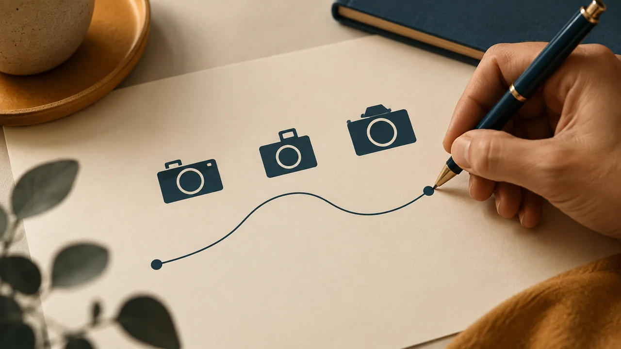
Teaching illustration created in Codex: A curve appears below three camera icons. It illustrates a visual path; the practice uses three points and two straight segments.
Test yourself
You only need to connect three details with a line. Which first step fits the task?
It is normal to get stuck hereIf a filled block appears, remove Fill. If the line disappears, check Stroke and its thickness.
Practice now 0/3
Draw a line and assess add-ons
Set aside 10 minutes of active work for this section. Account access and processing may take extra time. You are done when the line is visible and your decision about an add-on has a reason.
Use your own or authorized references. Label illustrative images and keep the originals. AI features may depend on your account and plan; check before generating.
Project: Luz de Rua
Lesson: Draw a line and assess add-ons
Line: three points and two segments — <your decision>
Appearance: deep teal Stroke, thickness 4 — <your decision>
Add-on: documented need or none — <your decision>
File or frame checked:
Decision: keep or adjust
Actual pending items:
After completing these steps, you can create a simple line and decide whether you need an add-on.
Lesson cheat sheet
Draw a line and assess add-ons
Line: three points and two segments
Appearance: deep teal Stroke, thickness 4
Add-on: documented need or none
Your next step
You now have criteria for creating a simple line and deciding whether you need an add-on.
Save this lesson’s deliverable in the project folder. You will use it in the next step.
Next: Review the design with concrete questions
Extra material · module 5Production notes and care tips to revisit after the short practice.
The pen connects editable points
Experiment at your own pace
Repeat on a copy of the piece, changing only one choice. Compare before keeping the change.
What to observe
Control names and locations may vary. Check your selection and editing permission before looking for the feature.
Add-ons add features made by third parties
Experiment at your own pace
Keep the earlier version and record what changed in how it reads. Undo a change if it does not help.
What to observe
The Luz de Rua case is fictional. The images are Codex illustrations; the diagrams show the method, not the actual Figma interface.
Check features and costs in your current account. Guides may show different paths depending on version and device.
Lesson 15 · Figma para Criadores v6.2 · INEMA.CLUB PRO
Module 6 · Lesson 16 of 18
Review the design with concrete questions
You can prepare a review and record a decision about the cover.
Asking only whether it looks nice gives you answers that are hard to use. A review should identify the problem and the criteria.
In 1 minute
Questions: main message and reading difficulty
Record: comment, interpretation, and decision in separate fields
Status: self-review done; outside conversation done or pending
1Ask for a read before explaining
Show the cover and ask: what is the main message?
Then ask what was hard to read.
Record the person’s words separately from your interpretation.
In Figma, Share contains the access options.
For a review, choose view access when available, without granting unnecessary editing.
Permissions depend on the account, file location, and plan.
Starter drafts have collaboration limits.
Alternatively, show the design on your own screen or send an exported image in the next lesson.
Do not move the file to a team space without checking the terms.
Tainá writes down the comment she received before suggesting a solution.
Weak decision
Ask for general approval and change every color after one opinion.
Verifiable decision
Ask about the message and readability, record the comment, and test a change tied to the problem.
Notice which characteristics make the second decision easy to check.
2An observation becomes a decision when it has a criterion
Fictional example: the person read “photography” but missed the direction to notice the city.
Hypothesis: the subtitle is too subtle.
Test: make it stand out more while keeping the main title.
Then compare.
Do not invent a real testimonial to justify this change.
The short practice prepares two questions and records your own review using the five criteria from lesson 2.
You can talk with another person later.
If that has not happened yet, write “outside review pending.”
Keep the comment received, your interpretation, and your decision in separate fields.
Álvaro can show the design on screen without giving editing access to the file.
Completed brief · lesson example
1Questions: main message and reading difficulty
2Record: comment, interpretation, and decision in separate fields
3Status: self-review done; outside conversation done or pending
Use this sheet as a reference. Replace the example with your own project.
3Check the decision against its use
Ask about the message and readability, record the comment, and test a change tied to the problem.
Álvaro uses the sheet to check: status: self-review done; outside conversation done or pending.
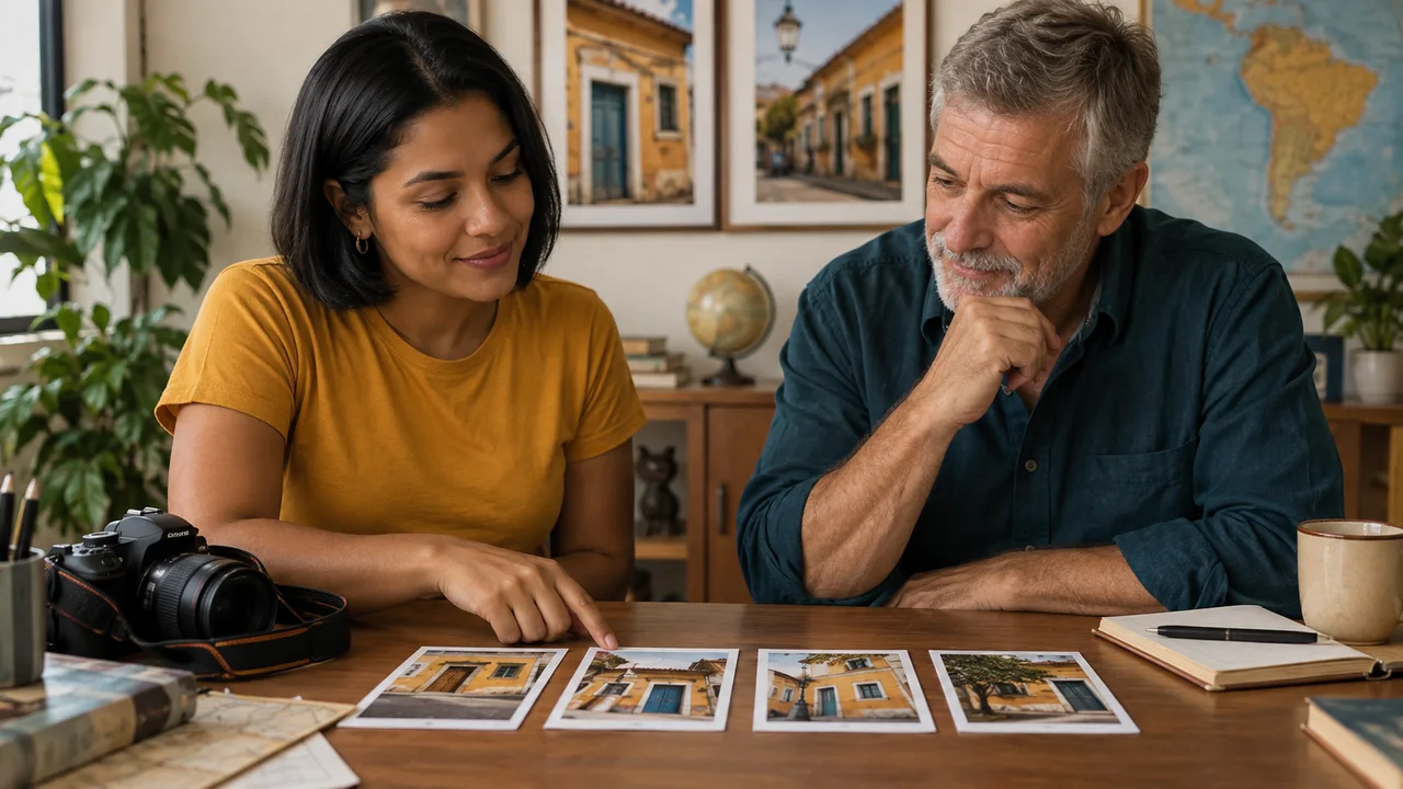
Teaching illustration created in Codex: Tainá and Álvaro look at photos together. The scene illustrates a review; it does not depict a real testimonial or test.
Test yourself
Someone said they did not read the subtitle. Which record keeps the fact and hypothesis separate?
It is normal to get stuck hereIf no one is available, do your own review and leave the outside conversation pending. Do not record feedback that did not happen.
Practice now 0/3
Review the design with concrete questions
Set aside 10 minutes of active work for this section. Account access and processing may take extra time. You are done when the questions and your self-review are recorded, and the outside conversation is marked.
Use your own or authorized references. Label illustrative images and keep the originals. AI features may depend on your account and plan; check before generating.
Project: Luz de Rua
Lesson: Review the design with concrete questions
Questions: main message and reading difficulty — <your decision>
Record: comment, interpretation, and decision in separate fields — <your decision>
Status: self-review done; outside conversation done or pending — <your decision>
File or frame checked:
Decision: keep or adjust
Actual pending items:
After completing these steps, you can prepare a review and record a decision about the cover.
Lesson cheat sheet
Review the design with concrete questions
Questions: main message and reading difficulty
Record: comment, interpretation, and decision in separate fields
Status: self-review done; outside conversation done or pending
Your next step
You now have criteria for preparing a review and recording a decision about the cover.
Save this lesson’s deliverable in the project folder. You will use it in the next step.
Next: Export and open the file to check it
Extra material · module 6Production notes and care tips to revisit after the short practice.
Ask for a read before explaining
Experiment at your own pace
Repeat on a copy of the piece, changing only one choice. Compare before keeping the change.
What to observe
Control names and locations may vary. Check your selection and editing permission before looking for the feature.
An observation becomes a decision when it has a criterion
Experiment at your own pace
Keep the earlier version and record what changed in how it reads. Undo a change if it does not help.
What to observe
The Luz de Rua case is fictional. The images are Codex illustrations; the diagrams show the method, not the actual Figma interface.
Check features and costs in your current account. Guides may show different paths depending on version and device.
Lesson 16 · Figma para Criadores v6.2 · INEMA.CLUB PRO
Module 6 · Lesson 17 of 18
Export and open the file to check it
You can export a cover as a PNG and check the result outside Figma.
Seeing the composition in the editor does not prove the delivered file is correct. Check it after saving, too.
In 1 minute
Selection: frame 00-Capa
Format: PNG at 1x, 1080 by 1350
Check: file opened outside the editor
1Export the full frame
Select the 00-Capa frame in the layer list.
In Export, add a setting with the plus sign.
Choose PNG and 1x scale.
Check the preview and export.
Save the file in a Luz-de-Rua/entrega folder.
Your browser may use the default downloads folder.
Open the PNG outside Figma.
Check the dimensions, 1080 by 1350, the full title, photo, background, and that no test objects are present.
If only one object appears, go back and select the frame.
If the background is missing, check Fill and whether it is included in the export.
Tainá checks the preview before saving the frame.
Prompts to compare · teaching example
RequestSend the first saved file without checking what was selected.
There are no observable limits to check the work against.
RequestSelect the full frame, export at 1x, and open the PNG to review it.
There are clear criteria for checking the decision.
Compare the two instructions. They are examples written for this lesson, with no simulated tool response.
2Choose a format for the deliverable
PNG preserves text and shapes well in static designs.
JPG can work for photos with a smaller file, but it does not preserve transparency.
PDF works for document review; SVG preserves vector shapes with some limitations.
None of these replaces the editable Figma working file.
As an extra test, export the same frame as a PDF and open it.
Check the text and effects: they may behave differently in each format.
For the final project, we will deliver four PNGs at 1x.
The editable copy will be saved separately in the next lesson.
Álvaro opens the saved file to check that the full cover is there.
Completed brief · lesson example
1Selection: frame 00-Capa
2Format: PNG at 1x, 1080 by 1350
3Check: file opened outside the editor
Use this sheet as a reference. Replace the example with your own project.
3Check the decision against its use
Select the full frame, export at 1x, and open the PNG to review it.
Álvaro uses the sheet to check: check: file opened outside the editor.
Teaching illustration created in Codex: A folder holds four images. The scene illustrates an organized delivery; it does not prove that files were exported from Figma.
Test yourself
The exported image contains only one circle. What should you check first?
It is normal to get stuck hereCheck which layer is selected. Exporting one object does not deliver the other elements in the frame.
Practice now 0/3
Export and open the file to check it
Set aside 10 minutes of active work for this section. Account access and processing may take extra time. You are done when the PNG opens outside Figma and contains the full cover at the planned dimensions.
Use your own or authorized references. Label illustrative images and keep the originals. AI features may depend on your account and plan; check before generating.
Project: Luz de Rua
Lesson: Export and open the file to check it
Selection: frame 00-Capa — <your decision>
Format: PNG at 1x, 1080 by 1350 — <your decision>
Check: file opened outside the editor — <your decision>
File or frame checked:
Decision: keep or adjust
Actual pending items:
After these steps, you can export a cover as a PNG and check the result outside Figma.
Lesson cheat sheet
Export and open the file to check it
Selection: frame 00-Capa
Format: PNG at 1x, 1080 by 1350
Check: file opened outside the editor
Your next step
You now have criteria to export a cover as a PNG and check the result outside Figma.
Save this lesson’s deliverable in the project folder. You will use it in the next step.
Next: Complete the set and save an editable copy
Extra material · module 6Production notes and care tips to revisit after the short practice.
Export the full frame
Experiment at your own pace
Repeat on a copy of the piece, changing only one choice. Compare before keeping the change.
What to observe
Control names and locations may vary. Check your selection and editing permission before looking for the feature.
Choose the format based on the delivery
Experiment at your own pace
Keep the earlier version and record what changed in how it reads. Undo a change if it does not help.
What to observe
The Luz de Rua case is fictional. The images are Codex illustrations; the diagrams show the method, not the actual Figma interface.
2The finished image and editable file serve different purposes
In the main menu, find File and Save a local copy.
Save a .fig copy of your own file.
This copy lets you continue editing later.
PNGs are for viewing and sharing the pieces.
Also save the source image and a note with the date and address of the online file.
The ten-minute practice is the final check, after the pages have been made.
Set aside eight to twelve hours for the full course and assembly work.
If a piece is missing, leave the delivery marked as pending.
Do not confuse the reference kit with a set you created in Figma.
Álvaro keeps the editable copy with the note so he can continue later.
Completed brief · lesson example
1Set: cover, light, detail, and series
2Delivery: four opened and checked PNGs
3File: .fig copy, source image, and note with date and address
Use this sheet as a reference. Replace the example with your own project.
3Check the decision against its use
Check the four PNGs, .fig copy, source image, and project note.
Álvaro checks the worksheet: file—a .fig copy, source image, and note with date and address.
Educational illustration created with Codex: The four photos together represent the idea of a series. The real delivery includes text and must be created and checked in Figma.
Test yourself
You need to change a title after delivery. Which item preserves the project for editing?
If you got stuck here, that is normalIf one page is missing, make it before the final check. The list helps locate what is pending; it does not turn a missing item into a finished result.
Practice now 0/3
Complete the set and save an editable copy
Set aside 10 minutes of active work for this section. Account access and processing may take extra time. You are done when all four PNGs are checked and the .fig copy is saved with the source image and note.
Use your own or authorized references. Label illustrative images and keep the originals. AI features may depend on your account and plan; check before generating.
Project: Luz de Rua
Lesson: Complete the set and save an editable copy
Set: cover, light, detail, and series — <your choice>
Delivery: four opened and checked PNGs — <your choice>
File: .fig copy, source image, and note with date and address — <your choice>
File or frame checked:
Decision: keep or adjust
Actual pending item:
After these steps, you can check four exported pieces and a local copy of the project.
Lesson cheat sheet
Complete the set and save an editable copy
Set: cover, light, detail, and series
Delivery: four opened and checked PNGs
File: .fig copy, source image, and note with date and address
Your next step
You now have criteria to check four exported pieces and a local copy of the project.
Save this lesson’s deliverable in the project folder. You will use it in the next step.
Next: Apply the system to a new piece and compare it with the documented rules.
Extra material · module 6Production notes and care tips to revisit after the short practice.
Apply the choices to all four pieces
Experiment at your own pace
Repeat on a copy of the piece, changing only one choice. Compare before keeping the change.
What to observe
Control names and locations may vary. Check your selection and editing permission before looking for the feature.
The finished image and editable file serve different purposes.
Experiment at your own pace
Keep the earlier version and record what changed in how it reads. Undo a change if it does not help.
What to observe
The Luz de Rua case is fictional. The images are Codex illustrations; the diagrams show the method, not the actual Figma interface.