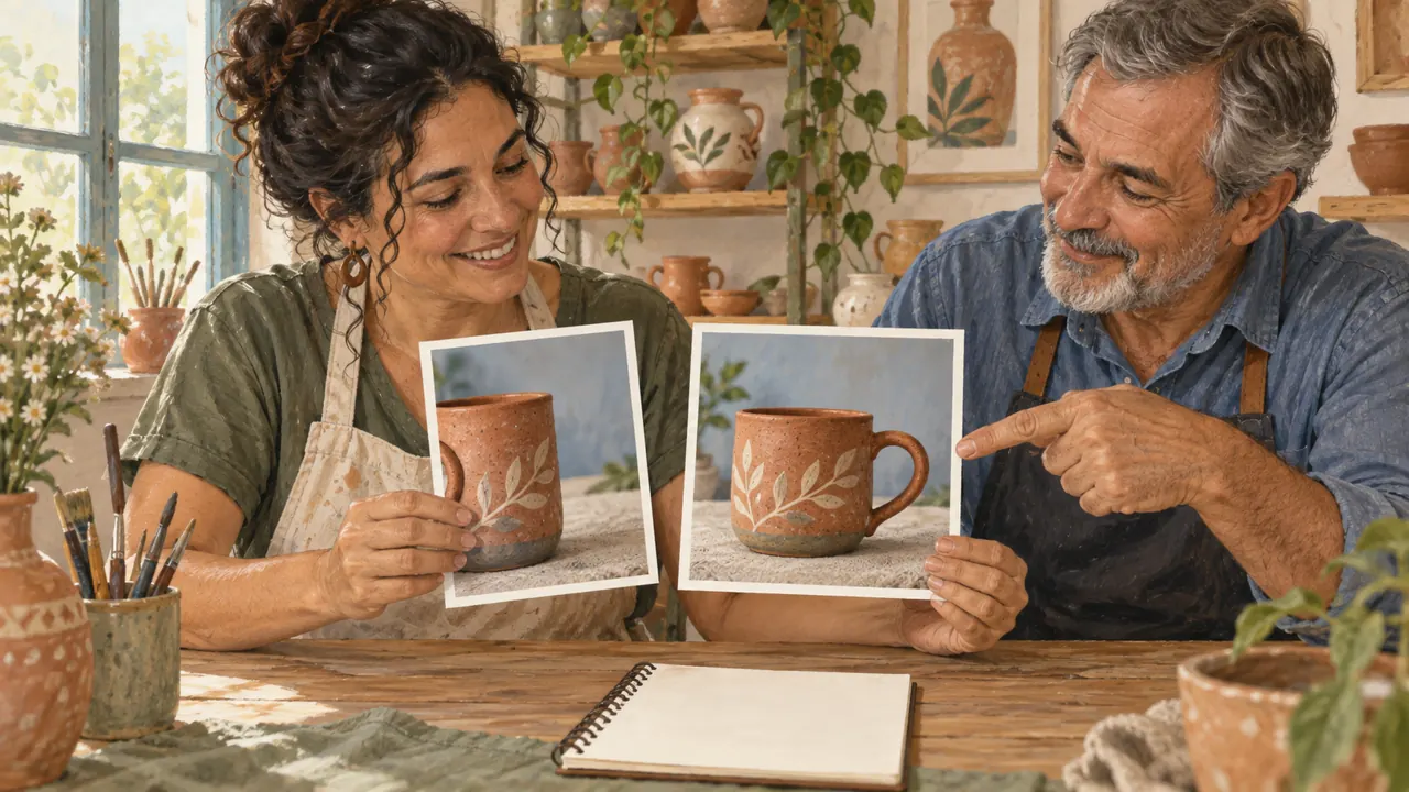
Decide what the work is before asking for an image
You can write five lines to guide a product image.
You ask for a beautiful image and get something that does not work for the shop. You need to say what this image must accomplish.
In 1 minute
The tool needs to generate and let you save the image.
Product, audience, use, intention, and limits guide the prompt.
A beautiful photo still needs to show the right product.
1Model, platform, and editor
Model is the system that generates or transforms the image.
A platform is the interface you use to access it.
An editor is the workspace where you crop, compose, or retouch.
A platform may offer several models, and the same model may appear in different interfaces.
Separating these three roles keeps you from blaming a model for a button or plan limitation.
A comparison is useful only if you know which version you actually used.
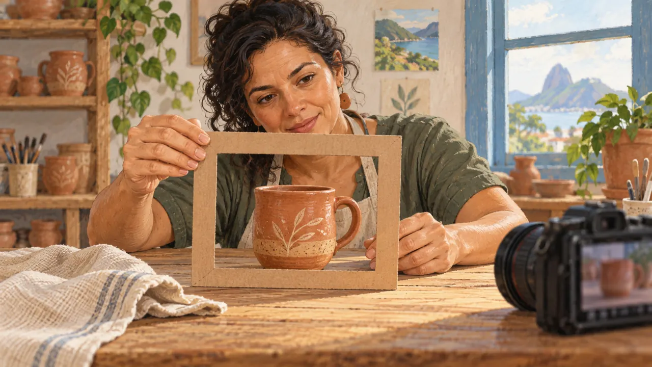
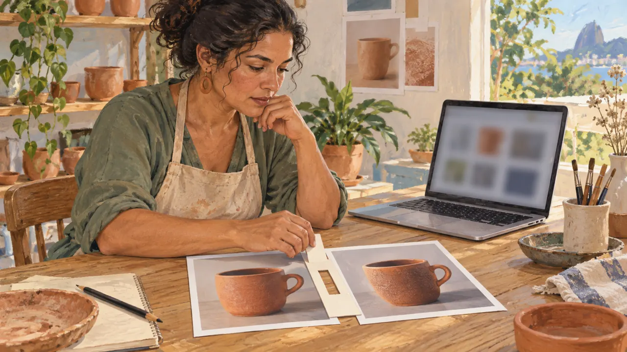
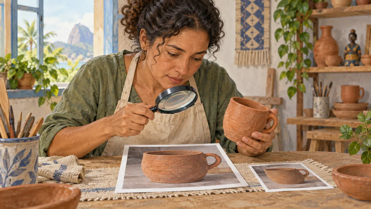
Joana, a craftswoman, needs to show the mug handle. Before she starts, she checks whether the tool lets her generate and save an image.
Prompts to compare · teaching example
PromptMake an amazing image of a mug.
There are no observable limits to check the work against.
PromptShow a terracotta mug with one complete handle. Audience: people who buy ceramics. Use: square catalog image. Intention: clarity. Cream background, no text.
One change is defined, along with something that must stay the same.
Compare the two instructions. They are examples written for this lesson, with no simulated tool response.
Model → generates the image
Platform → shows the prompt field and buttons
Editor → lets you crop and add text
An app may combine more than one role. Identify what it lets you do.
2A brief that fits in five lines
A brief describes the work: what to show, who it is for, where it will be used, what feeling to aim for, and what to preserve.
Aurora is our fictional ceramics brand. The goal is to show an artisan mug clearly and make it feel suited to everyday use.
Without criteria set in advance, any beautiful image can seem approved.
A catalog prompt needs a legible product; a lifestyle image can give the scene more presence.
Those are different decisions.
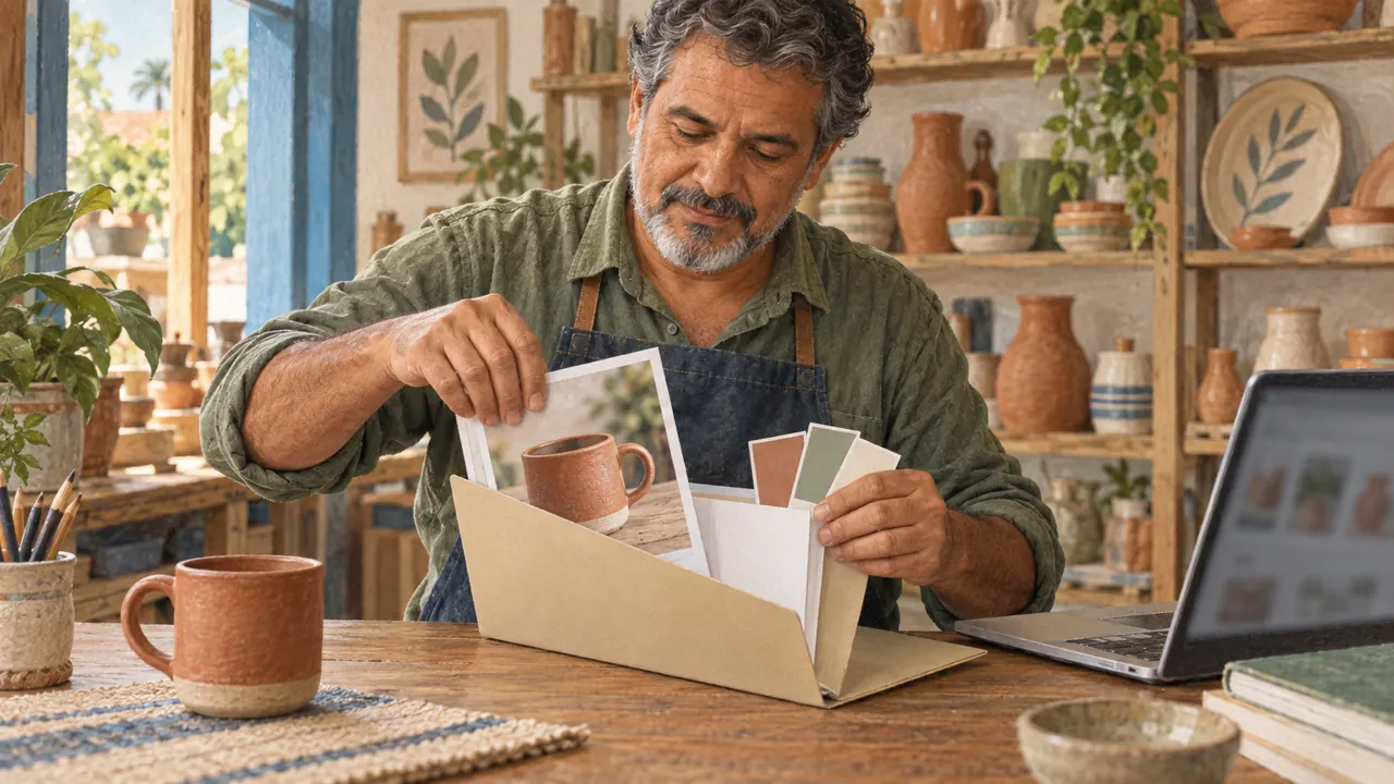
Mauro, a shop owner, is preparing a catalog. He asks for a simple background and the whole product to make it easier for customers to choose.
Completed brief · lesson example
1Product: terracotta mug with one handle
2Audience: people who buy ceramics
3Use: square catalog image
4Intention: show the shape clearly
5Must have: complete outline, cream background, and one handle
Use this brief as a reference. Replace the example with your own product.
3Check the decision against its use
Now check the five lines of the prompt. Once you generate an image, compare the result with them. A cropped handle fails a piece that is supposed to show it in full.
Mauro uses this note to decide: must have: complete outline, cream background, and one handle.
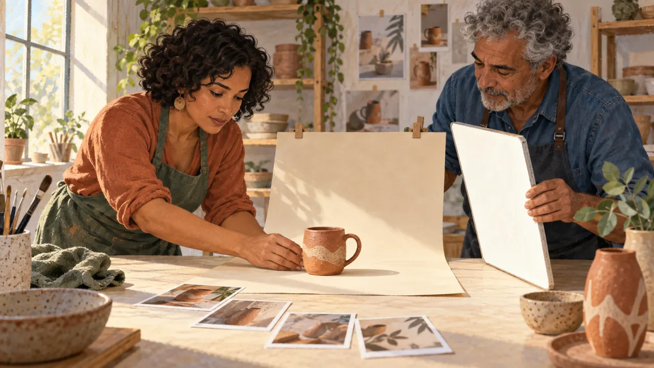
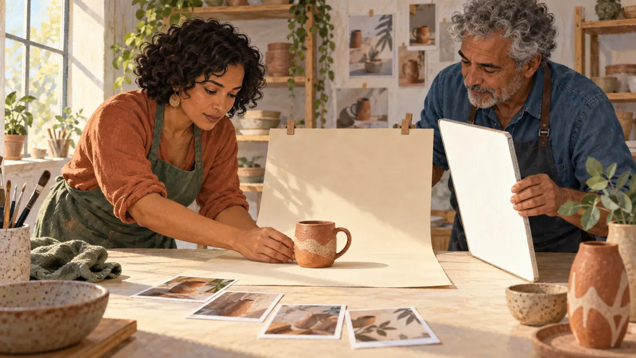
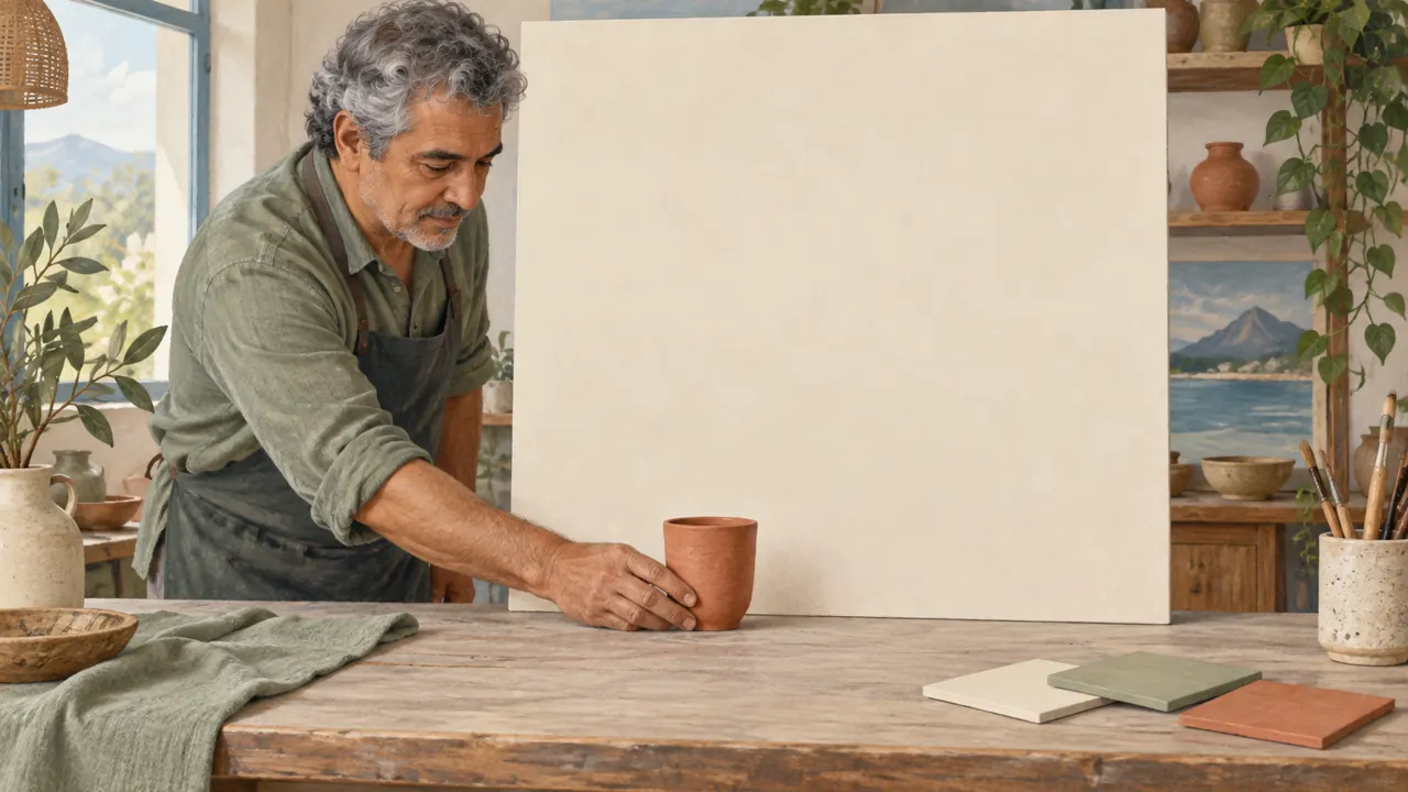
Look at the illustration: The mug is the subject; the light paper is the background; the white board bounces light back. These are separate decisions.
Test yourself
The catalog needs to show the handle, but the image cropped it. What should you do?
If you got stuck here, that is normalYou do not need to know camera terms. Start with the object and say what must not disappear.
Practice now 0/3
Fill out an image request
About 10 minutes. You are done when the five lines describe an image you can evaluate.
Use your own photos or ones you are authorized to use. Fill out the brief on paper or in Notes. If the exercise asks you to edit, keep the original and work on a copy.
Product: <object>
Audience: <who will see it>
Use and format: <where it will appear>
Intention: <what needs to be clear>
Must have: <three characteristics>
After completing the steps, you can write five lines to guide a product image.
Lesson cheat sheet
Decide what the work is before asking for an image
The tool needs to generate and let you save the image.
Product, audience, use, intention, and limits guide the prompt.
A beautiful photo still needs to show the right product.
Your next step
You now have criteria for writing five lines to guide a product image.
Use this lesson’s brief with an image from your work. Set aside ten minutes and note the decision you made.
Next step: Give each reference a role
Supplementary material · module 1Practice and considerations for both topics. Not included in lesson time.
Model, platform, and editor
Experiment at your own pace
Open the tool you already have. Find the model name, the prompt field (where you write the instruction), how to add reference images, and how to save the result. Note which features are available before subscribing to another service.
What to observe
Do not assume every feature shown in a lesson is available in your account. Names and limits vary. Start with a simple generation and save.
A brief that fits in five lines
Experiment at your own pace
Write: product, audience, final format, intention, and three required characteristics. Example: terracotta mug; people who like handmade objects; square; welcoming; one handle, intact rim, and cream background.
What to observe
Do not invent commercial attributes such as capacity, origin, or durability from an image. In this exercise, the brand and product are fictional.
Complete prompt to try
Original example to try in the tool you already use. Results vary; check against the criterion before approving.
Create a product photograph of an unbranded terracotta ceramic mug with one visible, complete oval handle. Place it on a light table in front of a plain cream background. Square framing, camera at mug height, soft light from a side window. Preserve the circular rim and complete handle. Leave open space above the object. No text in the image.
Check
Check the object, handle, shadow direction, and open space. Save the image and the exact model name, even if you do not approve the result.
Lesson 1 · Image Prompting v6.2 · INEMA.CLUB PRO
Module 1 · Lesson 2 of 21
Give each reference a role
You can select references and compare a generation using criteria.
A pile of photos can make the image direction unclear. Giving each reference a role makes evaluation clearer.
In 1 minute
One photo can guide the shape of the product.
Another reference can guide only the light.
Compare results using the same criteria.
1References with a defined role
A reference is an image used to guide one characteristic.
Separate references for the object, composition, and style.
A cropped product helps you study its shape; a scene can show the object’s placement; a palette guides color relationships.
Sending many images without explaining their roles can mix objects, backgrounds, and styles.
Selection is part of directing the image: each file should answer a specific visual question.
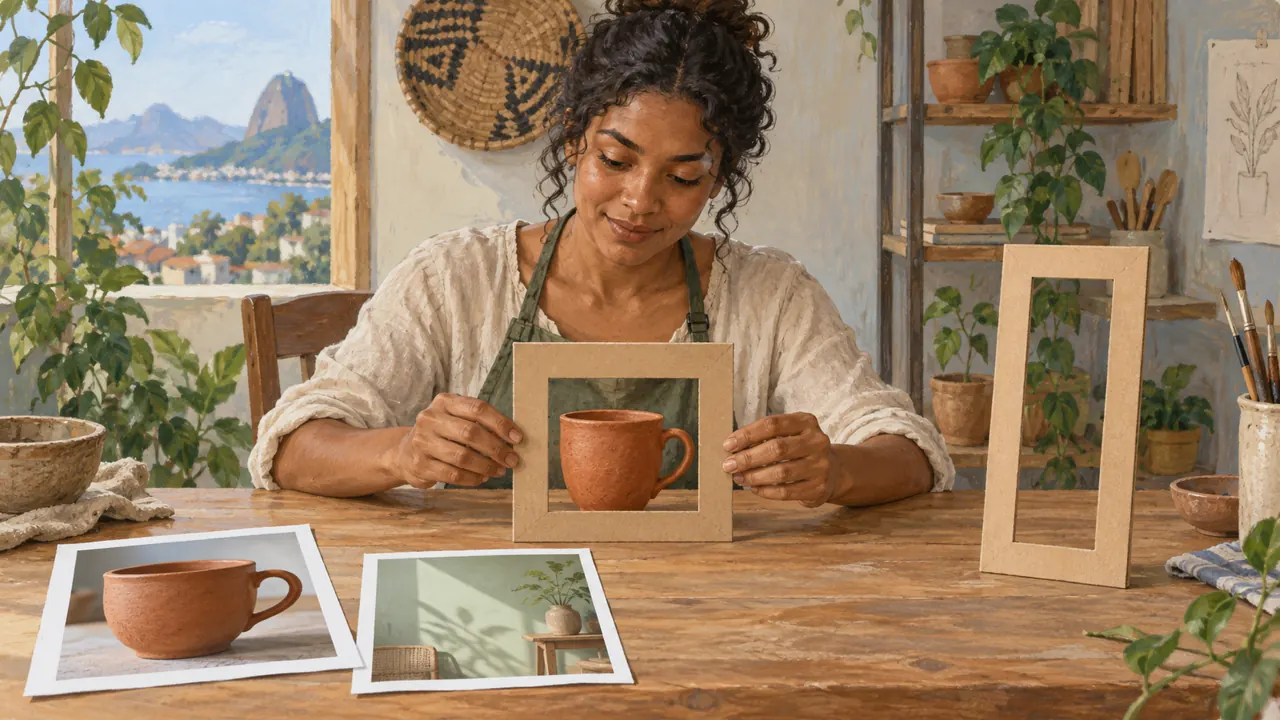
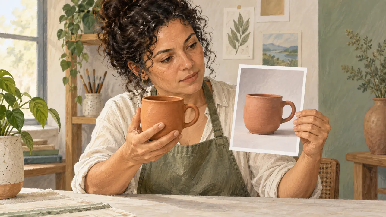
Joana separates a photo of the handle from a photo showing soft light. She labels each role to avoid a muddled mug.
Weak decision
Use all these photos and mix the styles.
Verifiable decision
Reference A: preserve the mug’s shape. Reference B: use only the soft light. Ignore the objects and colors in Reference B.
Notice which characteristics make the second decision easy to check.
2Compare by the work, not by ranking
A comparable test keeps the same prompt and evaluates criteria set before generation.
Record how well it follows the brief, how easy it is to edit, visible errors, and the effort needed to reach a usable version.
The most impressive model in a gallery may not work for your product.
You need to know whether you can fix an error, repeat the process, and export in the required format.
Mauro evaluates two attempts by the outline, light, and open space. His choice no longer depends only on a first impression.
Completed brief · lesson example
1Reference A → mug shape
2Reference B → soft light
3Test → same request and same criteria
Use this brief as a reference. Replace the example with your own product.
3Check the decision against its use
The request for this exercise is a mug with a complete handle, soft light, and open space above. Compare the image with these three requirements. A light reference should not change the product.
Mauro uses this note to decide: test → same request and same criteria.
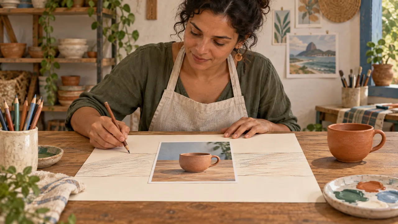
Look at the illustration: The photos on the table show shape, setting, and light. A setting reference does not need to change the object.
Test yourself
The light photo introduced a different handle. What adjustment would help?
If you got stuck here, that is normalIf the two references compete over the product’s shape, remove one. Two clear instructions help more than ten photos with no defined role.
Practice now 0/3
Make a two-reference brief
About 10 minutes. You are done when each reference has a role and you have evaluated an image against all three criteria.
Use your own photos or ones you are authorized to use. Fill out the brief on paper or in Notes. If the exercise asks you to edit, keep the original and work on a copy.
Reference A: use <characteristic>; ignore <the rest>.
Reference B: use <characteristic>; ignore <the rest>.
Image reviewed: <which one>.
Shape: <meets criteria or revise + reason>.
Light: <meets criteria or revise + reason>.
Open space: <meets criteria or revise + reason>.
After completing the steps, you can select references and compare a generation using criteria.
Lesson cheat sheet
Give each reference a role
One photo can guide the shape of the product.
Another reference can guide only the light.
Compare results using the same criteria.
Your next step
You now have criteria for selecting references and comparing a generation.
Use this lesson’s brief with an image from your work. Set aside ten minutes and note the decision you made.
Next step: Save the recipe and fix one thing
Supplementary material · module 1Practice and considerations for both topics. Not included in lesson time.
References with a defined role
Experiment at your own pace
Choose photos you own or are authorized to use. Name each by its role: product, composition, or light. If you do not have a photo, take one now of a whole object against a simple background. Write what to use and what to ignore in each image.
What to observe
A style reference does not guarantee the same identity. Do not use images of real people without authorization for the intended use.
Compare by the work, not by ranking
Experiment at your own pace
Run the module prompt in your chosen tool. If another tool is available, repeat it there. Rate each result from zero to two for shape, light, composition, and ease of correction; write evidence for each score.
What to observe
Do not turn two images into a universal ranking. They are samples from your test, with a date, model, and specific settings.
Complete prompt to try
Original example to try in the tool you already use. Results vary; check against the criterion before approving.
Create a product photograph of an unbranded terracotta ceramic mug with one visible, complete oval handle. Place it on a light table in front of a plain cream background. Square framing, camera at mug height, soft light from a side window. Preserve the circular rim and complete handle. Leave open space above the object. No text in the image.
Check
Check the object, handle, shadow direction, and open space. Save the image and the exact model name, even if you do not approve the result.
Lesson 2 · Image Prompting v6.2 · INEMA.CLUB PRO
Module 1 · Lesson 3 of 21
Save the recipe and fix one thing
You can record an attempt and plan a targeted correction.
You liked an image, but do not remember how you got it. Without a record, repeating or correcting it becomes a different job.
In 1 minute
Keep the image, prompt, and tool together.
Describe the flaw before asking for a correction.
Change one decision per attempt.
1Organize your work so you can repeat it
Keep the image, prompt, and references in the same place.
Record the tool name and date.
Add settings only when you know which ones you used.
This becomes a recipe for reviewing the work.
Without the source files, an approved image becomes difficult to review.
Saving only the prompt leaves out references and settings that influenced the generation.
Joana saves the approved photo with the prompt. That way, she can return to the reference when preparing another piece.
Weak decision
Improve everything and make it more professional.
Verifiable decision
Open up the framing to show the complete handle. Preserve the terracotta mug, cream background, and soft light.
Notice which characteristics make the second decision easy to check.
2Your first review cycle
Iterating means making an attempt, observing the result, and adjusting a hypothesis.
A useful cycle starts with a specific problem: the handle was cropped, the background is cluttered, or the shadow conflicts with the requested light.
Changing everything at once makes it impossible to learn what had an effect.
A short decision log is more useful than dozens of variations without a diagnosis.
Mauro sees the cropped handle and changes only the framing. He saves both versions to observe the difference.
Completed brief · lesson example
1Version 01 → cropped handle
2Version 02 prompt → open up the framing
3Approval → complete handle and same color
Use this brief as a reference. Replace the example with your own product.
3Check the decision against its use
A new version needs to fix the chosen flaw without creating another. If the color changed, the correction is not approved yet.
Mauro uses this note to decide: approval → complete handle and same color.
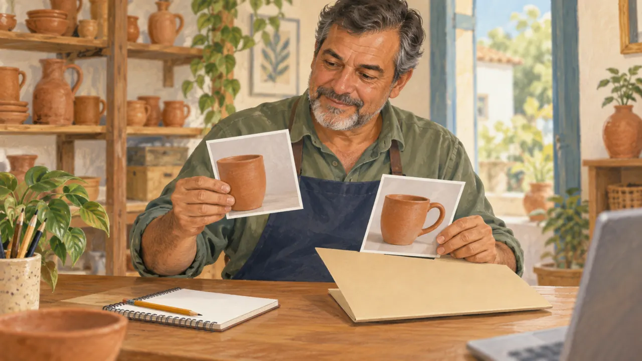
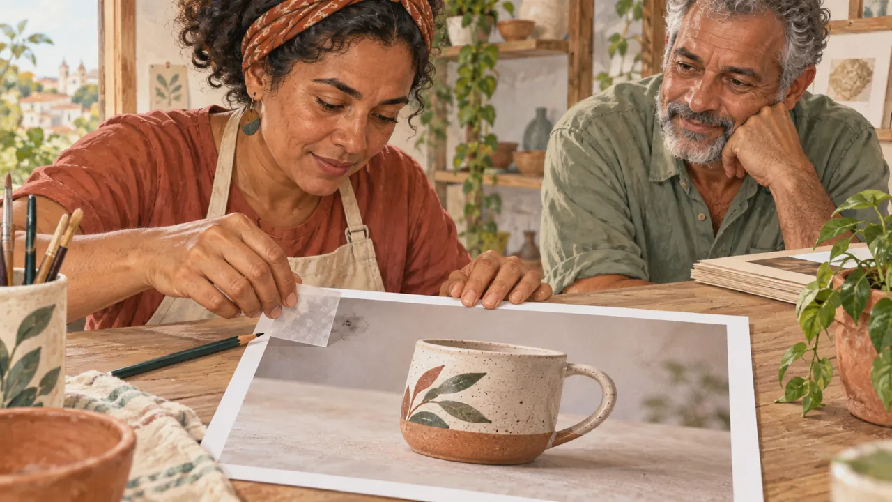
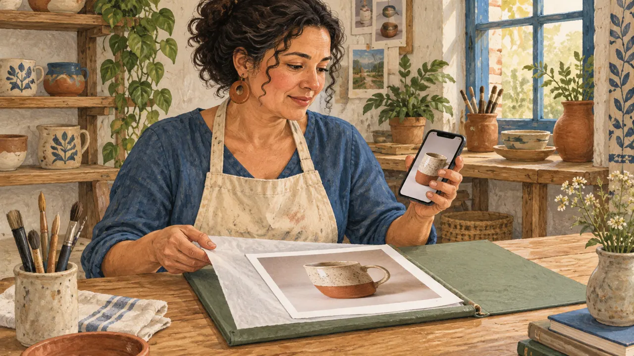
Look at the illustration: In the photos Mauro is holding, one handle is not shown in full. Comparing them helps name a specific flaw.
Test yourself
The handle improved, but the product turned blue. How should you evaluate it?
If you got stuck here, that is normalDo not remember the previous settings? Record them as unknown. The goal is to improve your record from this point on.
Practice now 0/3
Write a revision record
About 10 minutes. You are done when the record explains the flaw and the proposed correction.
Use your own photos or ones you are authorized to use. Fill out the brief on paper or in Notes. If the exercise asks you to edit, keep the original and work on a copy.
After completing the steps, you can record an attempt and plan a targeted correction.
Lesson cheat sheet
Save the recipe and fix one thing
Keep the image, prompt, and tool together.
Describe the flaw before asking for a correction.
Change one decision per attempt.
Your next step
You now have criteria for recording an attempt and planning a targeted correction.
Use this lesson’s brief with an image from your work. Set aside ten minutes and note the decision you made.
Next step: Choose the subject and shot size
Supplementary material · module 1Practice and considerations for both topics. Not included in lesson time.
Organize your work so you can repeat it
Experiment at your own pace
Create folders named 01-brief, 02-references, 03-tests, and 04-approved. Save aurora-light-a-v01.png with a note containing the date, prompt, model, and observations. Do not replace an approved version with an experiment.
What to observe
An initial randomness number does not replace references. If this control is available, read its explanation in the tool itself.
Your first review cycle
Experiment at your own pace
Generate this module’s example. Choose just one problem and describe a correction. Make a new version, compare them side by side, and write whether the change solved the problem or introduced another one.
What to observe
Set a limit for the exercise, such as three rounds. If the same error persists, review the reference or use local editing instead of repeating the prompt unchanged.
Complete prompt to try
Original example to try in the tool you already use. Results vary; check against the criterion before approving.
Create a product photograph of an unbranded terracotta ceramic mug with one visible, complete oval handle. Place it on a light table in front of a plain cream background. Square framing, camera at mug height, soft light from a side window. Preserve the circular rim and complete handle. Leave open space above the object. No text in the image.
Check
Check the object, handle, shadow direction, and open space. Save the image and the exact model name, even if you do not approve the result.
Lesson 3 · Image Prompting v6.2 · INEMA.CLUB PRO
Module 2 · Lesson 4 of 21
Choose the subject and shot size
You can write two framing prompts for the same product.
When the frame tries to show everything, the subject loses impact. Shot size determines what the audience can make out.
In 1 minute
State the main element and the action.
A wide shot shows the setting.
A close-up shows one specific part.
1Subject and action: what needs to be there
The subject is the image’s main element; the action is what happens to it.
In a still scene, the relationship to the surface also matters: a mug resting on a table is different from a mug suspended in the air.
Quantity and position reduce ambiguity.
A prompt like “beautiful product” does not specify shape, material, or situation.
The description should prioritize recognizable characteristics that serve the goal.
Joana chooses the mug as the subject. She removes objects that compete with the ceramic piece from the request.
Prompts to compare · teaching example
PromptA mug, flowers, books, coffee, hands, and an entire kitchen.
There are no observable limits to check the work against.
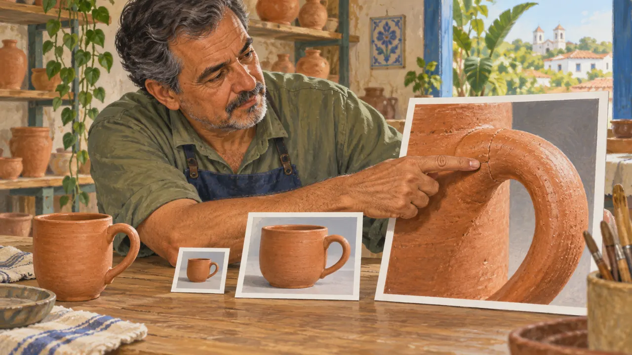
PromptA single terracotta mug on a light table. Close-up of the handle, fully inside the frame. Uncluttered background, no other objects.
One change is defined, along with something that must stay the same.
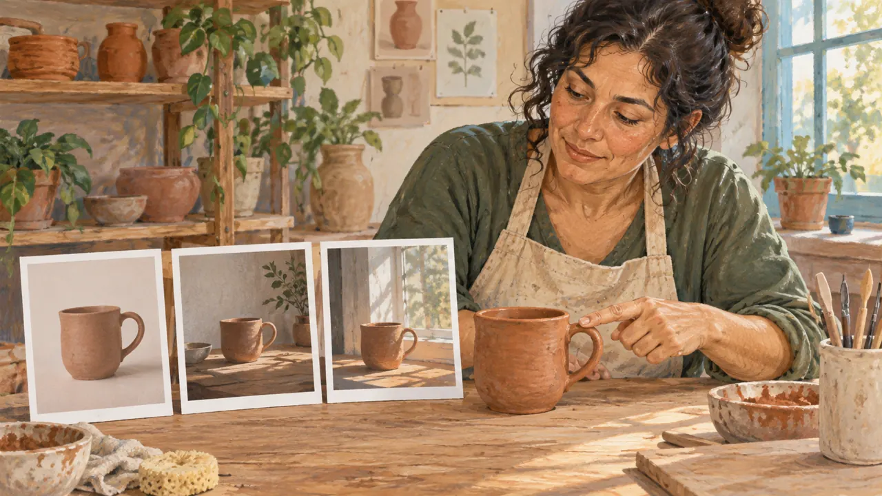
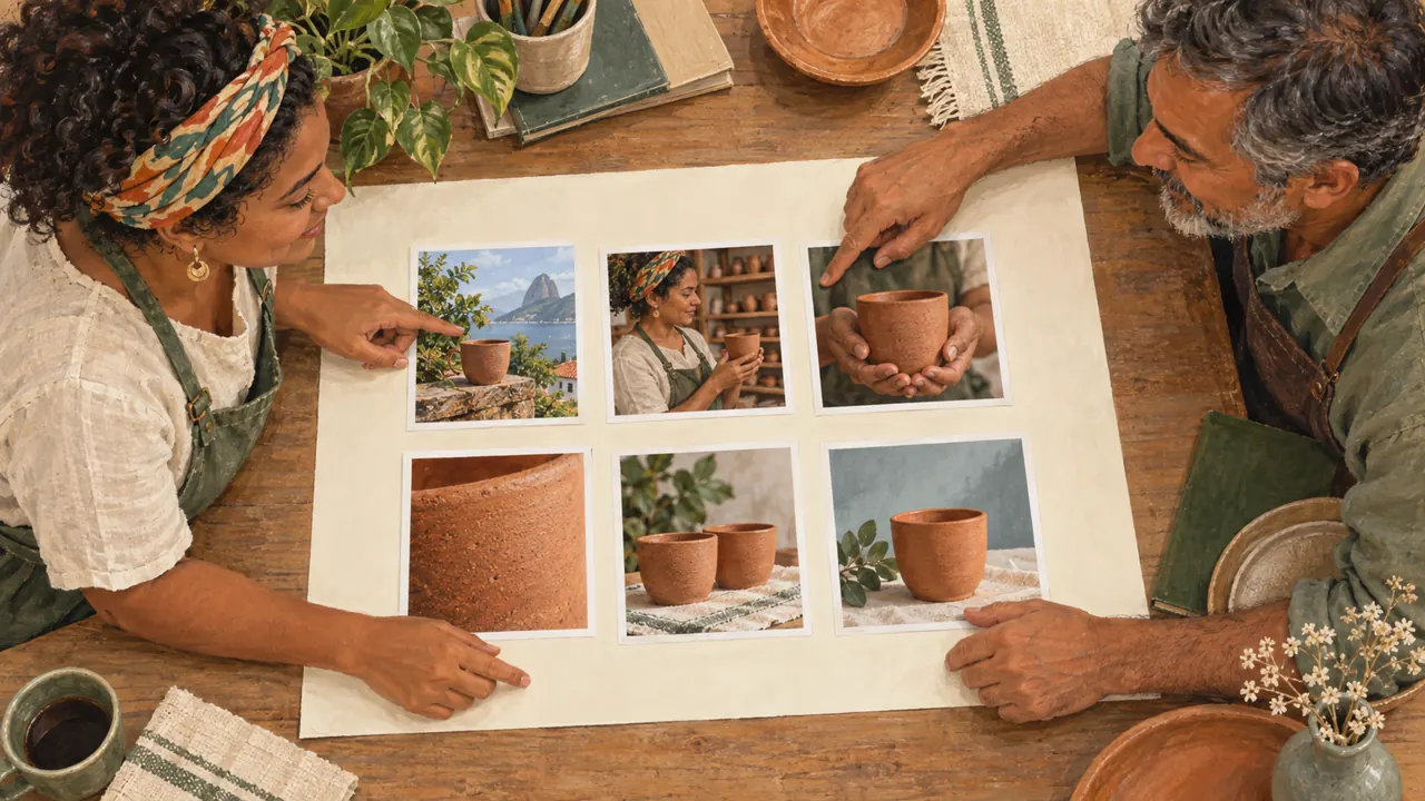
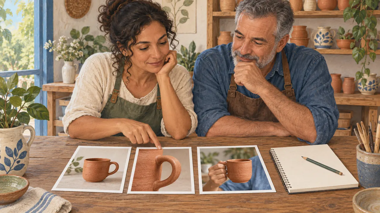
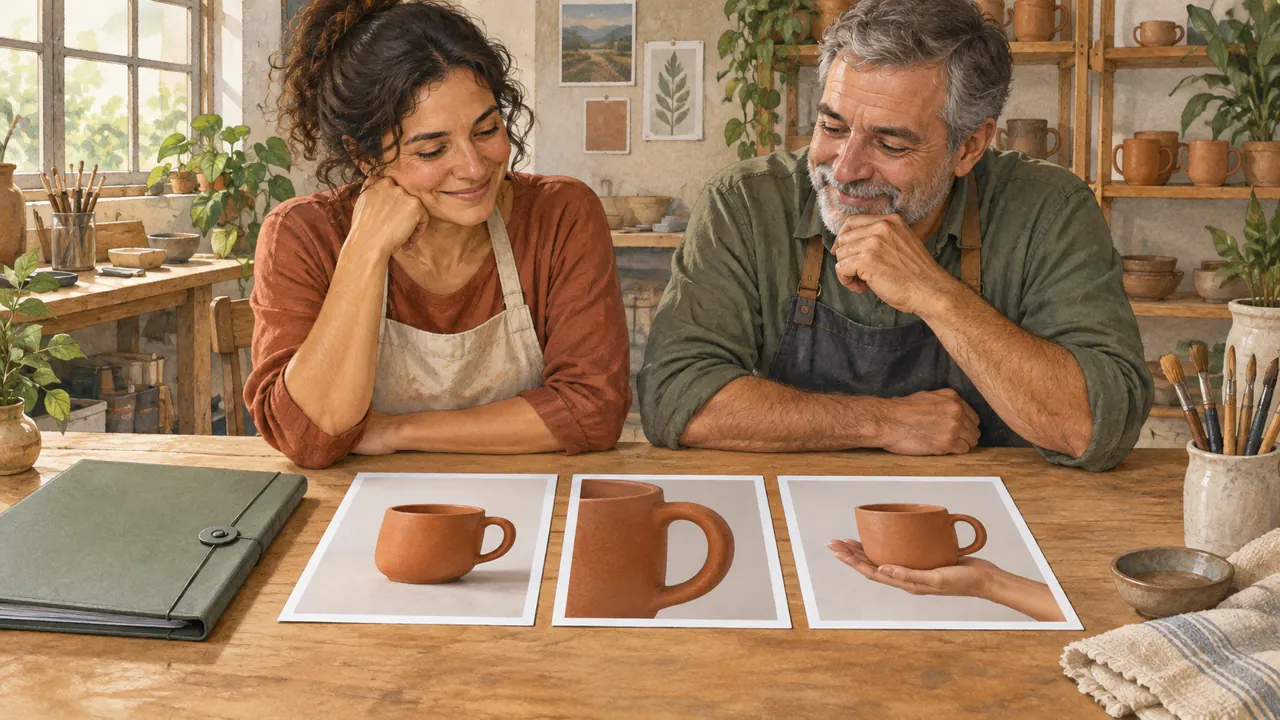
Compare the two instructions. They are examples written for this lesson, with no simulated tool response.Compare the three photos: whole product, handle close-up, and in use. Each crop answers a different question.
2Framing and viewpoint
Framing is the part of the scene that appears in the image.
A wide shot shows context; a medium shot balances the object and setting; a close-up shows one area.
Viewpoint describes the camera’s position: above, at the object’s height, or below.
The same mug can communicate use, shape, or finish depending on the crop.
The size of the subject in the image changes what a learner and audience can inspect.
Mauro prepares two pieces: one shows the coffee table; the other shows the handle’s finish.
Completed brief · lesson example
1Setting → mug within the coffee scene
2Product → whole, legible mug
3Detail → handle and finish
Use this brief as a reference. Replace the example with your own product.
3Check the decision against its use
The shot should match the buyer’s question. A scene-setting image cannot prove a small detail about the finish.
Mauro uses this note to decide: detail → handle and finish.
Look at the illustration: The frame crops the product. Notice how much of the object and setting remain inside it.
Test yourself
You want to show the rim’s texture. Which crop should you choose?
If you got stuck here, that is normalIf the shot name is confusing, describe the crop in everyday words: the whole product or a close-up of the handle.
Practice now 0/3
Write two framing prompts
About 10 minutes. You are done when the two prompts have different purposes and preserve the same object.
Use your own photos or ones you are authorized to use. Fill out the brief on paper or in Notes. If the exercise asks you to edit, keep the original and work on a copy.
Subject: <object and color>.
Version A: whole object, camera at object height.
Version B: close-up of <part>, without cropping what I need to show.
Preserve in both: <material and characteristic>.
After completing the steps, you can write two framing prompts for the same product.
Lesson cheat sheet
Choose the subject and shot size
State the main element and the action.
A wide shot shows the setting.
A close-up shows one specific part.
Your next step
You now have criteria for writing two framing prompts for the same product.
Use this lesson’s brief with an image from your work. Set aside ten minutes and note the decision you made.
Next step: Describe the light and surface
Supplementary material · module 2Practice and considerations for both topics. Not included in lesson time.
Subject and action: what needs to be there
Experiment at your own pace
Start with a sentence that includes the object, quantity, characteristic, and position. Then add an action if it helps: an adult hand holds the handle. Compare how complex the scene is with and without the hand.
What to observe
More details do not automatically mean more control. Avoid conflicting characteristics and keep the main object’s priority explicit.
Framing and viewpoint
Experiment at your own pace
Open one of your photos in the gallery. Look at the whole object, then zoom in on the handle or another detail with a pinch gesture. Write two prompts: whole product and close-up. Zooming the view does not create new information.
What to observe
Naming a lens in a prompt suggests an appearance but does not enforce an exact optical simulation. In real photography, perspective depends on camera position; changing distance changes spatial relationships.
Complete prompt to try
Original example to try in the tool you already use. Results vary; check against the criterion before approving.
Photograph an artisan terracotta mug with one visible, complete oval handle. Light table, whole mug with margin around it. Camera at rim height. Side window light and soft shadow on the side opposite the light source. Matte glaze with small irregularities, no cracks. Plain cream background. Product in the lower half with open space above for a later title. Horizontal 4:3 format. No text.
Check
Note where the subject, framing, light, texture, and composition appear in the result. If a requested element is missing, describe the deviation without adding a string of adjectives.
Lesson 4 · Image Prompting v6.2 · INEMA.CLUB PRO
Module 2 · Lesson 5 of 21
Describe the light and surface
You can distinguish a lighting decision from a material decision.
A surface can look like plastic when the intention was ceramic. Light and texture need to work together.
In 1 minute
Name the light source.
Say whether the shadow is soft or defined.
Describe the material with visible cues.
1Light: source, direction, and quality
The source is where the light comes from, such as a window.
Direction is its position relative to the object.
Quality describes the shadow transition: hard, with a defined edge; or soft, with a gradual transition.
The light’s color is another decision; it does not replace the ones above.
Light makes volume and material legible.
Saying only “cinematic lighting” leaves the shadows, reflections, and separation from the background unspecified.
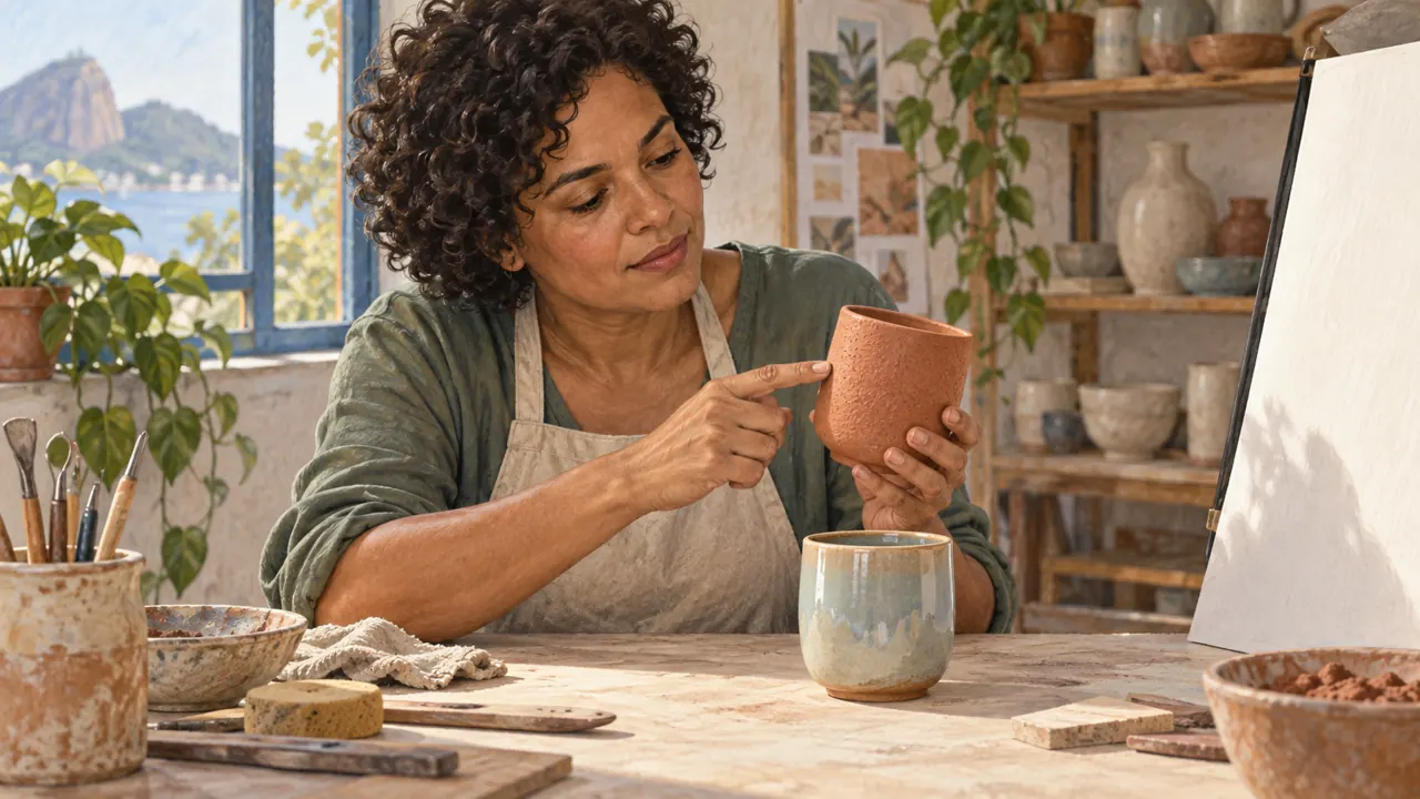
Joana wants to show the matte glaze. She avoids asking for intense reflections that hide the piece’s texture.
Weak decision
Perfect light, beautiful texture, maximum quality.
Verifiable decision
Matte ceramic mug with small variations in the glaze. Soft side-window light. Subtle reflections, no plastic shine.
Notice which characteristics make the second decision easy to check.Diagram of a shadow edge. Compare how it fades without confusing the shadow with the object’s material.
2Texture: how the surface responds
Texture is the pattern of small variations on a surface.
Material is what an object appears to be made of.
Matte ceramic, polished metal, and linen fabric call for different reflections and details; these cues help us interpret the image.
Adding “ultra-detailed” does not fix an incoherent material.
For Aurora, small glaze variations are useful; cracks and exaggerated roughness would change how the product is perceived.
Mauro places the mug near a window to photograph it. He notices the soft shadow and small variations in the matte surface.
Completed brief · lesson example
1Source → side window
2Shadow → soft transition
3Material → matte ceramic with subtle variations
Use this brief as a reference. Replace the example with your own product.
3Check the decision against its use
Check that the requested finish remains. Ceramic can be glossy, but a piece described as matte should not turn into a mirror-like surface.
Mauro uses this note to decide: material → matte ceramic with subtle variations.
Look at the illustration: Compare the surface Joana points to with the reflections on the other piece. Matte finish and shine are observable cues.
Test yourself
The ceramic looks like shiny plastic. What should you review?
If you got stuck here, that is normalYou do not need to measure the light. Compare a hard-edged shadow with one that gradually fades away.
Practice now 0/3
Create a light and material brief
About 10 minutes. You are done when the prompt describes the light and two surface cues.
Use your own photos or ones you are authorized to use. Fill out the brief on paper or in Notes. If the exercise asks you to edit, keep the original and work on a copy.
Show <object> made of <material>.
The surface has <two visible cues>.
Light it with <source>, creating <soft or defined> shadows.
Preserve <product characteristic>.
After completing the steps, you can distinguish a lighting decision from a material decision.
Lesson cheat sheet
Describe the light and surface
Name the light source.
Say whether the shadow is soft or defined.
Describe the material with visible cues.
Your next step
You now have criteria for distinguishing a lighting decision from a material decision.
Use this lesson’s brief with an image from your work. Set aside ten minutes and note the decision you made.
Next step: Arrange the frame and visual language
Supplementary material · module 2Practice and considerations for both topics. Not included in lesson time.
Light: source, direction, and quality
Experiment at your own pace
Place an object near a window. Look at the shadow’s edge. Compare it with a flashlight shadow, if you have one. Write down the light source and whether the shadow ends softly or sharply.
What to observe
The illustration is an example to observe. In your generation, check the shadow and reflection: the result may contradict the prompt.
Texture: how the surface responds
Experiment at your own pace
Choose two visible attributes and one limit: matte glaze, small irregularities, no cracks. Compare with a smooth, glossy version. Zoom in on the reflections to check the effect.
What to observe
Generated texture does not prove physical characteristics. Do not present an invented detail as a faithful photo of a real product.
Complete prompt to try
Original example to try in the tool you already use. Results vary; check against the criterion before approving.
Photograph an artisan terracotta mug with one visible, complete oval handle. Light table, whole mug with margin around it. Camera at rim height. Side window light and soft shadow on the side opposite the light source. Matte glaze with small irregularities, no cracks. Plain cream background. Product in the lower half with open space above for a later title. Horizontal 4:3 format. No text.
Check
Note where the subject, framing, light, texture, and composition appear in the result. If a requested element is missing, describe the deviation without adding a string of adjectives.
Lesson 5 · Image Prompting v6.2 · INEMA.CLUB PRO
Module 2 · Lesson 6 of 21
Arrange the frame and visual language
You can build an organized prompt without empty adjectives.
Words like “premium” do not say where the product goes. Composition and style need to become choices you can see.
In 1 minute
Choose where the subject sits in the frame.
Leave open space if text will be added later.
Translate the style into color, light, and texture.
1Composition: guide the eye
Composition is how elements are arranged within the frame.
Negative space is the area around the subject with little visual information.
The rule of thirds is a positioning guide, not a requirement for every image.
An image with a title needs reserved space before generation.
Adding text later without planning often covers the product or creates a confusing hierarchy.
Joana leaves open space for the campaign’s future caption. She plans for it before generating the image.
Weak decision
Premium, amazing, cinematic, and highly creative image.
Verifiable decision
Whole mug in the lower half of the frame. Open space above for a later title. Cream background, terracotta palette, soft window light.
Notice which characteristics make the second decision easy to check.
2Style and structure without magic words
Style is a set of choices about color, light, texture, and frame arrangement.
Write each choice on its own line.
The practice brief shows how to combine the decisions in a readable prompt.
Terms like “premium” and “cinematic” can help, but they need observable decisions.
A structured brief helps you review what stayed fixed and what changed.
Mauro translates a welcoming feel into soft light, a cream background, and a few objects. Now he can review the result through concrete choices.
Completed brief · lesson example
1Subject → whole mug
2Open space → room for a later title
3Style → cream, terracotta, soft light
Use this brief as a reference. Replace the example with your own product.
3Check the decision against its use
Cover the area where the title will go. Is the product still clear? If the text competes for space, revisit the composition.
Mauro uses this note to decide: style → cream, terracotta, soft light.
Look at the illustration: The light area above the product can hold a title. Cover it with your finger: is the product still visible?
Test yourself
The artwork will get a long title later. What should you plan for?
If you got stuck here, that is normalIf an aesthetic label feels abstract, ignore the label. Write down the colors, light, and type of background.
Practice now 0/3
Rewrite a prompt full of adjectives
About 10 minutes. You are done when the prompt identifies the subject, arrangement, and three visual choices.
Use your own photos or ones you are authorized to use. Fill out the brief on paper or in Notes. If the exercise asks you to edit, keep the original and work on a copy.
Subject: <object>.
Arrangement: <position and open space>.
Light: <source and shadow>.
Palette: <colors>.
Material: <observable appearance>.
Avoid: <specific distraction>.
After completing the steps, you can build an organized prompt without empty adjectives.
Lesson cheat sheet
Arrange the frame and visual language
Choose where the subject sits in the frame.
Leave open space if text will be added later.
Translate the style into color, light, and texture.
Your next step
You now have criteria for building an organized prompt without empty adjectives.
Use this lesson’s brief with an image from your work. Set aside ten minutes and note the decision you made.
Next step: Separate format, identity, and style
Supplementary material · module 2Practice and considerations for both topics. Not included in lesson time.
Composition: guide the eye
Experiment at your own pace
Draw a rectangle on paper. Reserve one area for a title and another for the product. Compare it with a centered drawing. In the lesson illustration, cover the empty area with your finger and check that the mug remains visible.
What to observe
An asymmetrical composition is not automatically better. The criteria are whether the product reads clearly and whether the image serves its purpose, even when viewed small.
Style and structure without magic words
Experiment at your own pace
Replace “elegant” with visible choices: simple background, soft light, few objects, and matte finish. Bring the decisions together with this lesson’s copyable brief. Save the text with the image.
What to observe
Do not paste parameters from one platform into another and expect the same effect. Structure organizes the work; behavior depends on the model and interface.
Complete prompt to try
Original example to try in the tool you already use. Results vary; check against the criterion before approving.
Photograph an artisan terracotta mug with one visible, complete oval handle. Light table, whole mug with margin around it. Camera at rim height. Side window light and soft shadow on the side opposite the light source. Matte glaze with small irregularities, no cracks. Plain cream background. Product in the lower half with open space above for a later title. Horizontal 4:3 format. No text.
Check
Note where the subject, framing, light, texture, and composition appear in the result. If a requested element is missing, describe the deviation without adding a string of adjectives.
Lesson 6 · Image Prompting v6.2 · INEMA.CLUB PRO
Module 3 · Lesson 7 of 21
Separate format, identity, and style
You can choose the image’s aspect ratio and assign roles to two references.
A beautiful reference can change the product without solving the format. These are different decisions and need separate instructions.
In 1 minute
Aspect ratio describes the frame’s shape.
Identity is what makes the object recognizable as the same one.
Style guides the scene’s appearance.
1Aspect ratio is not resolution
Aspect ratio is the relationship between width and height.
A square has a 1:1 aspect ratio.
Resolution is the image dimensions in dots, called pixels.
Files with 512 by 512 and 1024 by 1024 pixels are still square.
Choosing the aspect ratio first helps with composition.
Adding pixels later cannot restore a cropped handle or make room for a title.
Joana chooses a square format for the product sheet. An image with more pixels does not change its shape by itself.
Prompts to compare · teaching example
PromptUse this image as a reference for everything.
There are no observable limits to check the work against.
PromptSquare format. Preserve the mug from photo A. From photo B, use only the palette and light. Do not copy the object in photo B.
One change is defined, along with something that must stay the same.
Compare the two instructions. They are examples written for this lesson, with no simulated tool response.
512 × 512 pixels
Square · 1:1
1024 × 1024 pixels
Square · 1:1
Shown at the same screen size. The aspect ratio stays the same; the file dimensions change.
2References for identity and style
Identity is the appearance that lets you recognize the same product.
Style is the scene’s language of color, light, and texture.
A photo of the mug guides its shape.
Another image can guide only the light without changing the object.
Separating these roles prevents the product’s appearance from changing when you ask for a new atmosphere.
Check the identity first, then the light and colors.
Mauro uses one photo for the mug and another for the setting. He checks that the handle remains recognizable in both versions.
Use this brief as a reference. Replace the example with your own product.
3Check the decision against its use
Compare width and height separately from the pixel count. Then check the object before judging the atmosphere.
Mauro uses this note to decide: style → palette and light from photo B.
Look at the illustration: The square and vertical frames show different formats. More pixels do not turn a square into a rectangle.
Test yourself
A square image gained more pixels. What changed?
If you got stuck here, that is normalIf your tool does not offer separate references, start with only the product photo and describe the light in writing.
Practice now 0/3
Fill out a format and reference brief
About 10 minutes. You are done when the brief separates format, identity, and style.
Use your own photos or ones you are authorized to use. Fill out the brief on paper or in Notes. If the exercise asks you to edit, keep the original and work on a copy.
Destination: <use>.
Format: <square, vertical, or horizontal>.
Identity reference: <product photo>.
Style reference: <photo and relevant characteristic>.
Do not change: <shape that identifies the product>.
After completing the steps, you can choose the image’s aspect ratio and assign roles to two references.
Lesson cheat sheet
Separate format, identity, and style
Aspect ratio describes the frame’s shape.
Identity is what makes the object recognizable as the same one.
Style guides the scene’s appearance.
Your next step
You now have criteria for choosing an image’s aspect ratio and assigning roles to two references.
Use this lesson’s brief with an image from your work. Set aside ten minutes and note the decision you made.
Next step: Test the controls your tool offers
Supplementary material · module 3Practice and considerations for both topics. Not included in lesson time.
Aspect ratio is not resolution
Experiment at your own pace
Look at the square and vertical frames in the illustration. Choose the format required by the piece’s destination. In the saved file, open Info or Details to check width and height.
What to observe
Cropping removes information; expanding the canvas invents new areas. They are different operations, even when they produce the same final format.
References for identity and style
Experiment at your own pace
In your tool, find the feature for adding or editing an image. Attach the mug and say to preserve its shape. If you add a style reference, explain that you want only its light and palette.
What to observe
Reference features vary across tools. Read your interface’s help and use one photo at a time if objects get mixed together.
Complete prompt to try
Original example to try in the tool you already use. Results vary; check against the criterion before approving.
Use a photo of your own mug as a reference. If you do not have one, take a photo of a whole object now. Preserve its shape, color, and handle. Create a square image with a cream background and soft side light. Show the whole product. No text.
Check
Before generating, attach a photo of your own object. Then compare its shape and position. Record any other differences that appeared.
Lesson 7 · Image Prompting v6.2 · INEMA.CLUB PRO
Module 3 · Lesson 8 of 21
Test the controls your tool offers
You can plan an intensity test by changing one variable at a time.
Changing every control does not reveal which one helps. A small test makes the comparison useful.
In 1 minute
Not every tool offers the same controls.
Read what each adjustment actually does.
Change one value and compare using the same criterion.
1Style strength and exploration
Some tools let you adjust how freely the style is interpreted.
A different value can change the color, background, or finish.
Observe the effect in a small comparison.
The adjustment’s name and scale depend on the tool.
Understanding what a control does lets you choose between exploring ideas and refining a decision.
Names and scales vary across tools.
Joana increases style freedom and checks whether the texture still looks like ceramic. She does not change the light at the same time.
Weak decision
Raise every adjustment to its maximum.
Verifiable decision
Keep the same prompt and reference. Change only the available style-strength setting. Compare the product’s shape and texture.
Notice which characteristics make the second decision easy to check.
2Processing, text, and editing settings
Some tools show the number of processing steps, text influence, or editing strength.
More steps do not guarantee a better image.
Editing strength can change how much of the original image is preserved.
Read the description of one control and test only that one.
Each tool defines its own settings.
A value that works in one tool may fail in another.
Start with the default and observe one change at a time.
Mauro finds an editing-strength control. He tests a lower value to preserve more of the original image.
Completed brief · lesson example
1Fixed → prompt, reference, and format
2Variable → one available control
3Criterion → preserved shape and consistent texture
Use this brief as a reference. Replace the example with your own product.
3Check the decision against its use
More processing or text influence does not guarantee quality. Record the effect you observed in your tool.
Mauro uses this note to decide: criterion → preserved shape and consistent texture.
Look at the illustration: Two images with different finishes help you choose a criterion. The illustration does not show controls from a real tool.
Test yourself
Which comparison helps you learn about a control?
If you got stuck here, that is normalDid not find this control? That does not stop the lesson. Compare two style instructions while keeping the rest of the prompt the same.
Practice now 0/3
Design a test for one control
About 10 minutes. You are done when the plan has one variable, one criterion, and a limit on attempts.
Use your own photos or ones you are authorized to use. Fill out the brief on paper or in Notes. If the exercise asks you to edit, keep the original and work on a copy.
Example without a control in the interface:
A: whole terracotta mug, cream background, soft light, photographic appearance.
B: whole terracotta mug, cream background, soft light, watercolor appearance.
Variable: style instruction only.
Keep fixed: product, reference, format, and light.
Compare: handle outline and texture.
Limit: two attempts. Status: planned.

If there is a style control:
Name and function: <read in the tool>.
Value A: <default>. Value B: <small change>.
Keep fixed: <prompt, reference, and format>.
Compare: <visible characteristic>.
By following the steps, you can plan an intensity test with one variable at a time.
Lesson cheat sheet
Test the controls your tool offers
Not every tool offers the same controls.
Read what each adjustment actually does.
Change one value and compare using the same criterion.
Your next step
You now have criteria for planning an intensity test with one variable at a time.
Use this lesson’s brief with an image from your work. Set aside ten minutes and note the decision you made.
Next step: Save a setting you can explain
Supplementary material · module 3Practice and considerations for both topics. Not included in lesson time.
Style intensity and exploration
Experiment at your own pace
If the control is available, run two rounds with values close to the default and a moderate difference. Keep everything else the same. Record which parts changed: framing, objects, finish, or color.
What to observe
Do not teach a number as a universal recipe. A high value does not mean higher quality; it may move the image away from the brief.
Processing, text, and editing settings
Experiment at your own pace
Start with the model default. Read the description of one control and run a small test. Note the value, expected change, and observed effect. If the interface does not expose the parameter, continue without it.
What to observe
In the interface, these controls may appear as steps, guidance, or editing strength. They are different settings. Do not copy values between tools and expect the same result.
Complete prompt to try
Original example to try in the tool you already use. Results vary; check against the criterion before approving.
Use a photo of your own mug as a reference. If you do not have one, take a photo of a whole object now. Preserve its shape, color, and handle. Create a square image with a cream background and soft side light. Show the whole product. No text.
Check
Before generating, attach a photo of your own object. Then compare its shape and position. Record any other differences that appeared.
Lesson 8 · Image Prompting v6.2 · INEMA.CLUB PRO
Module 3 · Lesson 9 of 21
Save a setting you can explain
You can record a testable recipe without promising perfect repetition.
Copying a number does not preserve a person or a style. A useful recipe documents the full set of conditions.
In 1 minute
Record the settings that are actually available.
A starting number does not fix an identity.
A recipe needs an example and a criterion.
1Seed and fair comparison
A seed is a numeric starting point used by some generators.
It can help reduce one source of variation in a test, but the prompt, model, and settings also affect the result.
Using the same seed does not make two images a perfectly controlled experiment.
The comparison should record what actually changed, not just what you intended to change.
Joana notes the initial randomness value when it appears. She also keeps the reference that defines the mug.
Weak decision
Write down only the starting number and expect the same image in any tool.
Verifiable decision
Keep the prompt, references, stated model, format, and controls used. Compare a new generation by its outline and lighting.
Notice which characteristics make the second decision easy to check.
2A verifiable preset
A preset is a saved set of settings.
To be useful in your work, it needs a reference and an approval criterion alongside it.
A preset without context only repeats numbers.
The complete recipe lets you resume work without guessing and identify behavior changes after a tool update.
Mauro saves a recipe called soft catalog. Alongside it, he keeps an approved piece and the criteria behind the choice.
Use this brief as a reference. Replace the example with your own product.
3Check the decision against its use
A recipe is not a guarantee. Model or interface changes can change the result even with the same recorded values.
Mauro uses the note below to decide: criterion → whole handle, simple background, soft light.
Look at the illustration: The approved photo and color samples are kept together. The reference is part of the recipe, along with the prompt text.
Test yourself
The recipe has not produced an image yet. What should you call it?
If you got stuck here, that is normalThe tool does not show a starting number? Do not make one up. Record the data you can observe.
Practice now 0/3
Build an image generation recipe
About 10 minutes. You are done when the recipe distinguishes what has been tested from what still needs testing.
Use your own photos or ones you are authorized to use. Fill out the brief on paper or in Notes. If the exercise asks you to edit, keep the original and work on a copy.
Name: soft catalog. Status: to test.
Prompt: whole terracotta mug, cream background, soft side window light, no text.
Format: square 1:1.
Reference: my-mug-photo.
Model: <observed name or unknown>.
Controls: <available or unavailable values>.
Criteria: one whole handle, simple background, and soft shadow.
By following the steps, you can record a testable recipe without promising perfect repetition.
Lesson cheat sheet
Save a setting you can explain
Record the settings that are actually available.
A starting number does not fix an identity.
A recipe needs an example and a criterion.
Your next step
You now have criteria for recording a testable recipe without promising perfect repetition.
Use this lesson’s brief with an image from your work. Set aside ten minutes and note the decision you made.
Next step: Approve the image that will guide the series
Supplementary material · module 3Practice and considerations for both topics. Not included in lesson time.
Seed and fair comparison
Experiment at your own pace
Make A with soft light and B with hard light. If a seed is available, record it and keep it the same. Compare shadow, pose, background, and shape. Separate the lighting difference from any additional changes.
What to observe
The starting number helps with certain tests, but it does not preserve a person or style. Keep the product reference and check the result.
A verifiable preset
Experiment at your own pace
Fill in the copyable worksheet from this lesson’s activity. Include the prompt, reference, format, tool, and available controls. Mark it to test if you have not run the recipe yet.
What to observe
Reproducibility here means documenting the process and recognizing differences. Do not promise identical files across different platforms or versions.
Complete prompt to try
Original example to try in the tool you already use. Results vary; check against the criterion before approving.
Use a photo of your own mug as a reference. If you do not have one, take a photo of a whole object now. Preserve its shape, color, and handle. Create a square image with a cream background and soft side light. Show the whole product. No text.
Check
Before generating, attach a photo of your own object. Then compare its shape and position. Record any other differences that appeared.
Lesson 9 · Image Prompting v6.2 · INEMA.CLUB PRO
Module 4 · Lesson 10 of 21
Approve the image that will guide the series
You can define fixed characteristics and choose a base image.
A series loses unity when every scene invents a different product. Approve the main reference before creating variations.
In 1 minute
List the characteristics that must stay the same.
Choose a reference with a clearly visible shape.
Reject the base if it already contains flaws.
1Define what must not change
Invariants are characteristics that need to remain consistent throughout the series.
For the mug: color, number of handles, and shape.
For the fictional character: age range, hair, main features, and outfit.
Angle and action can vary.
A coherent campaign depends on recognizing the same world, not repeating the same framing.
Separating invariants from variables lets you create variety with control.
Joana defines color, handle, and rim as fixed characteristics. The setting can change, but the product cannot.
Prompts to compare · teaching example
PromptStart six scenes from a mug whose handle is hidden.
There are no observable limits to check the work against.
PromptUse a base image showing the whole mug. Preserve terracotta color, one oval handle, and an intact rim in every scene.
One change is defined, along with something that must stay the same.
Compare the two instructions. They are examples written for this lesson, with no simulated tool response.
2Create and approve a base image
A base image is the approved reference that will guide the series.
For identity, prefer an unobstructed face; for a product, prefer visible edges and lighting that shows its shape.
A flawed base transfers uncertainty to every scene.
Fixing the eyes, hair, handle, or label before expanding the series saves later revisions.
Mauro chooses the photo where he can check the entire mug. He rejects a beautiful version that hides the handle.
Completed brief · lesson example
1Fixed → terracotta, one oval handle, whole rim
2Variable → setting and framing
3Approved base → product is clear
Use this brief as a reference. Replace the example with your own product.
3Check the decision against its use
A flawed base image tends to guide the scenes toward that flaw. Fix or replace the base before expanding the series.
Mauro uses the note below to decide: approved base → product is clear.
Look at the illustration: Compare the object and the reference. The shape, color, and handle must be visible to guide the series.
Test yourself
The reference hides the rim that needs to be preserved. What should you do?
If you got stuck here, that is normalIf no photo shows everything, take a simple photo. A clear reference is more useful than an elaborate, confusing scene.
Practice now 0/3
Choose your main reference
About 10 minutes. You are done when the base lets you check all three fixed characteristics.
Use your own photos or ones you are authorized to use. Fill out the brief on paper or in Notes. If the exercise asks you to edit, keep the original and work on a copy.
Product: <name>.
Fixed characteristics: <1>, <2>, <3>.
Can vary: <setting or framing>.
Chosen base: <file>.
Decision and reason: <approved or revise>.
By following the steps, you can define fixed characteristics and choose a base image.
Lesson cheat sheet
Approve the image that will guide the series
List the characteristics that must stay the same.
Choose a reference with a visible shape.
Reject the base if it already has flaws.
Your next step
You now have criteria for defining fixed characteristics and choosing a base image.
Use this lesson’s brief with an image from your work. Set aside ten minutes and note the decision you made.
Next step: Plan different scenes without changing the product
Supplementary material · module 4Activities and guidance for the two topics. Not included in the lesson time.
Define what must not change
Experiment at your own pace
Make a two-column worksheet: preserve and vary. Choose no more than five invariants for the first round and describe how to check them visually.
What to observe
Do not use vague adjectives such as same energy as your only criterion. Describe signs that another person can verify in the image.
Create and approve a base image
Experiment at your own pace
Choose your own photo of a whole object and check its outline, color, and handle or another important part. Save the approved reference with a stable name. If your work includes a person, use an authorized reference with the face visible.
What to observe
Do not confuse a visually appealing image with a useful reference. Shadows that hide half the face can make identity hard to check.
Complete prompt to try
Original example to try in the tool you already use. Results vary; check against the criterion before approving.
Create a scene for the fictional brand Aurora. A fictional adult craftswoman with short gray hair, a simple blue shirt, and a beige apron holds a terracotta mug with an oval handle. Use the attached mug reference for its shape and material. Studio setting with a light table, soft side window light, medium framing. The hand should support the mug plausibly. Do not include logos or text. Preserve the character’s appearance in future edits based on this approved image.
Check
The required reference is the approved mug. After creating the first character image, also save her portrait and use it in later scenes; check the face, clothes, hands, and product.
Lesson 10 · Image Prompting v6.2 · INEMA.CLUB PRO
Module 4 · Lesson 11 of 21
Plan different scenes without changing the product
You can organize six scenes with clear roles and references.
Repeating the same frame does not tell a story. Varying things without a plan can also change the product.
In 1 minute
Each scene needs a purpose.
The product reference stays fixed.
Setting references play a different role.
1Combine references without mixing their roles
A scene can use separate references for the person, product, clothing, and setting.
The instruction should assign each file its correct role, according to how the tool lets you attach images.
Without clear assignments, AI may copy the setting from the product photo or change the character’s outfit.
A clear prompt matters as much as the number of images.
Joana keeps the product photo separate from the studio photo. That way, the new setting does not redefine the mug’s shape.
Weak decision
Six beautiful photos, each with a different mug.
Verifiable decision
The same mug in six roles: setting, choice, use, detail, group, and closing. Each reference informs only its part.
Notice which characteristics make the second decision easy to check.
2Plan six scenes with different purposes
A scene list defines each image’s role in the story.
For Aurora: studio setting, choosing the piece, glaze detail, using the mug, a group on the table, and a final image with room for a message.
Having six images of the same product is not enough to build a sequence.
Each frame needs to add information or intentionally change the point of view.
Mauro plans a sequence that answers a buyer’s questions. A detail shows the finish; a use scene shows scale.
Completed brief · lesson example
1Setting: whole mug in the studio; shows where the piece is made
2Choice: hand between two pieces; shows the buyer’s decision
3Use: hand holding the handle; makes it possible to see the scale
4Detail: close-up of the glaze; shows the finish
5Group: mug with saucer on the table; shows what comes with it
6Closing: whole mug with space above; room for a message later
Use this brief as a reference. Replace the example with your own product.
3Check the decision against its use
Write the purpose before generating. If two scenes communicate exactly the same thing, replace one with missing information.
Mauro uses the note below to decide: closing: whole mug with space above; room for a message later.
Look at the illustration: Each frame has a purpose: setting, choice, use, detail, group, and closing. Planning is not the same as generating the final pieces.
Test yourself
Two scenes show the same detail without adding information. What should you review?
If you got stuck here, that is normalYou do not need to generate all six scenes now. The goal is to see whether the set makes sense before spending attempts.
Practice now 0/3
Plan six scenes on paper
About 10 minutes. You are done when the six scenes have distinct purposes and a shared identity.
Use your own photos or ones you are authorized to use. Fill out the brief on paper or in Notes. If the exercise asks you to edit, keep the original and work on a copy.
Scene: <number>.
Purpose: <what it teaches>.
Framing: <crop>.
Product reference: <file>.
Additional reference and role: <file and role>.
Preserve: <characteristics>.
By following the steps, you can organize six scenes with clear roles and references.
Lesson cheat sheet
Plan different scenes without changing the product
Each scene needs a purpose.
The product reference stays fixed.
Setting references play a different role.
Your next step
You now have criteria for organizing six scenes with clear roles and references.
Use this lesson’s brief with an image from your work. Set aside ten minutes and note the decision you made.
Next step: Review the set and fix the piece that stands out
Supplementary material · module 4Activities and guidance for the two topics. Not included in the lesson time.
Combine references without mixing their roles
Experiment at your own pace
Name the files and write: image A for the character; image B for the mug; background as described. Start with two references and add others only if they solve a real problem.
What to observe
The ability to use multiple references varies. If there is confusion, simplify to one edit at a time and check the invariants after each step.
Plan six scenes with different purposes
Experiment at your own pace
Use the copyable worksheet from this lesson’s activity six times, once per scene. Record the purpose, framing, reference, and fixed characteristics. When you produce the images, start with the simplest piece.
What to observe
Do not request six final images in one collage and assume each frame will have enough resolution. Use a collage for planning and produce final images individually.
Complete prompt to try
Original example to try in the tool you already use. Results vary; check against the criterion before approving.
Create a scene for the fictional brand Aurora. A fictional adult craftswoman with short gray hair, a simple blue shirt, and a beige apron holds a terracotta mug with an oval handle. Use the attached mug reference for its shape and material. Studio setting with a light table, soft side window light, medium framing. The hand should support the mug plausibly. Do not include logos or text. Preserve the character’s appearance in future edits based on this approved image.
Check
The required reference is the approved mug. After creating the first character image, also save her portrait and use it in later scenes; check the face, clothes, hands, and product.
Lesson 11 · Image Prompting v6.2 · INEMA.CLUB PRO
Module 4 · Lesson 12 of 21
Review the set and fix the piece that stands out
You can evaluate a small series and identify a specific correction.
An image can work on its own and still break the campaign. Comparing thumbnails makes these differences easier to notice.
In 1 minute
View the images together.
Look for differences in identity and visual language.
Fix the piece causing the problem.
1Make a contact sheet
A contact sheet is a view of several images as thumbnails.
It reveals differences in palette, scale, clothing, and lighting that go unnoticed when each file is viewed on its own.
The audience will see the campaign as a set.
An excellent image can break the unity of the series if the product or character changes in it.
Joana arranges three thumbnails on a sheet. She notices that one mug has two handles, even though the lighting is similar.
Weak decision
Restart the entire series because one shirt changed color.
Verifiable decision
Keep the approved scenes. In the problem scene, fix only the shirt and check the set again.
Notice which characteristics make the second decision easy to check.
2Fix the point that breaks the series
A localized correction preserves decisions that already work.
If only the shirt changed, describe that edit without rewriting the whole scene.
Also compare areas that should remain untouched.
Regenerating from scratch may fix one detail but lose the pose, identity, and composition.
Judge a correction by what it improves and what it preserves.
Mauro keeps the two correct pieces and revises the third. He avoids losing decisions that already worked.
Completed brief · lesson example
1Image A → one handle, terracotta, approved
2Image B → two handles, revise
3Image C → one handle, terracotta, approved
Use this brief as a reference. Replace the example with your own product.
3Check the decision against its use
Look at the product first, then the lighting and palette. Intentional framing differences are not automatically errors.
Mauro uses the note below to decide: image C → one handle, terracotta, approved.
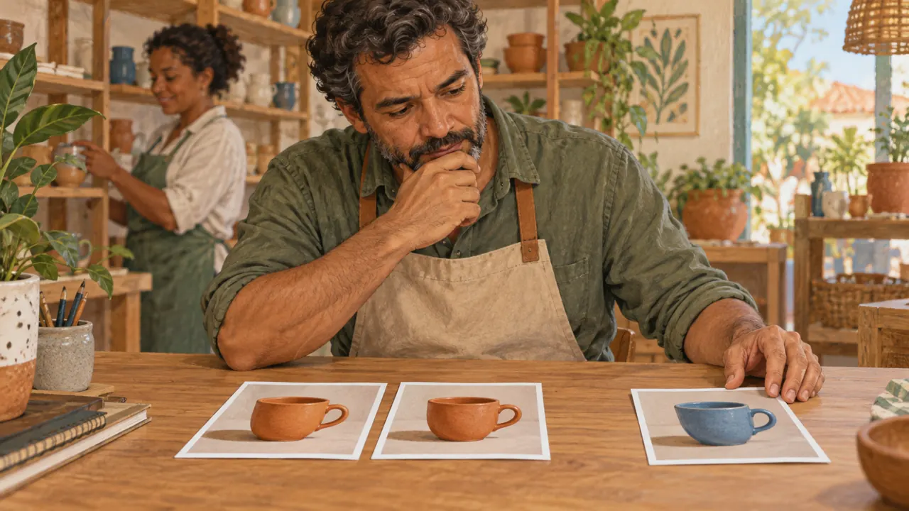
Look at the illustration: The blue piece stands out from the two terracotta ones. Here, color is the problem; changing the framing would be a possible choice.
Test yourself
One scene has two handles; the others are correct. What is the most precise action?
If you got stuck here, that is normalIf they all look different, start with one characteristic: the number of handles. Then move on to color.
Practice now 0/3
Review the set
About 10 minutes. You are done when you have identified a problematic difference and defined a correction.
Use your own photos or ones you are authorized to use. Fill out the brief on paper or in Notes. If the exercise asks you to edit, keep the original and work on a copy.
Problem piece: <name>.
Observed difference: <evidence>.
Is it intentional? <yes or no>.
Fix: <one part>.
Preserve: <rest of the image>.
By following the steps, you can evaluate a small series and identify a specific correction.
Lesson cheat sheet
Review the set and fix the piece that stands out
View the images together.
Look for differences in identity and visual language.
Fix the piece causing the problem.
Your next step
You now have criteria for evaluating a small series and identifying a specific correction.
Use this lesson’s brief with an image from your work. Set aside ten minutes and note the decision you made.
Next step: Choose the scope of the edit
Supplementary material · module 4Activities and guidance for the two topics. Not included in the lesson time.
Make a contact sheet
Experiment at your own pace
Arrange the six frames in a grid. Label each difference: smaller handle, different shirt, reversed lighting. Fix identity errors first; then adjust variations in finish.
What to observe
Avoid choosing only the individually prettiest images. Consistency and scene purpose are separate criteria from individual visual impact.
Fix the point that breaks the series
Experiment at your own pace
Choose the frame with the biggest deviation, attach it, and request an objective change. Save it as a new version. Put it back on the contact sheet to check whether the set improved.
What to observe
Do not accept a corrected hand if the mug changed shape. The final review must check the brief’s invariants again.
Complete prompt to try
Original example to try in the tool you already use. Results vary; check against the criterion before approving.
Create a scene for the fictional brand Aurora. A fictional adult craftswoman with short gray hair, a simple blue shirt, and a beige apron holds a terracotta mug with an oval handle. Use the attached mug reference for its shape and material. Studio setting with a light table, soft side window light, medium framing. The hand should support the mug plausibly. Do not include logos or text. Preserve the character’s appearance in future edits based on this approved image.
Check
The required reference is the approved mug. After creating the first character image, also save her portrait and use it in later scenes; check the face, clothes, hands, and product.
Lesson 12 · Image Prompting v6.2 · INEMA.CLUB PRO
Module 5 · Lesson 13 of 21
Choose the scope of the edit
You can distinguish between correcting the whole image and correcting one region.
A small flaw does not require changing the whole scene. Defining the area helps preserve what already works.
In 1 minute
A global edit affects the whole image.
A local edit changes one region.
The selection must cover the relevant area.
1Global or local: what is the scope?
A global edit changes the whole image, such as its contrast or temperature.
A local edit changes one area, such as removing an object.
The scope should match the problem you observed.
Asking for a new atmosphere to remove a distraction is a larger intervention than necessary.
Choosing the smallest scope reduces the number of things to check.
Joana chooses a global correction when the entire scene is dark. For an isolated spot, she prefers a local correction.
Prompts to compare · teaching example
PromptChange the whole image to remove a small spot from the background.
There are no observable limits to check the work against.
PromptSelect only the spot and a small border around it. Rebuild the cream background while preserving the mug, shadow, and framing.
One change is defined, along with something that must stay the same.
Compare the two instructions. They are examples written for this lesson, with no simulated tool response.
2Mask: show where to edit
A mask marks the region that can be changed.
Inpainting fills in or reconstructs that area.
The meaning of white, black, or selected varies by editor.
A mask needs to define the object area and allow it to blend with the edges.
Including too much area can change what you wanted to preserve.
Mauro marks the part of the background that needs to change. He checks whether the selection touches the mug’s edge.
Completed brief · lesson example
1Problem across the whole scene → global adjustment
2Problem in one region → local adjustment
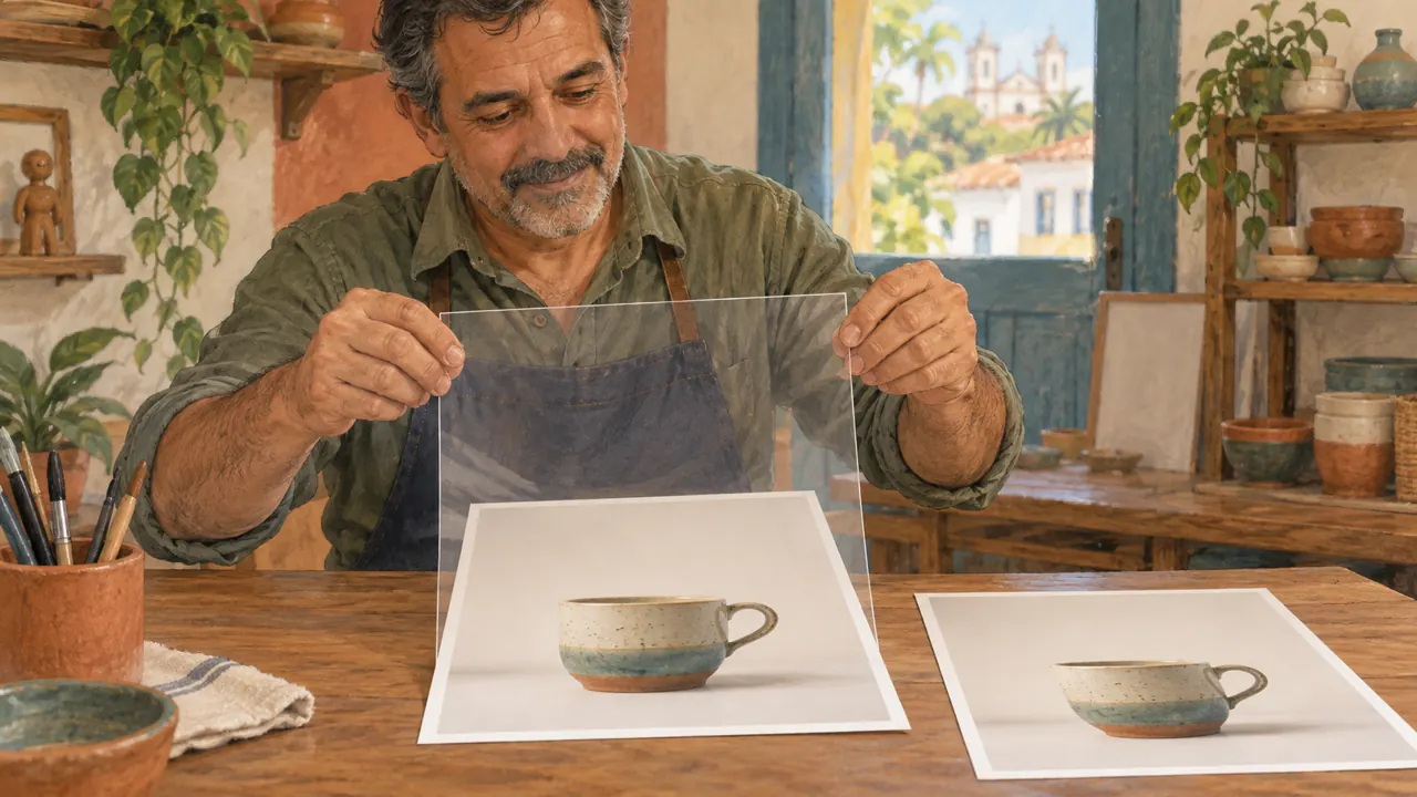
3Check → seam, outline, and shadow
Use this brief as a reference. Replace the example with your own product.
3Check the decision against its use
After editing, look at the edge of the corrected area. A spot can disappear and leave a visible seam.
Mauro uses the note below to decide: check → seam, outline, and shadow.
Look at the illustration: The small selection covers the spot in the background. Protect the rest of the object during the correction.
Test yourself
Only one spot in the background is wrong. What scope should you choose?
If you got stuck here, that is normalDoes your tool prevent you from selecting an area? Plan the change in writing and use an editor you already know if you need to carry it out.
Practice now 0/3
Plan a localized edit
About 10 minutes. You are done when the scope of the change and the areas to preserve are clear.
Use your own photos or ones you are authorized to use. Fill out the brief on paper or in Notes. If the exercise asks you to edit, keep the original and work on a copy.
Fix only: <region>.
Rebuild as: <appearance>.
Preserve: <product, shadow, and frame>.
Then check: <edge, texture, and contact>.
By following the steps, you can distinguish between correcting the whole image and correcting one region.
Lesson cheat sheet
Choose the scope of the edit
A global edit affects the whole image.
A local edit changes one region.
The selection must cover the relevant area.
Your next step
You now have criteria for distinguishing between a whole-image correction and a correction to one region.
Use this lesson’s brief with an image from your work. Set aside ten minutes and note the decision you made.
Next step: Expand the frame and check the blend
Supplementary material · module 5Activities and guidance for the two topics. Not included in the lesson time.
Global or local: what is the scope?
Experiment at your own pace
Describe one problem in your image. Classify it as global, local, structural, or layout-related. Choose a method before opening the editor.
What to observe
A local request in natural language does not guarantee pixel-by-pixel preservation. Compare the entire result and keep the original.
Mask: show where to edit
Experiment at your own pace
Draw the image outline on paper and circle the flawed area. Write “preserve” on the other areas. If you edit in a tool, select the area with a small margin and check the whole result.
What to observe
Check how the tool interprets the mask before applying it. If you are removing a duplicate handle, protect the correct handle and review the shadow and outline after editing.
Complete prompt to try
Original example to try in the tool you already use. Results vary; check against the criterion before approving.
Edit a copy of the image. Remove only the marked spot in the background and rebuild the cream background in that area. Preserve the mug, outline, color, framing, and shadow. Do not expand the frame.
Check
Compare the corrected area and its edge. Check that the spot is gone, that there is no seam, and that the product and shadow stayed the same.
Lesson 13 · Image Prompting v6.2 · INEMA.CLUB PRO
Module 5 · Lesson 14 of 21
Expand the frame and check the blend
You can plan an image expansion without losing contact with the surface or perspective.
Adding space around the product can solve a format problem. But the new background needs to fit the existing scene.
In 1 minute
Expansion creates content outside the original area.
Preserve the object’s scale and perspective.
Check the light, shadow, and contact with the table.
1Expansion creates content outside the frame
Outpainting generates content beyond the original area.
It can adapt a vertical image to a horizontal format or create room for text, preserving the subject when possible.
A crop only reduces the area; expansion adds content.
Knowing the difference prevents you from stretching an image and deforming the product to fit the format.
Joana needs a horizontal banner. She expands the setting instead of distorting the mug.
Weak decision
Stretch the mug to fill a horizontal design.
Verifiable decision
Preserve the mug and expand the cream background at the sides. Keep the table, perspective, and direction of the existing shadow.
Notice which characteristics make the second decision easy to check.
2Blend the object, light, and background
An inserted object looks like it belongs in the scene when scale, perspective, light, and contact with the surface are consistent.
The contact shadow is the dark area near where the object touches the surface.
Changing the background without considering these relationships makes the image look like a cutout pasted in.
The correction needs to account for all the visual clues, not just the edge.
Mauro sees that the piece looks like it is floating after a composite. He asks for a contact shadow that fits the table.
Completed brief · lesson example
1Object → same scale and outline
2New background → table continues naturally
3Contact → shadow next to the base
Use this brief as a reference. Replace the example with your own product.
3Check the decision against its use
Expansion invents new content. Do not treat details created outside the frame as documentation of the original location.
Mauro uses the note below to decide: contact → shadow next to the base.
Look at the illustration: The background grows around the original frame. The object does not need to be stretched to fit a horizontal format.
Test yourself
The mug looks like it is floating after the composite. What should you check?
If you got stuck here, that is normalIf you are not sure how to judge perspective, look at the table edge. It should continue in a consistent direction in the new area.
Practice now 0/3
Write a verifiable expansion prompt
About 10 minutes. You are done when the planned expansion does not require deforming the product.
Use your own photos or ones you are authorized to use. Fill out the brief on paper or in Notes. If the exercise asks you to edit, keep the original and work on a copy.
Expand the background to <format>.
Keep <object> the same shape and scale.
Continue <table and background>.
Preserve the direction of the light and the contact shadow.
Do not add other objects.
By following the steps, you can plan an image expansion without losing contact with the surface or perspective.
Lesson cheat sheet
Expand the frame and check the blend
Expansion creates content outside the original area.
Preserve the object’s scale and perspective.
Check the light, shadow, and contact with the table.
Your next step
You now have criteria for planning an image expansion without losing contact with the surface or perspective.
Use this lesson’s brief with an image from your work. Set aside ten minutes and note the decision you made.
Next step: Keep the text editable and record the change
Supplementary material · module 5Activities and guidance for the two topics. Not included in the lesson time.
Expansion creates content outside the frame
Experiment at your own pace
Extend the canvas on one side and describe how the background and table should continue. Keep the base image in place. Check the horizon line, shadows, and transition between the original and generated areas.
What to observe
The model may invent new objects in open areas. Ask for a simple continuation and check joins, repetition, and changes in texture.
Blend the object, light, and background
Experiment at your own pace
Observe the direction of light on the product. Choose or generate a compatible background. Check that the base touches the table and that the shadow starts at the contact point, with no gap that makes the object float.
What to observe
A beautiful background with light coming from the opposite direction can make the result worse. Do not use excessive blur to hide every mismatch.
Complete prompt to try
Original example to try in the tool you already use. Results vary; check against the criterion before approving.
Edit a copy of the provided image. Preserve the product, its scale, and its color. Expand only the setting to a horizontal frame. Continue the background and table without adding objects. Keep a consistent shadow next to the base.
Check
Compare the expanded copy with the original. Check the product’s scale, table continuity, light direction, and shadow next to the base. Do not stretch the object.
Lesson 14 · Image Prompting v6.2 · INEMA.CLUB PRO
Module 5 · Lesson 15 of 21
Keep the text editable and record the change
You can plan text on a separate layer and record a comparison plan.
One misspelled word can ruin finished artwork. Separating text from the image makes correction and reuse easier.
In 1 minute
Generate the scene with room for text.
Write titles in an editor that lets you correct them.
Plan a comparison with a similar crop.
1Text and branding on an editable layer
A layer is a separate element in a composition.
Keeping text and a logo on separate layers lets you fix spelling, size, position, and color without regenerating the photo.
AI can produce text that is useful for study, but the final file needs review.
Exact typography and color codes require control in a layout editor.
Joana leaves room in the frame and adds the title later. That lets her change the message without changing the product.
Weak decision
Regenerate the entire product to fix one letter in the title.
Verifiable decision
Keep the image without text. Add the title on an editable layer and correct only the word that needs it.
Notice which characteristics make the second decision easy to check.
2Edit history and before/after
A useful before-and-after keeps framing and scale comparable.
The history records the problem, the intervention, and the approval criterion.
This makes the review explainable.
Without the original, it is hard to know whether you corrected something or only changed the style.
The comparison helps you notice losses of identity and invented details.
Mauro presents the before and after at the same size. The difference shows the actual correction without favoring one version through its crop.
Completed brief · lesson example
1Image → product and open space
2Text → separate, editable element
3Record → problem, intervention, and result
Use this brief as a reference. Replace the example with your own product.
3Check the decision against its use
Read the text at the size it will be published. Looking only at an enlarged image can hide a readability problem on a phone.
Mauro uses the note below to decide: record → problem, intervention, and result.
Look at the illustration: The transparent sheet represents a separate layer. The clean image is still saved for another composition.
Test yourself
The title has a spelling error. Which arrangement makes it easier to fix?
If you got stuck here, that is normalDo you not use an editor with layers? Always keep the version without text. That lets you redo the caption without rebuilding the image.
Practice now 0/3
Prepare the text and review plan
About 10 minutes. You are done when text and image have separate roles and the comparison has a criterion.
Use your own photos or ones you are authorized to use. Fill out the brief on paper or in Notes. If the exercise asks you to edit, keep the original and work on a copy.
Base image: <file without text>.
Title: <exact text>.
Open area: <description>.
Before: <problem>. After: <change>.
Comparison: same crop and size.
By following the steps, you can plan text on a separate layer and record a comparison plan.
Lesson cheat sheet
Keep the text editable and record the change
Generate the scene with room for text.
Write titles in an editor that lets you correct them.
Plan a comparison with a similar crop.
Your next step
You now have criteria for planning text on a separate layer and recording a comparison plan.
Use this lesson’s brief with an image from your work. Set aside ten minutes and note the decision you made.
Next step: Enlargement cannot recover a lost truth
Supplementary material · module 5Activities and guidance for the two topics. Not included in the lesson time.
Text and branding on an editable layer
Experiment at your own pace
Export the image without text, open it in your preferred editor, and add Aurora and a short phrase. Test readability on a phone and leave margins at the edges.
What to observe
Do not claim font fidelity or an exact HEX color just because the prompt mentions them. Use the correct brand file and adjust colors directly on the layers.
Edit history and before/after
Experiment at your own pace
Save v01-original, v02-edited, and v03-final. Write one sentence for each change. Compare as a thumbnail, at display size, and enlarged. Approve only when the problem is solved without losing the invariants.
What to observe
A later version is not necessarily better. Return to the previous one when a local improvement causes an important loss elsewhere.
Complete prompt to try
Original example to try in the tool you already use. Results vary; check against the criterion before approving.
Edit a copy of the provided image. Preserve the product, its scale, and its color. Expand only the setting to a horizontal frame. Continue the background and table without adding objects. Keep a consistent shadow next to the base.
Check
Compare the expanded copy with the original. Check the product’s scale, table continuity, light direction, and shadow next to the base. Do not stretch the object.
Lesson 15 · Image Prompting v6.2 · INEMA.CLUB PRO
Module 6 · Lesson 16 of 21
Enlargement cannot recover a lost truth
You can distinguish an increase in size from an invented detail.
An enlarged image can look sharper and still invent texture. A convincing appearance does not prove fidelity to the object.
In 1 minute
Dimensions need to fit the intended use.
Making an image larger does not guarantee true detail.
Compare the enlarged version with the reference.
1Pixels, size, and destination
A pixel is the sampling unit of a digital image.
Resolution describes an image’s dimensions in pixels.
The required size depends on its use; a thumbnail and a large print have different requirements.
Generating a huge file without a need uses resources.
Delivering a small file for a large display area causes visible loss of definition.
Joana notices a new crack after enlarging the photo. She checks the reference before presenting it as a detail of the piece.
Prompts to compare · teaching example
PromptEnlarge a blurry photo and assume the new inscription was on the object.
There are no observable limits to check the work against.
PromptUse the enlargement for presentation and check inscriptions, texture, and outline against the original photo. Mark anything invented as reconstructed.
One change is defined, along with something that must stay the same.
Compare the two instructions. They are examples written for this lesson, with no simulated tool response.
2Interpolation and invented detail
Interpolation increases the pixel grid by estimating values between existing samples.
Generative upscaling can create plausible details.
Plausible means it looks believable, not that it existed in the original.
An image can become sharper and less faithful at the same time.
This distinction is essential for faces, documents, inscriptions, or products with specific details.
Mauro chooses the dimensions needed for the catalog. He avoids generating huge files without a use for them.
Completed brief · lesson example
1Size → dimensions needed for the destination
2Appearance → may look sharper
3Fidelity → requires a reference and a check
Use this brief as a reference. Replace the example with your own product.
3Check the decision against its use
For documents or evidence, do not accept reconstructed details as recovered information. For visual creation, decide whether the change is acceptable.
Mauro uses the note below to decide: fidelity → requires a reference and a check.
Look at the illustration: The magnifying glass helps compare the reference texture. Enlargement can create details that were not in the original image.
Test yourself
The enlargement created an inscription that was unreadable before. How should you treat it?
If you got stuck here, that is normalDo you not know the ideal dimensions? First check the requirements of the place where the image will be used. Do not choose the largest number.
Practice now 0/3
Set a criterion for enlargement
About 10 minutes. You are done when the plan separates desired size from required fidelity.
Use your own photos or ones you are authorized to use. Fill out the brief on paper or in Notes. If the exercise asks you to edit, keep the original and work on a copy.
Destination: <use>.
Current dimensions: <observed or unknown value>.
Required dimensions: <known or to-be-confirmed requirement>.
Do not invent: <details>.
Reference for checking: <file>.
By following the steps, you can distinguish an increase in size from an invented detail.
Lesson cheat sheet
Enlargement cannot recover a lost truth
Dimensions need to fit the intended use.
Making an image larger does not guarantee true detail.
Compare the enlarged version with the reference.
Your next step
You now have criteria for distinguishing an increase in size from an invented detail.
Use this lesson’s brief with an image from your work. Set aside ten minutes and note the decision you made.
Next step: Correct the shape and inspect at three scales
Supplementary material · module 6Activities and guidance for the two topics. Not included in the lesson time.
Pixels, size, and destination
Experiment at your own pace
Check the intended destination and record the required width, height, and aspect ratio. Open the current file’s properties and compare. For a web exercise, use a size that fits the display area.
What to observe
Writing 4K in the prompt does not prove the resolution. Check the downloaded file; the interface option may also refer to a later enlargement.
Interpolation and invented detail
Experiment at your own pace
Compare a basic enlargement with a generative restoration, if you have access to both. Look at edges, patterns, and letters. Mark any detail that appeared only afterward.
What to observe
Do not present invented detail as verified recovery. A very small image does not contain enough information for guaranteed reconstruction.
Complete prompt to try
Original example to try in the tool you already use. Results vary; check against the criterion before approving.
Use the attached image as the base. Make a conservative restoration, reducing compression artifacts while keeping the mug’s outline, handle, and shadow position. Preserve the small irregularities already visible in the glaze. Avoid inventing inscriptions, marks, or new patterns. Deliver the highest resolution available in this tool without changing the aspect ratio.
Check
Check the file’s actual dimensions. Compare edges, texture, and details with the original. The prompt does not guarantee 4K, perfect identity, or recovery of missing information.
Lesson 16 · Image Prompting v6.2 · INEMA.CLUB PRO
Module 6 · Lesson 17 of 21
Correct the shape and inspect at three scales
You can review structure, real-world use, and small flaws in an image.
Enlarging a flaw may only make it sharper. Each viewing size answers a different question.
In 1 minute
Correct the outline and number of parts first.
View the image as a thumbnail and at its intended display size.
Enlarge it to look for seams and artifacts.
1Enlarge only after fixing the structure
Structure includes outline, proportions, number of elements, and composition.
Upscaling improves how an image is presented, but it is not the best way to fix a wrong handle or a cropped object.
Enlarging too early can make errors more obvious and increase the correction work.
The order of steps should prioritize the bigger decisions first.
Joana rejects the extra handle before improving the definition. The problem is the shape, not the number of pixels.
Weak decision
Enlarge a mug with two handles and expect its structure to fix itself.
Verifiable decision
Fix the extra handle first. Then check hierarchy in the thumbnail, readability at display size, and edges when enlarged.
Notice which characteristics make the second decision easy to check.
2Inspect at three scales
A thumbnail shows hierarchy and unity; display size shows real readability; enlargement shows edges and artifacts.
None of these views replaces the others.
A texture may look impressive when enlarged and distracting at final size.
A logo may look right from a distance and have broken letters up close.
Mauro views the piece on his phone and then enlarges it. The first view shows readability; the second reveals a seam in the background.
Completed brief · lesson example
1Thumbnail → recognizable subject
2Display size → readable text and product
3Enlarged view → edges, seams, and flaws
Use this brief as a reference. Replace the example with your own product.
3Check the decision against its use
A piece can pass close inspection and fail as a thumbnail. Approval needs to consider the size at which the audience will see the image.
Mauro uses the note below to decide: enlarged view → edges, seams, and flaws.
Look at the illustration: The thumbnail, normal view, and enlarged detail answer different questions about the same piece.
Test yourself
The product is not recognizable in the thumbnail. What should you review first?
If you got stuck here, that is normalDo not search endlessly for flaws. Choose one important edge and one textured area to inspect when enlarged.
Practice now 0/3
Inspect the same image at three scales
About 10 minutes. You are done when you have recorded one observation at each scale.
Use your own photos or ones you are authorized to use. Fill out the brief on paper or in Notes. If the exercise asks you to edit, keep the original and work on a copy.
Thumbnail: <what I recognize>.
Actual use: <what I can read>.
Enlarged view: <flaw or edge checked>.
Fix first: <structural problem, if any>.
By following the steps, you can review structure, real-world use, and small flaws in an image.
Lesson cheat sheet
Correct the shape and inspect at three scales
Correct the outline and number of parts first.
View the image as a thumbnail and at its intended display size.
Enlarge it to look for seams and artifacts.
Your next step
You now have criteria for reviewing structure, real-world use, and small flaws in an image.
Use this lesson’s brief with an image from your work. Set aside ten minutes and note the decision you made.
Next step: Export a copy and approve it for its intended use
Supplementary material · module 6Activities and guidance for the two topics. Not included in the lesson time.
Enlarge only after fixing the structure
Experiment at your own pace
Review the shape and composition in the base image. Fix local problems. Only then make the necessary enlargement and review it again. Keep the previous file for comparison.
What to observe
Do not repeat enlargements automatically. Each pass can reinforce artifacts and invent texture; stop when the final use is supported.
Inspect at three scales
Experiment at your own pace
First, view the thumbnail. Then open it at the size planned for publication. Finally, enlarge an edge or a textured area. Note one problem per scale or record that the criterion was met.
What to observe
Avoid judging only at extreme zoom. The final decision should consider where the image will be used.
Complete prompt to try
Original example to try in the tool you already use. Results vary; check against the criterion before approving.
Use the attached image as the base. Make a conservative restoration, reducing compression artifacts while keeping the mug’s outline, handle, and shadow position. Preserve the small irregularities already visible in the glaze. Avoid inventing inscriptions, marks, or new patterns. Deliver the highest resolution available in this tool without changing the aspect ratio.
Check
Check the file’s actual dimensions. Compare edges, texture, and details with the original. The prompt does not guarantee 4K, perfect identity, or recovery of missing information.
Lesson 17 · Image Prompting v6.2 · INEMA.CLUB PRO
Module 6 · Lesson 18 of 21
Export a copy and approve it for its intended use
You can prepare a deliverable with its format and quality checked.
A file that looks good in the editor may be too large or become hard to read after saving. The review needs to include the final copy.
In 1 minute
Save the original and export a copy.
Reduce the file size without destroying what matters.
Open the final file and check it.
1Exporting and compression
Exporting means saving a version suited to its destination.
Compression reduces file size, sometimes by discarding information.
JPEG is common for photography; PNG is useful when transparency or graphic elements call for different handling.
The working file and the deliverable file can serve different purposes.
Keeping the source lets you export again without accumulating losses.
Joana keeps the working image and creates a copy for the shop. That way, she can prepare the deliverable again without losing the original.
Weak decision
Send the first export without opening the file.
Verifiable decision
Save a copy for its destination. Open it again and check dimensions, text, and edges. Keep the original separate.
Notice which characteristics make the second decision easy to check.
2Approve it using visible criteria
A final review should return to the brief: correct product, format, consistent light, legibility, and no significant defects.
Quality is a decision documented for a specific use.
Without criteria, the process becomes an endless search for a prettier version.
Approval should explain why the image works for the task.
Mauro notices blotches after heavy compression. He compares the final file with the previous version before publishing.
Completed brief · lesson example
1Original → preserved for editing
2Final copy → suited to its destination
3Check → open, inspect, then deliver
Use this brief as a reference. Replace the example with your own product.
3Check the decision against its use
Approval means meeting the request. Check the format, product, light, and legibility in the actual file you will deliver.
Mauro uses this note to decide: check → open, inspect, then deliver.
Look at the illustration: The image is checked on a phone at its intended display size. The original copy stays separate for future edits.
Test yourself
The file is smaller, but the title is harder to read. What should you do?
If you got stuck here, that is normalIf the app offers only one save option, keep that copy and check its details before looking for another editor.
Practice now 0/3
Check a deliverable copy
About 10 minutes. You are done when you have opened the final copy and evaluated it for its intended use.
Use your own photos or ones you are authorized to use. Fill out the brief on paper or in Notes. If the exercise asks you to edit, keep the original and work on a copy.
Final file: <name>.
Destination: <use>.
Format and dimensions: <observed values>.
Product and text: <checked>.
Decision: <approved or revise>.
Reason: <evidence>.
After completing the steps, you can prepare a deliverable with a checked format and quality.
Lesson cheat sheet
Export a copy and approve it for its intended use
Save the original and export a copy.
Reduce the file size without destroying what matters.
Open the final file and check it.
Your next step
You now have criteria for preparing a deliverable with a checked format and quality.
Use this lesson’s brief with an image from your work. Set aside ten minutes and note the decision you made.
Next step: Define three pieces and what changes between them
Supplementary material · module 6Activities and guidance for the two topics. Not included in the lesson time.
Exporting and compression
Experiment at your own pace
Keep a high-quality version and export a copy for the web. Open the copy and check its dimensions, file size, and edges. If the tool offers WebP, compare how it looks in the browser your audience uses.
What to observe
Do not rename the extension to convert the format. Do not repeatedly save the only copy as low-quality JPEG.
Approve it using visible criteria
Experiment at your own pace
Evaluate shape, light, composition, and consistency. For each criterion: zero means it fails; one means it needs revision; two means it meets the requirement. Record evidence for every score. Lesson 20 has the full rubric.
What to observe
The rubric total should not hide a disqualifying error, such as the wrong product or incorrect text. Record these problems separately.
Complete prompt to try
Original example to try in the tool you already use. Results vary; check against the criterion before approving.
Use the attached image as the base. Make a conservative restoration, reducing compression artifacts while keeping the mug’s outline, handle, and shadow position. Preserve the small irregularities already visible in the glaze. Avoid inventing inscriptions, marks, or new patterns. Deliver the highest resolution available in this tool without changing the aspect ratio.
Check
Check the file’s actual dimensions. Compare edges, texture, and details with the original. The prompt does not guarantee 4K, perfect identity, or recovery of missing information.
Lesson 18 · Image Prompting v6.2 · INEMA.CLUB PRO
Module 7 · Lesson 19 of 21
Define three pieces and what changes between them
You can plan a three-image project with clear limits.
Without a defined scope, the project grows with every attempt. Three pieces with clear purposes are enough to demonstrate a complete process.
In 1 minute
State which files you will deliver.
Keep the product and palette consistent.
Vary the framing to suit each purpose.
1Set the scope before generating
Scope defines what will be delivered.
This project includes three images, a before-and-after comparison, a generation brief, and a short account of your decisions.
The goal is to demonstrate direction and revision, not volume.
A small set lets you care for every detail and see the relationship between the brief and the result.
Limiting the deliverables also helps you finish.
Joana chooses three images to present the piece. She defines the end of the project before starting more attempts.
Prompts to compare · teaching example
PromptKeep generating until there is a complete campaign, with no limit on the number of pieces.
There are no observable limits to check the work against.
PromptDeliver three images: whole product, detail, and in use. Preserve the terracotta mug and a consistent background. Include one documented revision.
One change is defined, along with something that must stay the same.
Compare the two instructions. They are examples written for this lesson, with no simulated tool response.
2Build a variation matrix
A variation matrix organizes what stays fixed and what changes in each image.
Across all three pieces, keep the product, palette, and lighting logic consistent; vary the purpose, shot, and setting deliberately.
The matrix turns loose choices into a series.
It also helps diagnose whether a difference is intentional or a generation error.
Mauro builds a simple matrix: the product and palette stay fixed; the crop and purpose vary for each piece.
Completed brief · lesson example
1Piece 1 → whole product, identification
2Piece 2 → detail, finish
3Piece 3 → in use, everyday context
Use this brief as a reference. Replace the example with your own product.
3Check the decision against its use
Add another piece only if it meets a need. Do not expand the project to hide an image that still needs correction.
Mauro uses this note to decide: piece 3 → in use, everyday context.
Look at the illustration: Three pieces have different purposes: whole product, detail, and in use. The main characteristics should stay the same.
Test yourself
Which variation preserves the planned consistency?
If you got stuck here, that is normalIf three pieces feel like a lot, plan all of them and work on one per session. The plan stays small and verifiable.
Practice now 0/3
Write the scope of your final project
About 10 minutes. You are done when all three pieces are described and the project limit is set.
Use your own photos or ones you are authorized to use. Fill out the brief on paper or in Notes. If the exercise asks you to edit, keep the original and work on a copy.
Product: <name>.
Deliverables: three images and one documented revision.
Piece 1: <purpose and frame>.
Piece 2: <purpose and frame>.
Piece 3: <purpose and frame>.
Fixed: <identity and palette>.
Attempt limit: <reasonable number>.
After completing the steps, you can plan a three-image project with clear limits.
Lesson cheat sheet
Define three pieces and what changes between them
State which files you will deliver.
Keep the product and palette consistent.
Vary the framing to suit each purpose.
Your next step
You now have criteria for planning a three-image project with clear limits.
Use this lesson’s brief with an image from your work. Set aside ten minutes and note the decision you made.
Next step: Choose using criteria and show a revision
Supplementary material · module 7Practice and considerations for both topics. Not included in lesson time.
Set the scope before generating
Experiment at your own pace
Use the five lines you wrote for lesson 1 in the practice brief. If you skipped that lesson, write the product, audience, use, intention, and three required characteristics. Define the purpose of the three pieces before generating.
What to observe
Do not add a video, a new logo, and a complete catalog in the middle of the project. Note future ideas and finish the agreed set.
Build a variation matrix
Experiment at your own pace
Fill in three rows on the brief: product, detail, and in use. For each row, write the framing, action, reference, and approval criterion. Generate one piece at a time.
What to observe
Do not change the light, style, character, and product all at once just to make the series look varied. Preserve the cues that identify the fictional brand.
Complete prompt to try
Original example to try in the tool you already use. Results vary; check against the criterion before approving.
Create a photograph for the fictional Aurora campaign using the attached reference of the approved mug. Preserve its terracotta body, oval handle, and matte finish. Show the mug on a light table in a simple studio, with soft light from a side window. Keep the terracotta, cream, and subtle blue palette. Leave open space above the product. Generate one image only; do not make a collage or add text.
Check
Create three separate images: whole product, glaze detail, and in use. Record the changed decision for each one, and keep references and settings with the files.
Lesson 19 · Image Prompting v6.2 · INEMA.CLUB PRO
Module 7 · Lesson 20 of 21
Choose using criteria and show a revision
You can justify selecting an image and improving it.
Saying a piece looks better does not show what you learned. Explaining a choice makes the process more reliable.
In 1 minute
Use the same criteria for every piece.
Give evidence for each evaluation.
Show a change that solved a problem.
1Choose with a rubric and explain why
A rubric is a list of criteria for evaluating work.
For this project, we use shape, light, composition, and consistency.
Zero means it fails; one means it needs revision; two means it meets the requirement.
Write evidence for each score and call out problems that prevent use.
Explaining your choice builds vocabulary for directing images.
A score alone teaches little; evidence like “complete handle” and “consistent shadow” shows what you observed.
Joana gives the shape a low score when an extra handle appears. She writes the reason alongside the evaluation.
Weak decision
Choose the image you like best without explaining why.
Verifiable decision
Evaluate shape, light, composition, and consistency. Record: complete handle, matching shadow, and space for a title. Document the crop correction.
Notice which characteristics make the second decision easy to check.
2Present a traceable revision
A case study shows the prompt, relevant attempts, correction, and result.
The before-and-after should reveal a decision that made a difference, such as making room for a title or fixing an object.
Showing your process makes your learning verifiable.
It also keeps your portfolio from becoming a sequence of images with no explanation.
Mauro shows a framing correction with two versions at the same size. The comparison reveals the problem he solved.
Completed brief · lesson example
1Shape → one handle and complete rim
2Composition → clear subject and planned space
3Revision → corrected crop without changing the product
Use this brief as a reference. Replace the example with your own product.
3Check the decision against its use
The score summarizes the evidence. A high score without a concrete observation does not explain approval.
Mauro uses this note to decide: revision → corrected crop without changing the product.
Look at the illustration: The two versions show the cropping problem and its revision. Also judge whether the product changed beyond what was requested.
Test yourself
Which reason supports approval?
If you got stuck here, that is normalCannot find Crop? Look in Edit in the gallery. If the option is unavailable, leave the practice pending until you have an editor available. Do not claim to have made an edit you did not make.
Practice now 0/3
Make and document a framing correction
About 10 minutes. You are done when an actual edit has been compared with the original and you have justified a decision.
Use your own photos or ones you are authorized to use. Fill out the brief on paper or in Notes. If the exercise asks you to edit, keep the original and work on a copy.
Shape: <0, 1, or 2> because <evidence>.
Light: <score> because <evidence>.
Composition: <score> because <evidence>.
Consistency: <score> because <evidence>.
Revision made: <change or attempt undone>.
Check: <what improved or got worse>.
After completing the steps, you can justify selecting an image and improving it.
Lesson cheat sheet
Choose using criteria and show a revision
Use the same criteria for every piece.
Give evidence for each evaluation.
Show a change that solved a problem.
Your next step
You now have criteria for justifying the selection and improvement of an image.
Use this lesson’s brief with an image from your work. Set aside ten minutes and note the decision you made.
Next step: Deliver the set and recognize your independence
Supplementary material · module 7Practice and considerations for both topics. Not included in lesson time.
Choose using the rubric and explain your choice
Experiment at your own pace
Compare two candidates for the same purpose. Score them and write one piece of evidence for each criterion. Choose the one that best meets the brief, even if the other is more eye-catching.
What to observe
The rubric is a study tool, not a scientific measure of beauty. Adjust the criteria when the goal changes.
Present a traceable review
Experiment at your own pace
Choose one edit and write down: observed problem, change made, and checked result. Use images at comparable scales. Identify the pieces as an original AI study for a fictional brand.
What to observe
Do not invent a client, published campaign, metrics, or commercial results. The value of the exercise is in the decisions and the quality shown.
Complete prompt to try
Original example to try in the tool you already use. Results vary; check against the criterion before approving.
Create a photograph for the fictional Aurora campaign using the attached reference of the approved mug. Preserve its terracotta body, oval handle, and matte finish. Show the mug on a light table in a simple studio, with soft light from a side window. Keep the terracotta, cream, and subtle blue palette. Leave open space above the product. Generate one image only; do not make a collage or add text.
Check
Create three separate images: whole product, glaze detail, and in use. Record the changed decision for each one, and keep references and settings with the files.
Lesson 20 · Image Prompting v6.2 · INEMA.CLUB PRO
Module 7 · Lesson 21 of 21
Deliver the set and recognize your independence
You can organize three pieces and explain the project decisions.
The project does not end when the image looks good. The recipient needs to understand which files to use and what was done.
In 1 minute
Separate final files from working materials.
Include a note about use and limitations.
Show what you can decide without copying the lesson.
1Assemble the delivery package
An organized package contains final images, authorized references, prompts, settings, and brief reuse instructions.
Keep test files separate from approved versions.
Another person—or you a month from now—needs to find the right image without opening dozens of files.
Good organization also lets you review only the piece that needs it.
Joana prepares a folder with the three final images. She keeps the attempts in another folder so the recipient will not confuse them.
Weak decision
Deliver a folder with mixed attempts and repeated filenames.
Verifiable decision
Separate three final images, authorized references, and a record of decisions. Explain the use of each piece and the review performed.
Notice which characteristics make the second decision easy to check.
2Review what you can do
Finishing a lesson and mastering a skill are different things.
The project should show that you can describe a scene and test one variable. You should also recognize an error and correct it without losing the intent.
The final review turns a finished exercise into concrete next steps.
Questions that remain show which module to revisit.
Mauro reads the delivery note and knows which image is for the catalog and which one shows the detail. He also knows what still needs review.
Completed brief · lesson example
1Finals → three clearly named images
2Record → prompt, reference, and review
3Note → use for each piece and actual pending work
Use this brief as a reference. Replace the example with your own product.
3Check the decision against its use
Finishing the lesson does not prove mastery. Evidence means being able to justify a choice, fix a flaw, and deliver usable files.
Mauro uses the note below to decide: note → use for each piece and actual pending work.
Look at the illustration: The three final pieces are kept separate from the references. The organization helps the recipient understand the set.
Test yourself
The project has two finished pieces and one that is only planned. How should you deliver it?
If you got stuck here, that is normalHave you not generated all three pieces yet? Record the plan as pending and produce one piece per session. Do not mark work that does not exist as finished.
Practice now 0/3
Assemble your project package
About 10 minutes. You are done when the package distinguishes approved deliverables, records, and pending work.
Use your own photos or ones you are authorized to use. Fill out the brief on paper or in Notes. If the exercise asks you to edit, keep the original and work on a copy.
Piece 1: <file and use>.
Piece 2: <file and use>.
Piece 3: <file and use>.
Visual decision: <choice and reason>.
Review performed: <problem and correction>.
Pending: <what is still missing or none>.
By following the steps, you can organize three pieces and explain the project decisions.
Lesson cheat sheet
Deliver the set and recognize your independence
Separate final files from working materials.
Include a note about use and limitations.
Show what you can decide without copying the lesson.
Your next step
You now have criteria for organizing three pieces and explaining the project decisions.
Use this lesson’s brief with an image from your work. Set aside ten minutes and note the decision you made.
Next step: Apply the method to another product and compare your decisions.
Supplementary material · module 7Practice and considerations for both topics. Not included in lesson time.
Assemble the delivery package
Experiment at your own pace
Create three folders: finals, references, and record. Use names that show each file’s purpose and version. Include a text file with usage instructions and limitations. Keep the images separate from the course progress export.
What to observe
Progress is saved in your browser. A separate copy of your progress does not include images you added from outside the course. Keep those image files too.
Review what you can do
Experiment at your own pace
Without looking at the text, explain an image through five decisions. Then write a new prompt for another object using the same reasoning. List one skill that is now clear and one that needs more practice.
What to observe
Do not mark a skill as mastered just because the image looks good. Check whether you can explain and repeat the process with a new example.
Complete prompt to try
Original example to try in the tool you already use. Results vary; check against the criterion before approving.
Create a photograph for the fictional Aurora campaign using the attached reference of the approved mug. Preserve its terracotta body, oval handle, and matte finish. Show the mug on a light table in a simple studio, with soft light from a side window. Keep the terracotta, cream, and subtle blue palette. Leave open space above the product. Generate one image only; do not make a collage or add text.
Check
Create three separate images: whole product, glaze detail, and in use. Record the changed decision for each one, and keep references and settings with the files.