Before and after
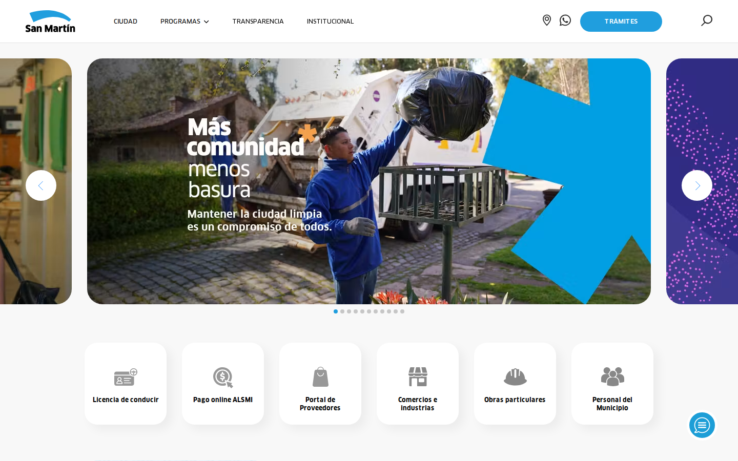
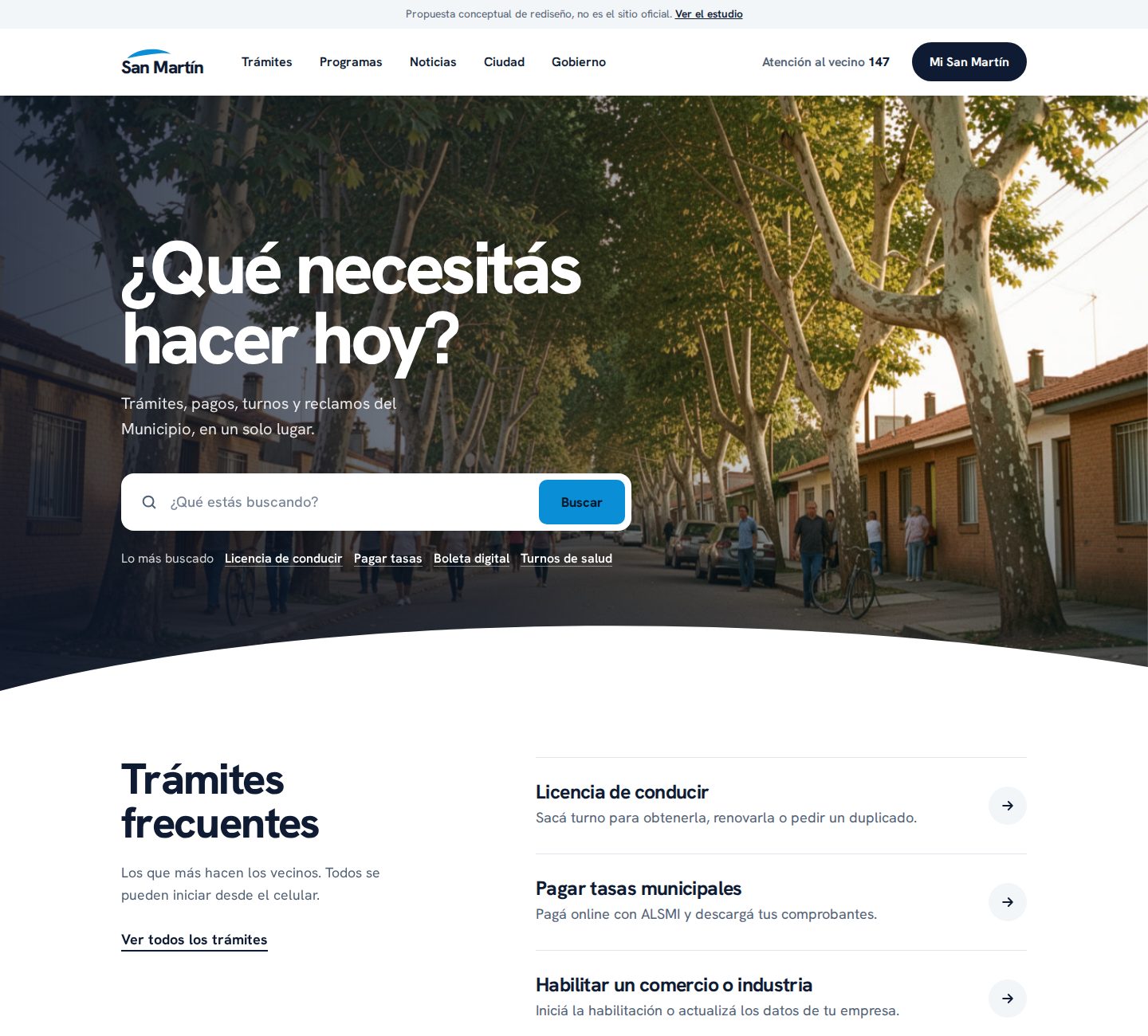
A diagnosis of sanmartin.gob.ar, what the best government websites do in 2026, and a homepage proposal in the style of a $10,000 project.
The brand is good (blue arc, campaign’s orange asterisk “Más comunidad*”), and the content exists. The problem is the architecture: the site is organized as a communications showcase, not as a service counter.

References: GOV.UK (world standard), Colorado (Best Government Site 2026 at the WebAward), Los Angeles, Denver, Utah, NYC, Chattanooga, and Mississippi.
People arrive with a question, not to browse. A large search bar centered on the first screen.
Utah, Denver, LA, OregonOrganize by “what I want to do” and “who I am,” not by the organizational chart.
Colorado, Chattanooga, TulareOnly the essential paths; everything else is handled through search and subpages. Loads quickly, less tiring.
NYC, Los AngelesWCAG 2.2 AA: 4.5:1 contrast, visible focus, keyboard access, real text (not in an image), large font.
GOV.UK, Washington D.C.Designed for someone paying a fee on their phone at 11 p.m. with 20% battery left.
Shadow Digital, 2026Real photos of people and neighborhoods; typography as a navigation tool, not decoration.
Mississippi, Brevard, Saint PaulIt doesn’t change the brand; it elevates it. The logo’s arc becomes the divider between sections (like the wave in the Helsinki Design System) and the frame for photos; the campaign’s orange asterisk appears in only two places. One typeface family, almost no borders, plenty of breathing room.
Sky#0A8FD6 brand, search, campaign
Sky text#0667A8 links and categories
Ink#0E1B33 text and blocks
Ink 2#516074 secondary text
Fog#F3F6F9 soft backgrounds
Orange#F07F1A asterisk and focus
Open, humanist grotesque, legible at small sizes and with poster weight at 800. Replaces FF Clan (paid) without losing the brand’s tone.
Hero title, section headings, list items, and body text (18px base, 1.6 line spacing).
Typical agency price range for a local government website with a CMS. Reference estimate, not a quote.
| Stage | Delivery | Property tax account |
|---|---|---|
| Discovery | Search/analytics analysis, interviews with residents, map of the 20 most common tasks | US$ 1.200 |
| Architecture and content | New task-based navigation, with process pages rewritten in plain language | US$ 1.800 |
| Design system | Tokens, components, homepage + 6 page templates, navigable prototype | US$ 2.500 |
| Development | Accessible front end on top of the current CMS (Prismic), search with synonyms | US$ 3.500 |
| Accessibility and launch | WCAG 2.2 AA audit, screen reader testing, performance, staff training | US$ 1.000 |