INEMA kit · website auditor
Did your AI-built website turn out beautiful and still look cheap?
It’s always the same 5 reasons. This kit measures all 5 on your page and tells you what to fix.

It’s always the same 5 reasons. This kit measures all 5 on your page and tells you what to fix.
site-que-vende is a kit that measures five patterns in a browser that distinguish a site that brings in customers from a site that looks “pretty and cheap” and was made with AI, then tells you what to fix. It’s for people who own a small business or build sites for small businesses. The kit opens your page on desktop and phone, measures text, color, layers, motion, and free sample, then returns a report with a list of fixes ready to paste into your coding agent (the AI program that edits files for you). To use it, you need Node.js and a terminal.
A trained eye gets tired and disagrees. The auditor opens the actual page at 1440×900 and 390×844, then measures it the same way every time.
First screen text, where the button's accent color appears, layers, what moves, and whether visitors have something to try. The score ranges from 0 de 5 to 5 de 5.
Along with a report you can open in a browser, it saves consertar.md: what failed and what to do, ready to paste into Claude Code, Codex, or Cursor.
One file, amostra.js, with a calculator and quiz configured with JSON. No dependencies, no network, no data collection.
| Component | File | What it does |
|---|---|---|
| Auditor | skill/site-que-vende/scripts/auditar.js | opens the page (URL or file), measures the 5 patterns, saves relatorio.html, relatorio.json, consertar.md, and screenshots |
| Measurements | skill/site-que-vende/scripts/medir.js | the code that runs inside the page (color, button, layers, motion, sample) |
| Samples | skill/site-que-vende/amostras/amostra.js | <amostra-calculadora> and <amostra-quiz>: one file, no dependencies, configured with JSON |
| Skill | skill/site-que-vende/SKILL.md | the 5 steps for the agent: brief, measure, fix, measure again, human review |
| Brief | skill/site-que-vende/referencias/brief.md | the questions to ask before design and the ready-to-paste request |
| Examples | exemplos/ruim/ and exemplos/bom/ | the same fictional business: one fails all 5, the other passes all 5 |
| Sample keys | skill/site-que-vende/referencias/amostras.md | all quiz and calculator JSON keys, color variables, and the result event |
| Tests | tests/rodar.sh | 38 checks: the bad example fails for the right reason, the good one passes, the samples work, and 7 cases that have fooled the auditor before still come out right |
For each pattern: the idea, the test number, what the auditor measures, and how to fix it. The numbers come from tests published by the people who ran them. When a number comes from a tool vendor, that is stated.
The first screen says who it is for, what they get, and what to do next.
When the right person lands on the first screen, they need to see themselves: their problem, their world, and a clear sign they are in the right place.
A job page for truck drivers was rebuilt around the drivers after they were interviewed: half accessed it on a phone, the headline offered no benefit, and the photo was a stock image of a handshake.
It does not measure whether the copy is true or speaks to the right person. That is why it returns the three human review questions.
The accent color appears only on clickable elements.
If you highlight a line in a book, you can find it in two seconds. If you highlight everything, you have highlighted nothing. AI puts the accent color on the headline, icons, border, background, and button. Then the button disappears.
The image desktop-marca-texto.png marks each incorrect use. See a real example in Before and after.
Scene in back, content in the middle, button in front.
On a cheap-looking site, everything is flat on the same plane, and your eye does not know where to start. On a stage, there is the painted backdrop, the furniture, and the actor. On a site: background (photo or shape), middle (the content), front (the button).
Text ready instantly, one thing moves per screen, and motion can be turned off.
Animation is the fastest way for a site to look expensive, and also the fastest way for it to look AI-generated. Every animation needs a job: show the product, point to the next step, or show what just happened.
prefers-reduced-motion: reduce: it must be zero.@media (prefers-reduced-motion: reduce), turn everything off.Visitors try the result before sharing their contact information.
Almost every site explains everything and gives you a form. Better: let people try the result before asking them for anything. We value more what we helped build. When someone enters their own numbers, the result belongs to them.
Search by name to read the original. None of these are our measurements.
| Number | Source |
|---|---|
| 12.1% → 21.7% (79.3% better) | case study by the conversion agency CXL on the signup page of the job site TruckersReport |
| +90% more clicks to the pricing page | CityCliq positioning A/B test (headline "Create a webpage for your business") |
| +31.4% conversion by repeating the searched word | Campaign Monitor dynamic text test on a landing page |
| Parallax: more fun and more professional-looking, with no overall improvement in user experience | thesis "The effects of parallax scrolling on user experience and preference in web design", Purdue University |
| Motion draws attention, for better and for worse | Nielsen Norman Group articles on animation in interfaces |
| About one third of adults over 40 with inner ear dysfunction | US national health survey analyzed by Johns Hopkins (published in 2009) |
| IKEA effect (we value more what we helped build) | Norton, Mochon and Ariely, "The IKEA effect: When labor leads to love" (2012) |
| Orthodontics calculator with close to 45% conversion | case shared by Outgrow, the company that sells the tool (not an independent study) |
| 60/30/10 rule | rule of thumb from interior decoration, not a study |
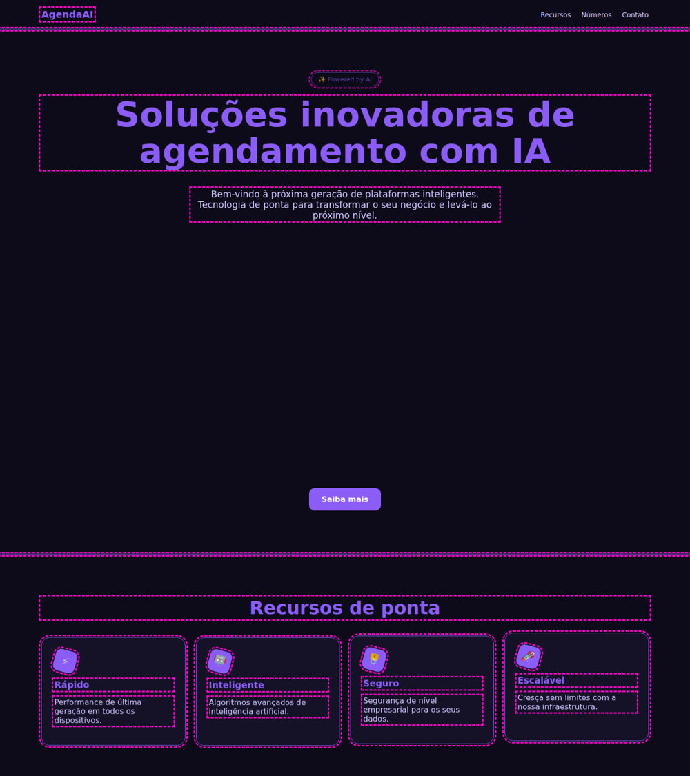
Both pages are for a fictional scheduling business for hair stylists. The photos below were taken by the auditor itself.


| Measure | Bad example | Good example |
|---|---|---|
| Headline | "Soluções inovadoras de agendamento com IA" (Innovative AI scheduling solutions) | "Encha sua agenda sem responder mensagem." (Fill your schedule without replying to messages.) |
| Main button | "Enviar" (Send), below the first screen | "Ver quanto meu horário vago custa" (See how much my open time costs), on the first screen on desktop and phone |
| Button color outside a click | 35 places | 0 |
| First screen background | solid color | background image |
| Items crossing a section edge | 0 | 1 |
| Elements with a shadow | 0 | 3 |
| Things moving on the same screen | 4 | 1 |
| Moving with "reduce motion" enabled | 4 | 0 |
| Free sample | no: just a contact form | amostra-calculadora, 2 fields, responds right away |
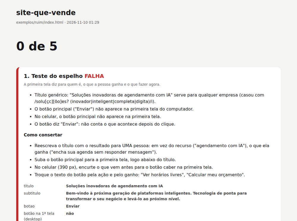
relatorio.html shows the score, each measured failure, what to do, and the measurements one by one. (Screenshot in Portuguese.)You need Node.js and git installed. These commands are for the bash or zsh terminal (Linux and Mac; on Windows, use WSL).
To check: node -v and git --version must return a version number. WSL is the Linux terminal Microsoft offers within Windows (how to install it). From step 2 onward, run the commands from inside the site-que-vende folder.
The auditor uses Playwright to control its own Chromium browser. You only need to install it once.
git clone https://github.com/inematds/site-que-vende && cd site-que-vende
cd skill/site-que-vende/scripts && npm install && npx playwright install chromium && cd -
Pass the website address or the path to an HTML file. The report goes in the --saida folder.
node skill/site-que-vende/scripts/auditar.js https://seusite.com.br --saida auditoria
With a file instead of an address:
node skill/site-que-vende/scripts/auditar.js minha-pagina/index.html --saida auditoria
auditoria/ (screenshots and report). Add auditoria/ to the site's .gitignore.fetch, any request that isn't GET) and every attempt to reach another address. Nothing is sent to the site, and the report lists what was blocked.data-cta attribute (<a data-cta href="...">). On a site you cannot edit, run with --cta "css-selector".../) and is not in a git repository: pass --raiz <folder that contains everything>. The auditor warns when a file returns 404.node skill/site-que-vende/scripts/auditar.js --help shows all options.This is the actual output for this repository’s bad example (node skill/site-que-vende/scripts/auditar.js exemplos/ruim/index.html --saida auditoria):
site-que-vende · exemplos/ruim/index.html

FALHA  1. Teste do espelho
         - Título genérico: "Soluções inovadoras de agendamento com IA" serve para qualquer empresa (o trecho "Soluções inovador" não diz nada sobre o cliente).
         - O botão principal ("Enviar") não aparece na primeira tela do computador.
         - No celular, o botão principal não aparece na primeira tela.
         - O botão diz "Enviar": não conta o que acontece depois do clique.
FALHA  2. Regra do marca-texto
         - A cor do botão (#8b5cf6) aparece em 35 lugares que não são clique (9 borda, 11 texto, 11 título, 4 ícone ou selo). Veja desktop-marca-texto.png.
FALHA  3. Frente, meio e fundo
         - A primeira tela é uma caixa de cor lisa: não há foto, forma nem degradê atrás do texto.
         - Nenhuma peça atravessa a borda de uma seção: a página é uma pilha de caixas.
         - Nenhum elemento tem sombra: tudo está no mesmo plano.
FALHA  4. Movimento com função
         - O título não está legível 0,4 s depois de a página abrir, no computador e no celular (opacidade 0.39): o visitante espera a animação.
         - 4 coisas se movem ao mesmo tempo na tela 2 (div.cartao, div.cartao, div.cartao, div.cartao).
         - Com "reduzir movimento" ligado no aparelho, 4 elemento(s) continuam se movendo.
FALHA  5. Amostra grátis
         - A página explica e entrega um formulário de contato: não há nada para o visitante experimentar.

0 de 5 padrões passam.  Relatório: auditoria/relatorio.html
O que consertar (cole no seu agente): auditoria/consertar.md
The auditor’s messages, relatorio.html, and consertar.md are in Portuguese. The same output is translated below for reference. You can paste consertar.md as is into your agent and ask it to respond in your language.
site-que-vende · exemplos/ruim/index.html

FAIL  1. Mirror test
         - Generic title: "Soluções inovadoras de agendamento com IA" could apply to any company (the snippet "Soluções inovador" says nothing about the customer).
         - The main button ("Enviar") does not appear on the desktop's first screen.
         - On the phone, the main button does not appear on the first screen.
         - The button says "Enviar": it doesn't tell you what happens after you click it.
FAIL  2. Highlighter rule
         - The button's accent color (#8b5cf6) appears in 35 places that are not clickable (9 border, 11 text, 11 title, 4 icon or badge). See desktop-marca-texto.png.
FAIL  3. Front, middle and back
         - The first screen is a solid-color box: there's no photo, shape, or gradient behind the text.
         - No element crosses a section boundary: the page is a stack of boxes.
         - No element has a shadow: everything is on the same plane.
FAIL  4. Motion with a purpose
         - The title isn't readable 0.4 s after the page opens, on desktop and phone (opacity 0.39): the visitor has to wait for the animation.
         - 4 things move at the same time on screen 2 (div.cartao, div.cartao, div.cartao, div.cartao).
         - With “reduce motion” enabled on the device, 4 element(s) keep moving.
FAIL  5. Free sample
         - The page explains and provides a contact form: there's nothing for the visitor to try.

0 of 5 patterns pass.  Report: auditoria/relatorio.html
What to fix (paste into your agent): auditoria/consertar.md
The opacity number on the pattern 4 line changes slightly with each run because it depends on when the measurement is taken.
The auditoria/ folder contains: relatorio.html (to open in a browser), relatorio.json (the measurements), consertar.md (the to-do list), and the screenshots desktop-tela1.png, celular-tela1.png, desktop-pagina.png, and desktop-marca-texto.png.
Exit code: 0 means all five passed, 1 means at least one failed, and 2 means a usage error or the page did not open. This works in CI (the automated check that runs whenever the code changes).
Paste auditoria/consertar.md into your coding agent along with the page. The order follows patterns 1 through 5: text before color, color before layering. Without an agent, open relatorio.html and fix things by hand. Each failure tells you what to do.
Repeat steps 2 through 4. Don’t change the auditor or the rules to pass. If a pattern still fails after 3 rounds, stop and check the measurement. It may be your decision.
The auditor doesn’t judge the text. Look at auditoria/desktop-tela1.png and auditoria/celular-tela1.png, then answer the three questions at the end of consertar.md:
A skill is a folder with a SKILL.md file: the instructions the agent follows. This kit’s skill tells the agent to create the brief, measure, fix, measure again, then stop for your review.
From inside the kit folder, create the shortcut in Claude Code’s skills folder:
mkdir -p ~/.claude/skills
ln -s "$PWD/skill/site-que-vende" ~/.claude/skills/site-que-vende
Claude Code reads ~/.claude/skills/site-que-vende/SKILL.md when a session starts. Open a new session and ask: "audit my site with site-que-vende" or "why isn’t my site converting?". If it doesn’t load automatically, say: "read ~/.claude/skills/site-que-vende/SKILL.md and follow the steps".
Inside SKILL.md, the paths (scripts/, amostras/, referencias/) are relative to the skill folder, which it calls $KIT. The agent works in your site's folder: it calls the auditor with node $KIT/scripts/auditar.js and copies $KIT/amostras/amostra.js into the site.
In Codex or Cursor, open the kit folder and say: "read skill/site-que-vende/SKILL.md and follow the steps".
Without an agent, follow the six steps above. The auditor and samples work on their own, and relatorio.html tells you what to do for each failure.
To check the kit: bash tests/rodar.sh runs 38 checks and must finish with TUDO OK.
data-cta on a hidden button or hide elements just to pass the auditor. Change the text the site owner wrote when it already answers the three questions. Ask for an email before showing the sample result.Copy skill/site-que-vende/amostras/amostra.js to your site, paste the tag, and replace the JSON with your business numbers. Nothing is sent to any server.
<amostra-calculadora>
  <script type="application/json">
  { "titulo": "Quanto custa pintar a sua casa?", "base": 350,
    "campos": [
      {"rotulo": "Área de parede", "tipo": "faixa", "min": 20, "max": 300, "passo": 10, "valor": 80, "unidade": "m²", "porUnidade": 28},
      {"rotulo": "Acabamento", "tipo": "opcoes", "opcoes": [{"rotulo": "Econômico", "vezes": 1}, {"rotulo": "Premium", "vezes": 1.6}]}
    ],
    "margem": 12, "prefixo": "Sua pintura fica entre",
    "botao": {"texto": "Receber o orçamento exato", "href": "#contato"} }
  </script>
</amostra-calculadora>
<script src="amostra.js"></script>
The button’s color comes from your page:
:root { --amostra-destaque: #c2410c; }
You can also adjust --amostra-destaque-texto, --amostra-fundo, --amostra-texto, --amostra-borda, and --amostra-raio. The sample inherits the page’s font and has no animation.
Adjust the area and finish: the result changes right away. That’s what pattern 5 measures. See the quiz and calculator on the sample page (in Portuguese).
| Tag | Keys | How it works |
|---|---|---|
<amostra-calculadora> | titulo, subtitulo, base, campos, margem, arredondar, prefixo, sufixo, botao, nota, moeda, idioma, ate | result = (base + sum of fields) × multipliers, shown as a range (plus or minus the margin). A "tipo": "faixa" field uses porUnidade; with "multiplica": true, it acts as a multiplier. A "tipo": "opcoes" field uses soma or vezes. |
<amostra-quiz> | titulo, perguntas, resultados, prefixo, refazer, textoPergunta, idioma | each option adds pontos to one or more results; the result with the most points wins. Each result has titulo, texto, and botao. |
The JSON keys stay in Portuguese (titulo, campos, rotulo); the values are yours, in any language. Fixed text (the quiz counter, the separator between the two range values, "Estimate", "Start over") appears in Portuguese, English, or Spanish depending on the JSON idioma or the page's lang, and each can be changed in the JSON. Both tags fire the amostra-resultado event when the result changes, so you can measure usage without collecting personal data. Invalid or incomplete JSON appears as text in place of the sample (for example, amostra-quiz: falta a lista "perguntas"). All keys, including multiplica, margem, moeda, and idioma, the CSS variables, and the event are documented in referencias/amostras.md (in Portuguese).
Answer these before asking AI to build the page, then paste your answers into the prompt. Without them, AI writes for “any business,” and no design can save it.
Replace what’s between < > with your answers. Each field’s number matches the question above.
Create the page for <business>.
Who it is for: <1>
What the person gains: <2>
Main action (one button, marked with data-cta): <3>
Word they use: <4>
Free sample (answers "<5>"): copy the amostra.js file from the site-que-vende kit (skill/site-que-vende/amostras/) to this site and use <amostra-calculadora> or <amostra-quiz>; these are the numbers: <...>
Colors: background <hex>, structure <hex>, accent <hex> (accent only on buttons and links).
First screen: headline, one supporting line, and the button, ready without animation, with a real photo in the background.
One element crosses the edge of the first section. Shadow only on the button and the main card.
At most one thing moves per screen, and nothing moves with prefers-reduced-motion: reduce.
Do not invent a testimonial, number, or customer.
Then run the kit's auditor: node <kit-folder>/skill/site-que-vende/scripts/auditar.js index.html  and fix until you get 5 de 5.
data-cta is an attribute you add to the main button's HTML (<a data-cta href="...">) to tell the auditor which one it is. Without the marker, the auditor picks the largest filled button on the first screen and says in the report which one it picked. <kit-folder> is where you cloned site-que-vende.
You decide what only you know. AI writes and fixes. The script measures without using tokens.
| # | Step | What happens | Who does it |
|---|---|---|---|
| 1 | Brief | answer the brief questions: who it’s for, what they gain, what they do now, three colors, sample question | 👤 you, with 🧠 AI |
| 2 | Page | AI generates the page using the completed brief (or your site is already live) | 🧠 AI |
| 3 | Measure | node skill/site-que-vende/scripts/auditar.js <url or file> --saida auditoria | ⚙️ script |
| 4 | Fix | paste auditoria/consertar.md into the agent; it fixes only what failed, in order from 1 to 5 | 🧠 AI |
| 5 | Sample | if pattern 5 failed: copy amostras/amostra.js and set up the quiz or calculator with your business numbers | 👤 you, with 🧠 AI |
| 6 | Measure again | repeat 3 and 4 until 5 de 5 (up to 3 rounds; after that, the decision is yours) | ⚙️ script |
| 7 | Human review and publish | look at desktop-tela1.png and celular-tela1.png, answer the three mirror test questions, publish | 👤 you |
What the auditor cannot see, in plain terms.
<canvas> or WebGL counts as a single thing.